Plotly:如何在蜡烛图中添加成交量

16

代码:

from plotly.offline import init_notebook_mode, iplot, iplot_mpl
    
def plot_train_test(train, test, date_split):
    data = [Candlestick(x=train.index, open=train['open'], high=train['high'], low=train['low'], close=train['close'],name='train'),
           Candlestick(x=test.index, open=test['open'], high=test['high'], low=test['low'], close=test['close'],name='test')
            ]
            layout = {
                'shapes': [
                    {'x0': date_split, 'x1': date_split, 'y0': 0, 'y1': 1, 'xref': 'x', 'yref': 'paper',
                     'line': {'color': 'rgb(0,0,0)', 'width': 1}}],
                'annotations': [{'x': date_split, 'y': 1.0, 'xref': 'x', 'yref': 'paper', 'showarrow': False, 'xanchor': 'left','text': ' test data'},
                    {'x': date_split, 'y': 1.0, 'xref': 'x', 'yref': 'paper', 'showarrow': False, 'xanchor': 'right', 'text': 'train data '}] }
            figure = Figure(data=data, layout=layout)
            iplot(figure)

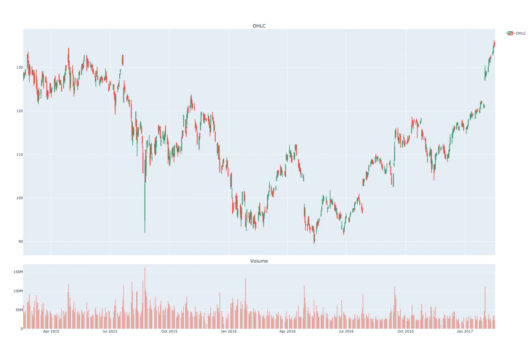
上述代码是正确的。但现在我想在这个K线图中添加“volume”(成交量)

代码:

from plotly.offline import init_notebook_mode, iplot, iplot_mpl
        
def plot_train_test(train, test, date_split):
    data = [Candlestick(x=train.index, open=train['open'], high=train['high'], low=train['low'], close=train['close'],volume=train['volume'],name='train'),
           Candlestick(x=test.index, open=test['open'], high=test['high'], low=test['low'],close=test['close'],volume=test['volume'],name='test')]
            layout = {
                'shapes': [
                    {'x0': date_split, 'x1': date_split, 'y0': 0, 'y1': 1, 'xref': 'x', 'yref': 'paper',
                     'line': {'color': 'rgb(0,0,0)', 'width': 1}}
                ],
                'annotations': [
                    {'x': date_split, 'y': 1.0, 'xref': 'x', 'yref': 'paper', 'showarrow': False, 'xanchor': 'left',
                     'text': ' test data'},
                    {'x': date_split, 'y': 1.0, 'xref': 'x', 'yref': 'paper', 'showarrow': False, 'xanchor': 'right',
                     'text': 'train data '}
                ]
            }
            figure = Figure(data=data, layout=layout)
            iplot(figure) 

错误:

值错误:为类型为plotly.graph_objs.Candlestick的对象指定了无效属性“volume”

5个回答

31

如果您想在OHLC图表下添加更小的交易量子图,您可以使用以下方法:

  1. rowscols 来指定子图网格。
  2. shared_xaxes=True 可以实现相同的缩放和过滤。
  3. row_width=[0.2, 0.7] 可以改变图表的高度比例。例如,交易量的图表可以比OHLC图表更小。

图表: Plotly Chart

import pandas as pd
import plotly.graph_objects as go
from plotly.subplots import make_subplots

# data
df = pd.read_csv('https://raw.githubusercontent.com/plotly/datasets/master/finance-charts-apple.csv')


# Create subplots and mention plot grid size
fig = make_subplots(rows=2, cols=1, shared_xaxes=True, 
               vertical_spacing=0.03, subplot_titles=('OHLC', 'Volume'), 
               row_width=[0.2, 0.7])

# Plot OHLC on 1st row
fig.add_trace(go.Candlestick(x=df["Date"], open=df["AAPL.Open"], high=df["AAPL.High"],
                low=df["AAPL.Low"], close=df["AAPL.Close"], name="OHLC"), 
                row=1, col=1
)

# Bar trace for volumes on 2nd row without legend
fig.add_trace(go.Bar(x=df['Date'], y=df['AAPL.Volume'], showlegend=False), row=2, col=1)

# Do not show OHLC's rangeslider plot 
fig.update(layout_xaxis_rangeslider_visible=False)
fig.show()

尝试了一下,但音量条以一种奇怪的方式排序,y轴的值也没有排序。不太清楚为什么会这样。 - topace
@topace 或许你想在绘图之前清理和排序你的数据,并将日期转换为日期或日期时间对象类型。 - Mega J

26

由于您没有提供一个带有数据示例的完整代码片段,所以我需要建议基于这里的示例构建解决方案。

无论如何,你之所以会得到那个错误信息,仅仅是因为go.Candlestick没有一个Volume属性。而且一开始看起来可能不太一样,但你可以很容易地将go.Candlestick设置为一个独立的迹线,然后使用一个独立的go.Bar()迹线包含Volumes:

  1. fig = make_subplots(specs=[[{"secondary_y": True}]])
  2. fig.add_traces(go.Candlestick(...), secondary_y=True)
  3. fig.add_traces(go.Bar(...), secondary_y=False)

图表:

enter image description here

完整代码:

import plotly.graph_objects as go
from plotly.subplots import make_subplots
import pandas as pd

# data
df = pd.read_csv('https://raw.githubusercontent.com/plotly/datasets/master/finance-charts-apple.csv')

# Create figure with secondary y-axis
fig = make_subplots(specs=[[{"secondary_y": True}]])

# include candlestick with rangeselector
fig.add_trace(go.Candlestick(x=df['Date'],
                open=df['AAPL.Open'], high=df['AAPL.High'],
                low=df['AAPL.Low'], close=df['AAPL.Close']),
               secondary_y=True)

# include a go.Bar trace for volumes
fig.add_trace(go.Bar(x=df['Date'], y=df['AAPL.Volume']),
               secondary_y=False)

fig.layout.yaxis2.showgrid=False
fig.show()

1
非常感谢,我已经将它修改到我的代码中了,现在它可以正常工作了! - William
1
这篇文章写得非常好,洞察力很强,谢谢你! - Aniruddha Kalburgi
4
如何在高度上缩小音量,使其占据面板高度的1/8? - mike01010
1
等一下,那个下面的图表没有显示成交量。它只是显示了价格图表的缩小版本。它的形状完全相同,只是被压缩了。 - P i
1
那个下面的图表也不应该显示音量。下面的“图表”是主图表的选择器/滑块。 - vestland

4

这是我基于Vestland之前的答案进行改进实现后的结果,进行了一些标记和涂色方面的改进。

import plotly.graph_objects as go
from plotly.subplots import make_subplots

candlesticks = go.Candlestick(
    x=candles.index,
    open=candles['open'],
    high=candles['high'],
    low=candles['low'],
    close=candles['close'],
    showlegend=False
)

volume_bars = go.Bar(
    x=candles.index,
    y=candles['volume'],
    showlegend=False,
    marker={
        "color": "rgba(128,128,128,0.5)",
    }
)

fig = go.Figure(candlesticks)
fig = make_subplots(specs=[[{"secondary_y": True}]])
fig.add_trace(candlesticks, secondary_y=True)
fig.add_trace(volume_bars, secondary_y=False)
fig.update_layout(title="ETH/USDC pool after Uniswap v3 deployment", height=800)
fig.update_yaxes(title="Price $", secondary_y=True, showgrid=True)
fig.update_yaxes(title="Volume $", secondary_y=False, showgrid=False)
fig.show()

在这里输入图片描述

您可以在此开源笔记本中找到完整的源代码


1
为什么第二个子图除了成交量之外还有OHLC?这是不必要的,我找不到关闭它的方法。同样的情况也适用于这里的示例:https://plotly.com/python/candlestick-charts/ - undefined
1
@maverik 更新了答案 - undefined

1

如果您想为买入/卖出添加不同的颜色,可以使用一些库(例如mplfinance),这些库会自动完成此操作,但绘图是非交互式的。要获得具有分别用于买入/卖出颜色的交互式plotly图,需要为每个数据点添加跟踪。以下是代码:

    import plotly.graph_objects as go
    from plotly.subplots import make_subplots
    import pandas as pd
    # Create subplots and mention plot grid size
    title=df.symbol.unique()[0]

    fig = make_subplots(rows=2, cols=1, shared_xaxes=True, 
               vertical_spacing=0.02, 
               row_width=[0.25, 0.75])

    # Plot OHLC on 1st row
    fig.add_trace(go.Candlestick(x=df.index,
                    open=df['open'], high=df['high'],
                    low=df['low'], close=df['close'],showlegend=False),row=1, col=1,)

    # Bar trace for volumes on 2nd row without legend
    # fig.add_trace(go.Bar(x=df.index, y=df['volume'], showlegend=False), row=2, col=1)

    df['color']=''
    df['color']=['red' if (x>y) else t for x,y,t in zip(df['open'],df['close'],df['color'])]
    df['color']=['green' if (x<y) else t for x,y,t in zip(df['open'],df['close'],df['color'])]
    colors=df.color.tolist()
    df['prev_color']=[colors[0]]+colors[:(len(colors)-1)]
    df.loc[((df.open==df.close) & (df.color=='')),'color']=[z for x,y,z,t in zip(df['open'],df['close'],df['prev_color'],df['color']) if (x==y and t=='')]
    colors=df.color.tolist()
    df['prev_color']=[colors[0]]+colors[:(len(colors)-1)]
    df.loc[((df.open==df.close) & (df.color=='')),'color']=[z for x,y,z,t in zip(df['open'],df['close'],df['prev_color'],df['color']) if (x==y and t=='')]
    
    markers=['green','red']

    for t in markers:
        df_tmp=df.loc[~(df.color==t)] ## somehow the color it takes is opposite so take negation to 
        fig.add_trace(go.Bar(x=df_tmp.index, y=df_tmp['volume'], showlegend=False), row=2, col=1)

    # Do not show OHLC's rangeslider plot 
    fig.update(layout_xaxis_rangeslider_visible=False)
    fig.layout.yaxis2.showgrid=False
    fig.update_layout(title_text=title,title_x=0.45)

    fig.show()

0

关于在不同子图中绘制成交量的建议,我的看法是,只需使用marker_color即可使@user6397960的响应更简洁,而无需通过黑客手段获取正确的颜色。想一想,是什么让K线变绿?就是收盘价高于开盘价,那红色的K线呢?很明显,就是收盘价低于开盘价。因此,基于这些基本原则:

import plotly.graph_objects as go
from plotly.subplots import make_subplots

# Create a Figure with 2 subplots, one will contain the candles
# the other will contain the Volume bars
figure = make_subplots(rows=2, cols=1, shared_xaxes=True, row_heights=[0.7, 0.3])

# Plot the candles in the first subplot
figure.add_trace(go.Candlestick(x=df.index, open=df.open, high=df.high, low=df.low, close=df.close, name='price',
                                increasing_line_color='#26a69a', decreasing_line_color='#ef5350'),
                 row=1, col=1)

# From our Dataframe take only the rows where the Close > Open
# save it in different Dataframe, these should be green
green_volume_df = df[df['close'] > df['open']]
# Same for Close < Open, these are red candles/bars
red_volume_df = df[df['close'] < df['open']]

# Plot the red bars and green bars in the second subplot
figure.add_trace(go.Bar(x=red_volume_df.index, y=red_volume_df.volume, showlegend=False, marker_color='#ef5350'), row=2,
                 col=1)
figure.add_trace(go.Bar(x=green_volume_df.index, y=green_volume_df.volume, showlegend=False, marker_color='#26a69a'),
                 row=2, col=1)

# Hide the Range Slider
figure.update(layout_xaxis_rangeslider_visible=False)
figure.update_layout(title=f'BTC/USDT', yaxis_title=f'Price')
figure.update_yaxes(title_text=f'Volume', row=2, col=1)
figure.update_xaxes(title_text='Date', row=2)

参考资料


网页内容由stack overflow 提供, 点击上面的
可以查看英文原文,
原文链接