Plotly:如何格式化数值y轴和悬停文本?

4
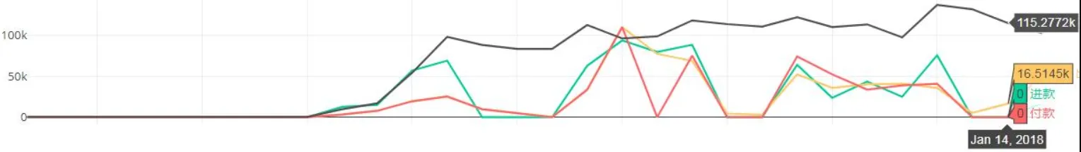
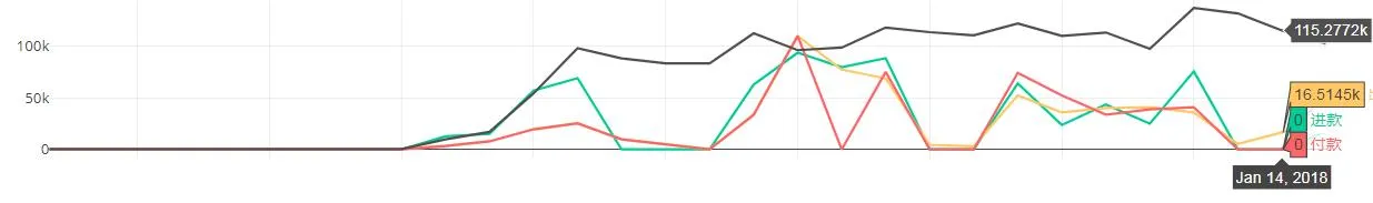
我有一个Python Plotly图表,具有数值y轴,它会自动将y轴数字格式化为“k”比例,并在悬停点时显示像`115.277258k`这样的值。
如何更改比例以显示100,000而不是100k,并格式化悬停文本以显示115,2772.58而不是115.277258kPlotly图表示例:

enter image description here

目前正在使用循环绘制多个子图。

for i in range(1, allcities.size + 1):
    for col in ['total_inflow', 'total_outflow', 'total_withdraw', 'total_account']:
        plot_data = hist[hist['city_id'] == allcities[i - 1]]
        plot_data = plot_data.merge(datelist, on='balance_date', how='right')
        fig.append_trace({'x': plot_data['balance_date'],
                          'y': round(plot_data[col], 2),
                          'type': 'scatter',
                          'mode': 'lines', 
                          'line': dict(color=line_colors[col]),
                          'showlegend': False,
                          'name': line_legends[col]
                          }, i + 1, 1)

谢谢!

1个回答

1
你可以像这样更改go.Scatter()的hovertemplate:

hovertemplate = 'y:%{y:20,.2f}'

您可以使用update_layout(yaxis=dict())编辑刻度标签,就像这样:

yaxis=dict(tickformat="20,.2f")

故事情节:

enter image description here

完整代码:
import plotly.graph_objects as go
import numpy as np

x = np.arange(10)

fig = go.Figure(data=go.Scatter(x=x**6, y=x**4,
                                mode='lines+markers',
                                hovertemplate = '<i>y</i>:%{y:20,.2f}'+ '<br><b>x</b>: %{x}<br>',

fig.update_layout(yaxis=dict(tickformat="20,.2f"),
                  xaxis=dict(tickformat="20,.2f", tickangle = 0))


fig.show()

网页内容由stack overflow 提供, 点击上面的
可以查看英文原文,
原文链接