在R中,有条件地对置信区间之外的数据点进行颜色标记

7
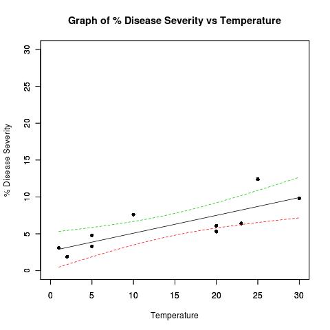
我需要将下图中超出置信区间的数据点与在置信区间内的数据点区别开来。我应该向数据集添加一个单独的列以记录数据点是否在置信区间内吗?请给出一个例子。 Plot with confidence bands 示例数据集:
## Dataset from http://www.apsnet.org/education/advancedplantpath/topics/RModules/doc1/04_Linear_regression.html

## Disease severity as a function of temperature

# Response variable, disease severity
diseasesev<-c(1.9,3.1,3.3,4.8,5.3,6.1,6.4,7.6,9.8,12.4)

# Predictor variable, (Centigrade)
temperature<-c(2,1,5,5,20,20,23,10,30,25)

## For convenience, the data may be formatted into a dataframe
severity <- as.data.frame(cbind(diseasesev,temperature))

## Fit a linear model for the data and summarize the output from function lm()
severity.lm <- lm(diseasesev~temperature,data=severity)

# Take a look at the data
plot(
  diseasesev~temperature,
  data=severity,
  xlab="Temperature",
  ylab="% Disease Severity",
  pch=16,
  pty="s",
  xlim=c(0,30),
  ylim=c(0,30)
)
title(main="Graph of % Disease Severity vs Temperature")
par(new=TRUE) # don't start a new plot

## Get datapoints predicted by best fit line and confidence bands
## at every 0.01 interval
xRange=data.frame(temperature=seq(min(temperature),max(temperature),0.01))
pred4plot <- predict(
                        lm(diseasesev~temperature),
                        xRange,
                        level=0.95,
                        interval="confidence"
                    )

## Plot lines derrived from best fit line and confidence band datapoints
matplot(
  xRange,
  pred4plot,
  lty=c(1,2,2),   #vector of line types and widths
  type="l",       #type of plot for each column of y
  xlim=c(0,30),
  ylim=c(0,30),
  xlab="",
  ylab=""
)
3个回答

10

我本以为使用ggplot2会很简单,但现在我意识到我不知道如何计算stat_smooth/geom_smooth 的置信区间。

考虑以下内容:

library(ggplot2)
pred <- as.data.frame(predict(severity.lm,level=0.95,interval="confidence"))
dat <- data.frame(diseasesev,temperature, 
    in_interval = diseasesev <=pred$upr & diseasesev >=pred$lwr ,pred)
ggplot(dat,aes(y=diseasesev,x=temperature)) +
stat_smooth(method='lm')  + geom_point(aes(colour=in_interval)) +
    geom_line(aes(y=lwr),colour=I('red')) + geom_line(aes(y=upr),colour=I('red'))

这将产生:

alt text http://ifellows.ucsd.edu/pmwiki/uploads/Main/strangeplot.jpg

我不明白为什么由stat_smooth计算的置信区间与由predict直接计算的置信区间(即红线)不一致。有谁能解释一下吗?

编辑:

弄清楚了。ggplot2使用1.96 *标准误差来绘制所有平滑方法的区间。

pred <- as.data.frame(predict(severity.lm,se.fit=TRUE,
        level=0.95,interval="confidence"))
dat <- data.frame(diseasesev,temperature, 
    in_interval = diseasesev <=pred$fit.upr & diseasesev >=pred$fit.lwr ,pred)
ggplot(dat,aes(y=diseasesev,x=temperature)) +
    stat_smooth(method='lm')  + 
    geom_point(aes(colour=in_interval)) +
    geom_line(aes(y=fit.lwr),colour=I('red')) + 
    geom_line(aes(y=fit.upr),colour=I('red')) +
    geom_line(aes(y=fit.fit-1.96*se.fit),colour=I('green')) + 
    geom_line(aes(y=fit.fit+1.96*se.fit),colour=I('green'))

Ian - predict()命令是否使用不同的标准误差数字,比如四舍五入到2位小数?另外,我注意到红色带在x = 10和x = 20处有“折线”,而ggplot stat_smooth在曲率上没有任何不连续性。另外,可能应该给这个问题打上一个ggplot2的标签,对吗? - briandk
pridict使用相同的标准误差,但使用t分布来计算区间。这导致区间更宽。这些奇怪的线条是由于geom_line仅在数据点处进行评估所导致的。 - Ian Fellows

6
最简单的方法可能是计算一个向量,其中包含指示数据点是否在置信区间内的 TRUE/FALSE 值。我将重新排列您的示例,以便在执行绘图命令之前完成所有计算-这提供了程序逻辑上的清晰分离,如果您要将其中一些内容打包成函数,则可以利用它。
第一部分基本相同,除了我用 severity.lm 变量替换了 predict()中的额外调用lm() - 当我们已经存储了线性模型时,没有必要使用其他计算资源来重新计算它:
## Dataset from 
#  apsnet.org/education/advancedplantpath/topics/
#    RModules/doc1/04_Linear_regression.html

## Disease severity as a function of temperature

# Response variable, disease severity
diseasesev<-c(1.9,3.1,3.3,4.8,5.3,6.1,6.4,7.6,9.8,12.4)

# Predictor variable, (Centigrade)
temperature<-c(2,1,5,5,20,20,23,10,30,25)

## For convenience, the data may be formatted into a dataframe
severity <- as.data.frame(cbind(diseasesev,temperature))

## Fit a linear model for the data and summarize the output from function lm()
severity.lm <- lm(diseasesev~temperature,data=severity)

## Get datapoints predicted by best fit line and confidence bands
## at every 0.01 interval
xRange=data.frame(temperature=seq(min(temperature),max(temperature),0.01))
pred4plot <- predict(
  severity.lm,
  xRange,
  level=0.95,
  interval="confidence"
)

今日免费次数已满, 请开通会员/明日再来
modelConfInt <- predict(
  severity.lm,
  level = 0.95,
  interval = "confidence"
)

insideInterval <- modelConfInt[,'lwr'] < severity[['diseasesev']] &
  severity[['diseasesev']] < modelConfInt[,'upr']

然后我们将进行绘图-首先是高级绘图函数plot(),就像您在示例中使用的那样,但我们只会绘制区间内的点。然后,我们将使用低级函数points()绘制所有区间外的点,颜色不同。最后,matplot()将用于填充置信区间,就像您使用的那样。但是,我更喜欢将参数add=TRUE传递给高级函数,使它们像低级函数一样运行,而不是调用par(new=TRUE)
使用par(new=TRUE)就像玩一个有未知后果的卑鄙把戏,可能会对绘图函数产生意想不到的影响。许多函数都提供了add参数,以便将信息添加到绘图中,而不是重新绘制它-我建议尽可能利用这个参数,并作为最后的手段回退到par()操作。
# Take a look at the data- those points inside the interval
plot(
  diseasesev~temperature,
  data=severity[ insideInterval,],
  xlab="Temperature",
  ylab="% Disease Severity",
  pch=16,
  pty="s",
  xlim=c(0,30),
  ylim=c(0,30)
)
title(main="Graph of % Disease Severity vs Temperature")

# Add points outside the interval, color differently
points(
  diseasesev~temperature,
  pch = 16,
  col = 'red',
  data = severity[ !insideInterval,]
)

# Add regression line and confidence intervals
matplot(
  xRange,
  pred4plot,
  lty=c(1,2,2),   #vector of line types and widths
  type="l",       #type of plot for each column of y
  add = TRUE
)

我喜欢这个答案纠正了我的一些错误,比如使用par()和重复使用severity.lm。除此之外,答案使用了我提供的内容,这也很好。这个答案不需要额外的库,干净简洁。 - D W
Ian的ggplot2示例也很不错-我本来要加入一个,但他做得非常好。如果你发现自己需要大量的统计图形,我强烈建议你投资一些时间学习ggplot2-这个软件包用于构建图形的代码非常干净、优雅,并且提供了我所见过的最强大的抽象层。 - Sharpie
我认为所有的答案都很好,我都点赞了。我会认真考虑你的建议,并研究ggplot2。 - D W

4

我喜欢这个想法,尝试为此编写了一个函数。当然,它远非完美。欢迎您的评论。

diseasesev<-c(1.9,3.1,3.3,4.8,5.3,6.1,6.4,7.6,9.8,12.4)
# Predictor variable, (Centigrade)
temperature<-c(2,1,5,5,20,20,23,10,30,25)

## For convenience, the data may be formatted into a dataframe
severity <- as.data.frame(cbind(diseasesev,temperature))

## Fit a linear model for the data and summarize the output from function lm()
severity.lm <- lm(diseasesev~temperature,data=severity)

# Function to plot the linear regression and overlay the confidence intervals   
ci.lines<-function(model,conf= .95 ,interval = "confidence"){
  x <- model[[12]][[2]]
  y <- model[[12]][[1]]
  xm<-mean(x)
  n<-length(x)
  ssx<- sum((x - mean(x))^2)
  s.t<- qt(1-(1-conf)/2,(n-2))
  xv<-seq(min(x),max(x),(max(x) - min(x))/100)
  yv<- coef(model)[1]+coef(model)[2]*xv

  se <- switch(interval,
        confidence = summary(model)[[6]] * sqrt(1/n+(xv-xm)^2/ssx),
        prediction = summary(model)[[6]] * sqrt(1+1/n+(xv-xm)^2/ssx)
              )
  # summary(model)[[6]] = 'sigma'

  ci<-s.t*se
  uyv<-yv+ci
  lyv<-yv-ci
  limits1 <- min(c(x,y))
  limits2 <- max(c(x,y))

  predictions <- predict(model, level = conf, interval = interval)

  insideCI <- predictions[,'lwr'] < y & y < predictions[,'upr']

  x_name <- rownames(attr(model[[11]],"factors"))[2]
  y_name <- rownames(attr(model[[11]],"factors"))[1]

  plot(x[insideCI],y[insideCI],
  pch=16,pty="s",xlim=c(limits1,limits2),ylim=c(limits1,limits2),
  xlab=x_name,
  ylab=y_name,
  main=paste("Graph of ", y_name, " vs ", x_name,sep=""))

  abline(model)

  points(x[!insideCI],y[!insideCI], pch = 16, col = 'red')

  lines(xv,uyv,lty=2,col=3)
  lines(xv,lyv,lty=2,col=3)
}

使用方式如下:

ci.lines(severity.lm, conf= .95 , interval = "confidence")
ci.lines(severity.lm, conf= .85 , interval = "prediction")

网页内容由stack overflow 提供, 点击上面的
可以查看英文原文,
原文链接