我有一个包含
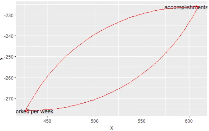
当我绘制它时,它看起来如下所示:
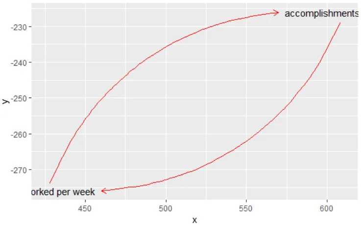
我期望的是:
这是我的
var和link类型元素的df。我想使用geom_text将元素var作为文本标签绘制,使用geom_curve将links作为箭头绘制。问题是,links会覆盖标签,而我希望它们从标签旁边开始和结束。
我有什么:
  type   x    y                    label from_x from_y to_x to_y
1 link  NA   NA                     <NA>    608   -229  460 -276
2 link  NA   NA                     <NA>    428   -274  570 -226
3  var 610 -226 accomplishments per week    608   -229  460   NA
4  var 426 -276    hours worked per week    428   -274  570   NA
当我绘制它时,它看起来如下所示:
ggplot(df) + geom_text(aes(x, y, label = label)) + geom_curve(aes(x =
from_x,y = from_y,xend = to_x, yend = to_y), curvature = -.3, arrow = arrow(length = unit(0.03, "npc")), color = "red")
我期望的是:
我该如何实现这个?
这是我的
df:df <- structure(list(type = structure(c(1L, 1L, 2L, 2L), .Label = c("link",
"var"), class = "factor"), x = c(NA, NA, 610, 426), y = c(NA,
NA, -226, -276), label = c(NA, NA, "accomplishments per week",
"hours worked per week"), from_x = c(610, 426, NA, NA), from_y = c(-226,
-276, NA, NA), to_x = c(426, 610, NA, NA), to_y = c(-276, -226,
NA, NA)), .Names = c("type", "x", "y", "label", "from_x", "from_y",
"to_x", "to_y"), row.names = c(NA, -4L), class = "data.frame")
这是我对绘制预期输出所做的手动调整:
df$from_x <- c(608, 428)
df$from_y <- c(-229, -274)
df$to_x <- c(460, 570)

ggplot(df) + geom_text(aes(x, y, label = label)) + geom_curve(aes(x = from_x,y = from_y,xend = to_x, yend = to_y), curvature = -.3, arrow = arrow(length = unit(0.03, "npc")), color = "red")
NA_real_进行漂亮计算的+1。我不知道那个存在。:) 另一方面,这仍然不完全令人满意,因为偏移量独立于标签的宽度和高度,而在我的实际数据中,标签可能相当小而且非常长,偏移应根据标签尺寸动态调整。 - symbolrushggplot2中计算动态偏移量是具有挑战性的,因为标签的宽度/高度取决于字体、字号、字重等因素,这些因素只有在调用ggplot()函数时才会被计算。也就是说,据我所知,不可能计算出标签的尺寸,应用适当的偏移量,然后将其插入geom_curve()中。 - Phildummy <- ggplot(df) + geom_text(aes(x, y, label = label))),并探索dummy对象以获取有关呈现标签的信息。然后,您可以将这些用作偏移量的输入,但我不了解ggplot2的内部情况!是否有更适合此类工具,例如TikZ? - Phil