绘制一个密度曲线总和为1的非标准化数据的直方图是非常困难的。已经有很多关于此的问题,但它们的解决方案都不适用于我的数据。需要一个简单的解决方案,而且必须有效。我找不到一个简单有效的答案。
以下是一些例子:
仅适用于标准正态数据的解决方案 ggplot2:叠加直方图和密度曲线
使用离散数据且没有密度曲线 ggplot2:带宽=.5、垂直线和中心位置的密度直方图
无答案 使用自定义bin在ggplot2上叠加密度和直方图图形
我的数据密度总和不为1 在ggplot2中创建密度直方图?
我的数据中总和不为1 使用自定义分 bin 的 ggplot2 密度直方图 这里有一个长的解释和示例,但是我的数据密度不为1 在垂直轴为频率(也称为计数)或相对频率的直方图上叠加“密度”曲线?--
一些示例代码:#Example code
set.seed(1)
t = data.frame(r = runif(100))
#first we try the obvious simple solution that should work
ggplot(t, aes(r)) +
geom_histogram() +
geom_density()
因此,很明显密度不会总和为1。
#maybe geom_histogram needs a ..density.. ?
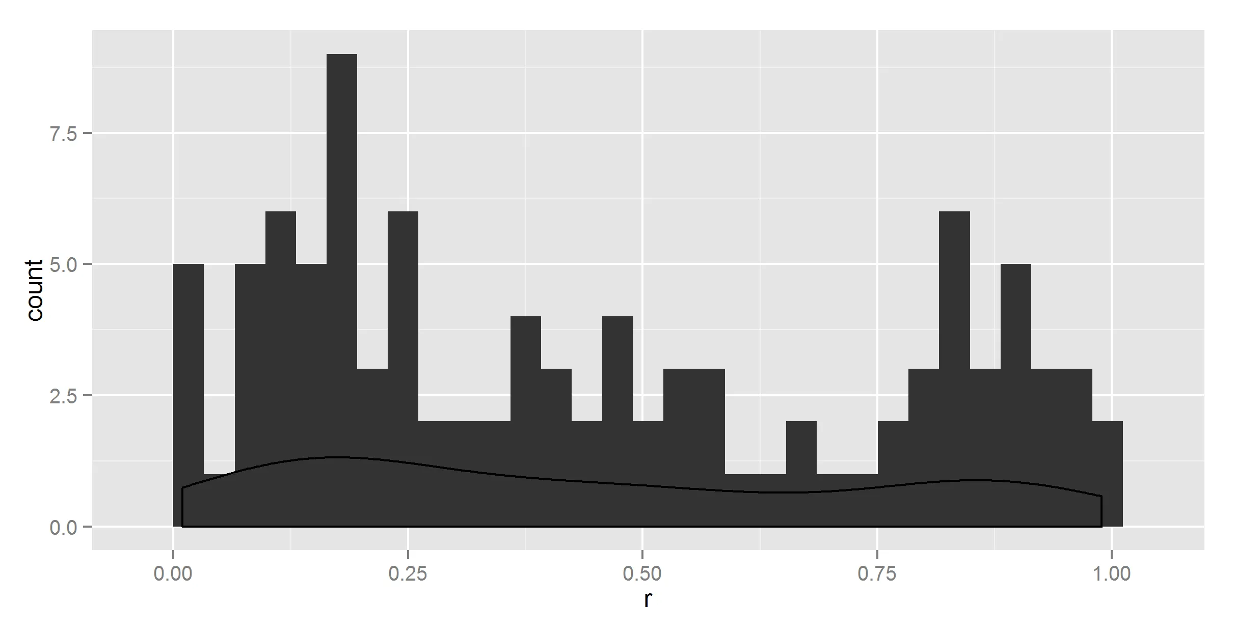
ggplot(t, aes(r)) +
geom_histogram(aes(y = ..density..)) +
geom_density()
它确实改变了一些东西,但不正确。
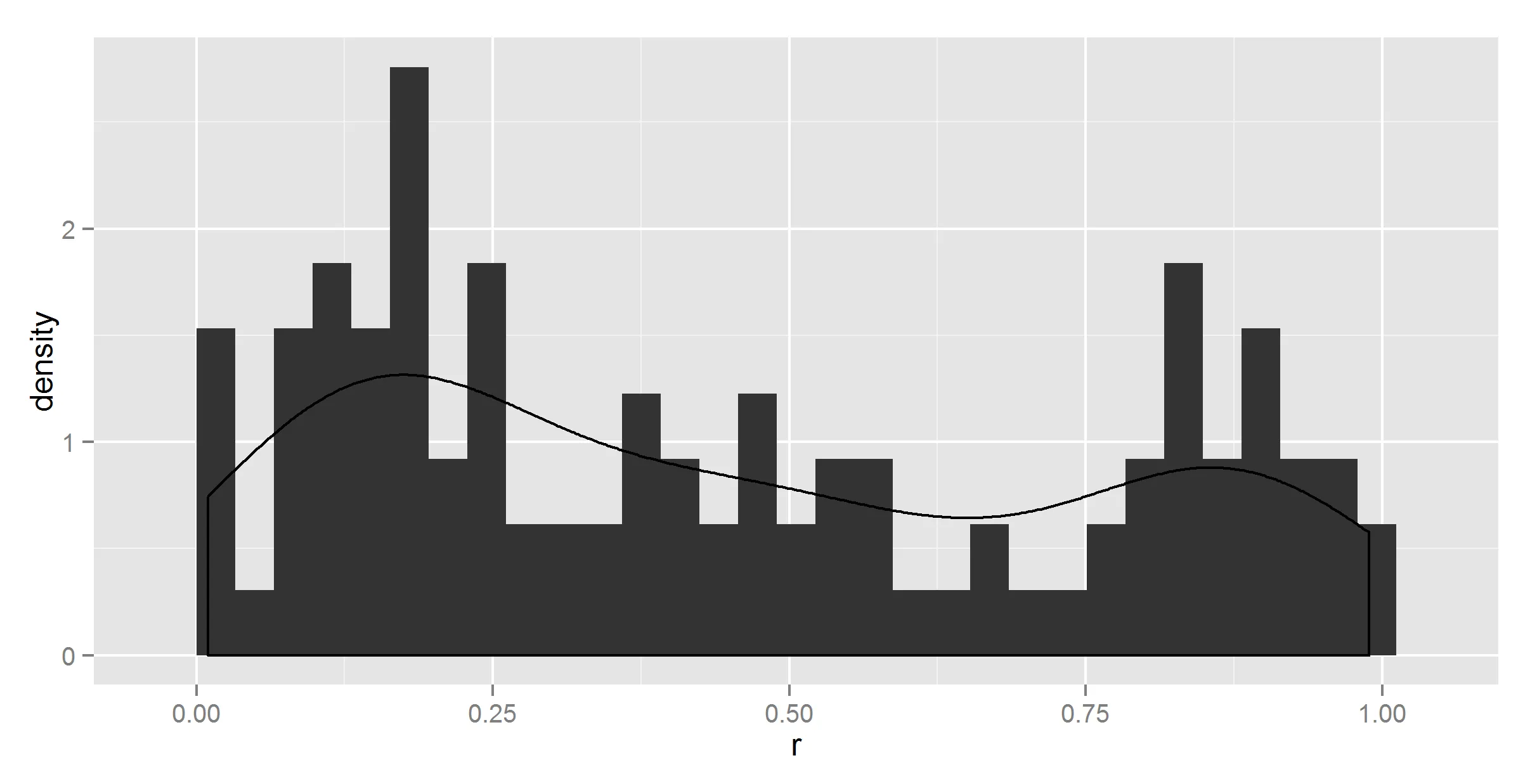
#maybe geom_density needs a ..density.. too ?
ggplot(t, aes(r)) +
  geom_histogram(aes(y = ..density..)) +
  geom_density(aes(y = ..density..))
没有变化。
#maybe binwidth = 1?
ggplot(t, aes(r)) +
  geom_histogram(aes(y = ..density..), binwidth=1) +
  geom_density(aes(y = ..density..))
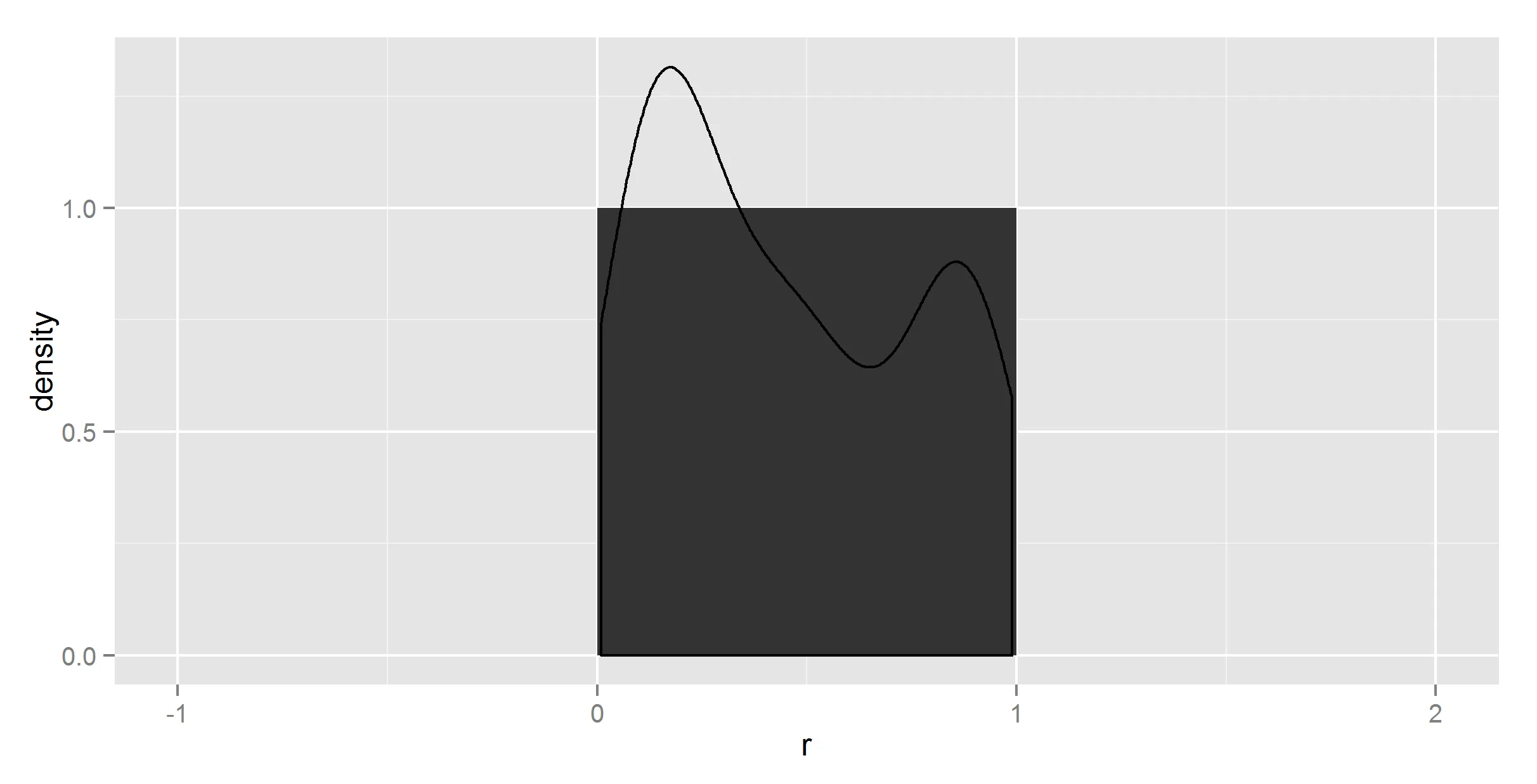
密度曲线仍然不正确,现在直方图也不正确。
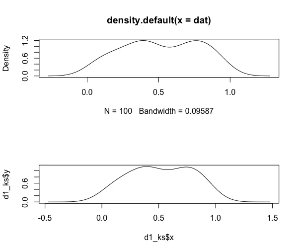
确保了,我花了4个小时尝试各种 ..count..、..sum.. 和 ..density.. 的组合,但由于找不到任何关于它们应该如何工作的文档,这是半盲目的试错。
所以我放弃了使用ggplot2来总结数据。
因此,首先我们需要获得正确的比例数据框,这并不简单:
get_prop_table = function(x, breaks_=20){
  library(magrittr)
  library(plyr)
  x_prop_table = cut(x, 20) %>% table(.) %>% prop.table %>% data.frame
  colnames(x_prop_table) = c("interval", "density")
  intervals = x_prop_table$interval %>% as.character
  fetch_numbers = str_extract_all(intervals, "\\d\\.\\d*")
  x_prop_table$means = laply(fetch_numbers, function(x) {
    x %>% as.numeric %>% mean
  })
  return(x_prop_table)
}

t_df = get_prop_table(t$r)
这提供了我们想要的摘要数据:
> head(t_df)
          interval density    means
1 (0.00859,0.0585]    0.06 0.033545
2   (0.0585,0.107]    0.09 0.082750
3    (0.107,0.156]    0.07 0.131500
4    (0.156,0.205]    0.10 0.180500
5    (0.205,0.254]    0.08 0.229500
6    (0.254,0.303]    0.03 0.278500
现在我们只需要绘制它。应该很容易...
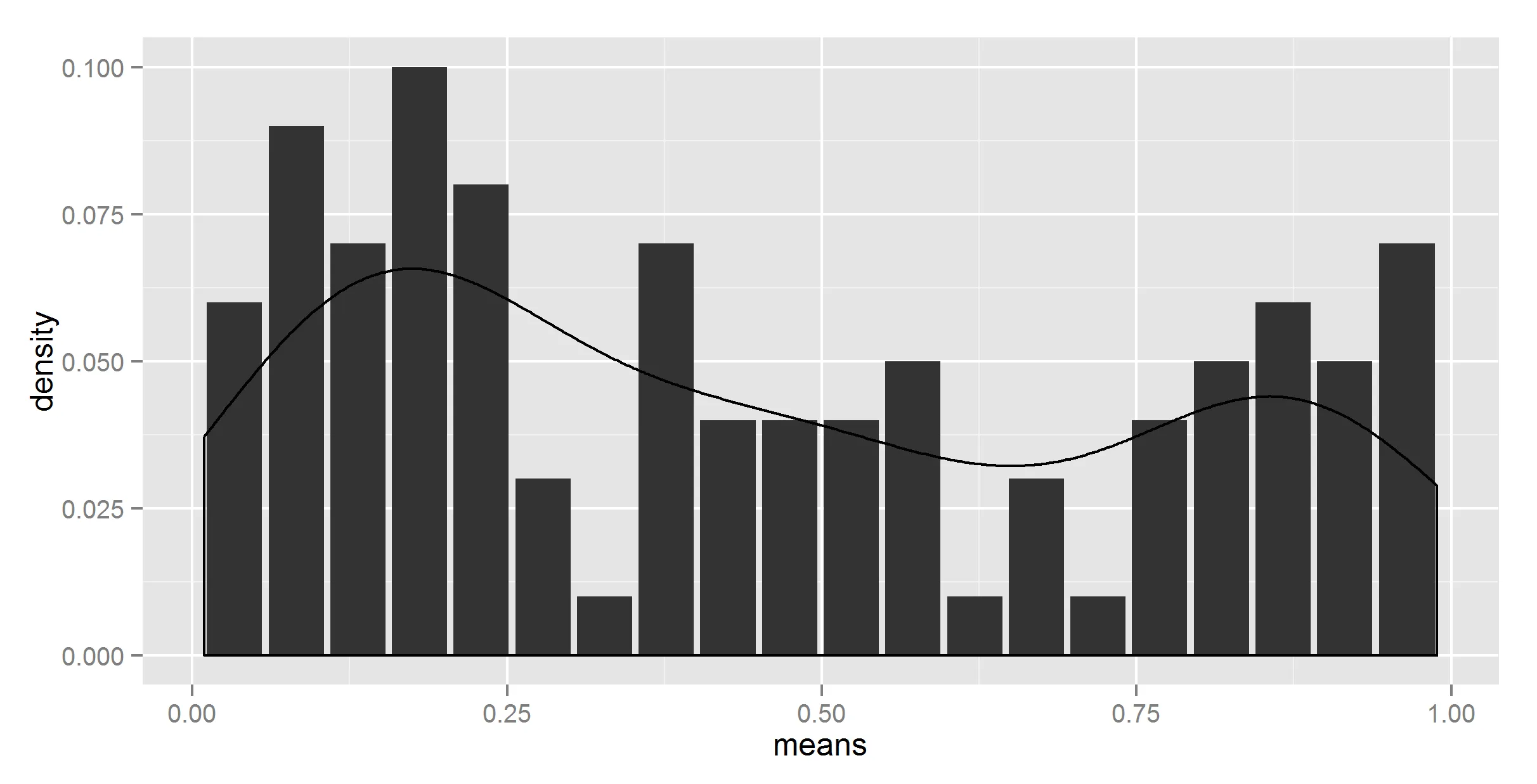
ggplot(t_df, aes(means, density)) +
  geom_histogram(stat = "identity") +
  geom_density(stat = "identity")
嗯,不完全是我想要的。为了确定,我尝试在 geom_density 中不使用 stat = "identity",此时它会抱怨没有 y。
#lets try adding ..density.. then
ggplot(t_df, aes(means, density)) +
  geom_histogram(stat = "identity") +
  geom_density(aes(y = ..density..))
更加奇怪了。
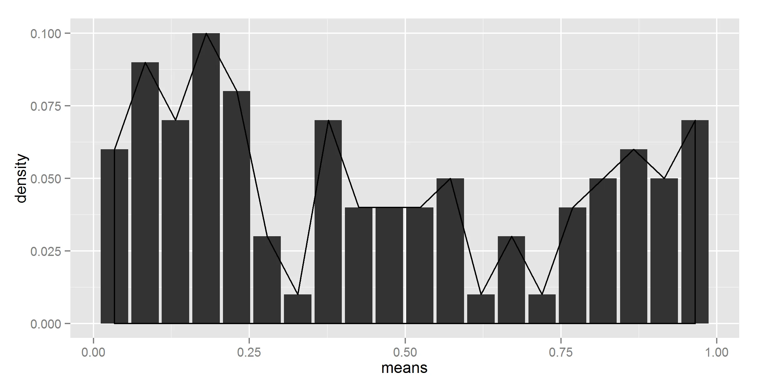
好的,也许我们应该放弃从摘要数据中获取密度曲线的想法。也许我们需要把方法结合起来使用一下...
#adding together
ggplot(t_df, aes(means, density)) +
  geom_bar(stat = "identity") +
  geom_density(data=t, aes(r, y = ..density..), stat = 'density')
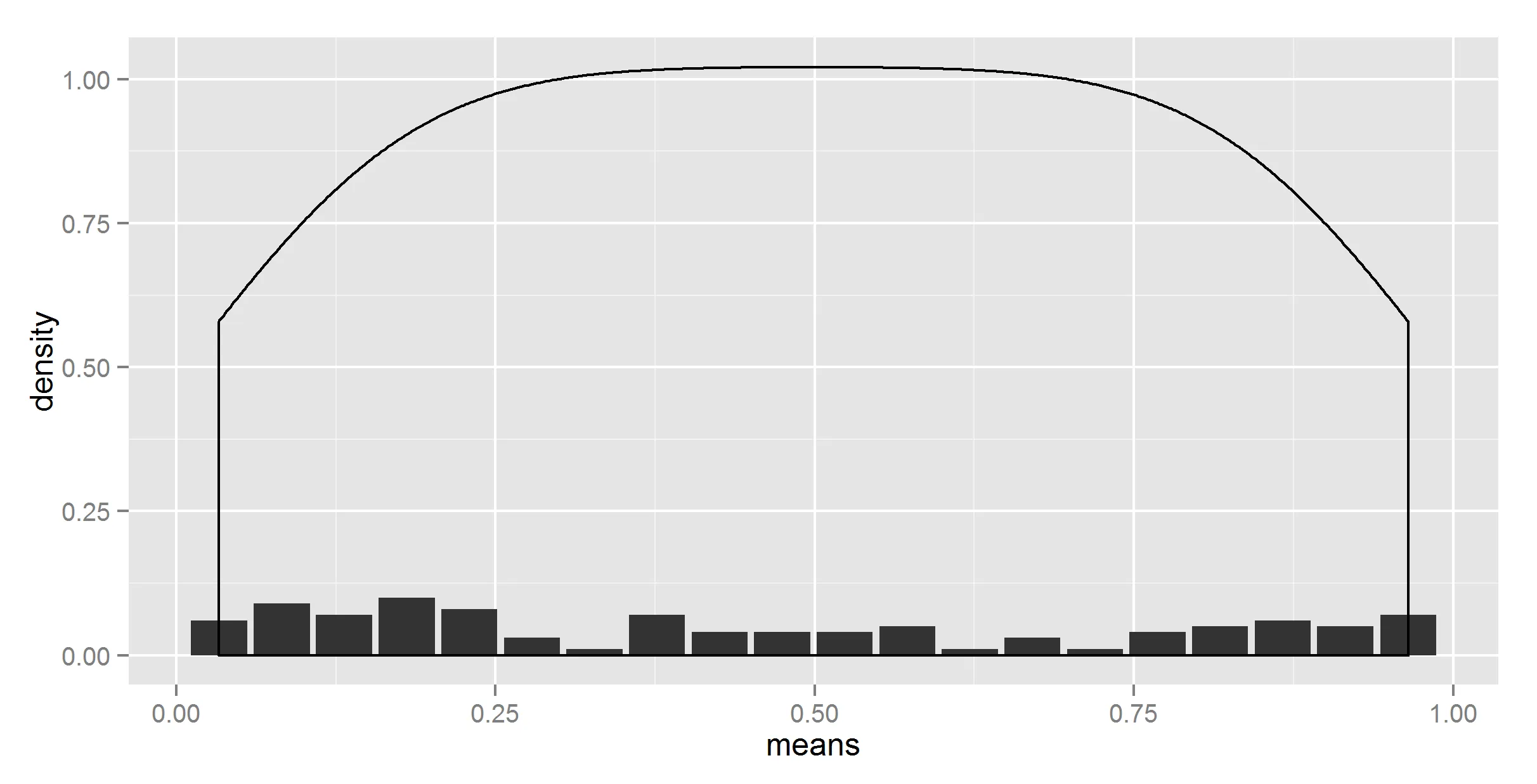
好的,至少形状现在是正确的。现在,我们需要想办法将其缩小。
#lets try dividing by the number of bins
ggplot(t_df, aes(means, density)) +
  geom_bar(stat = "identity") +
  geom_density(data=t, aes(r, y = ..density../20), stat = 'density')
看起来我们有一个获胜者。但是这个数字是硬编码的。
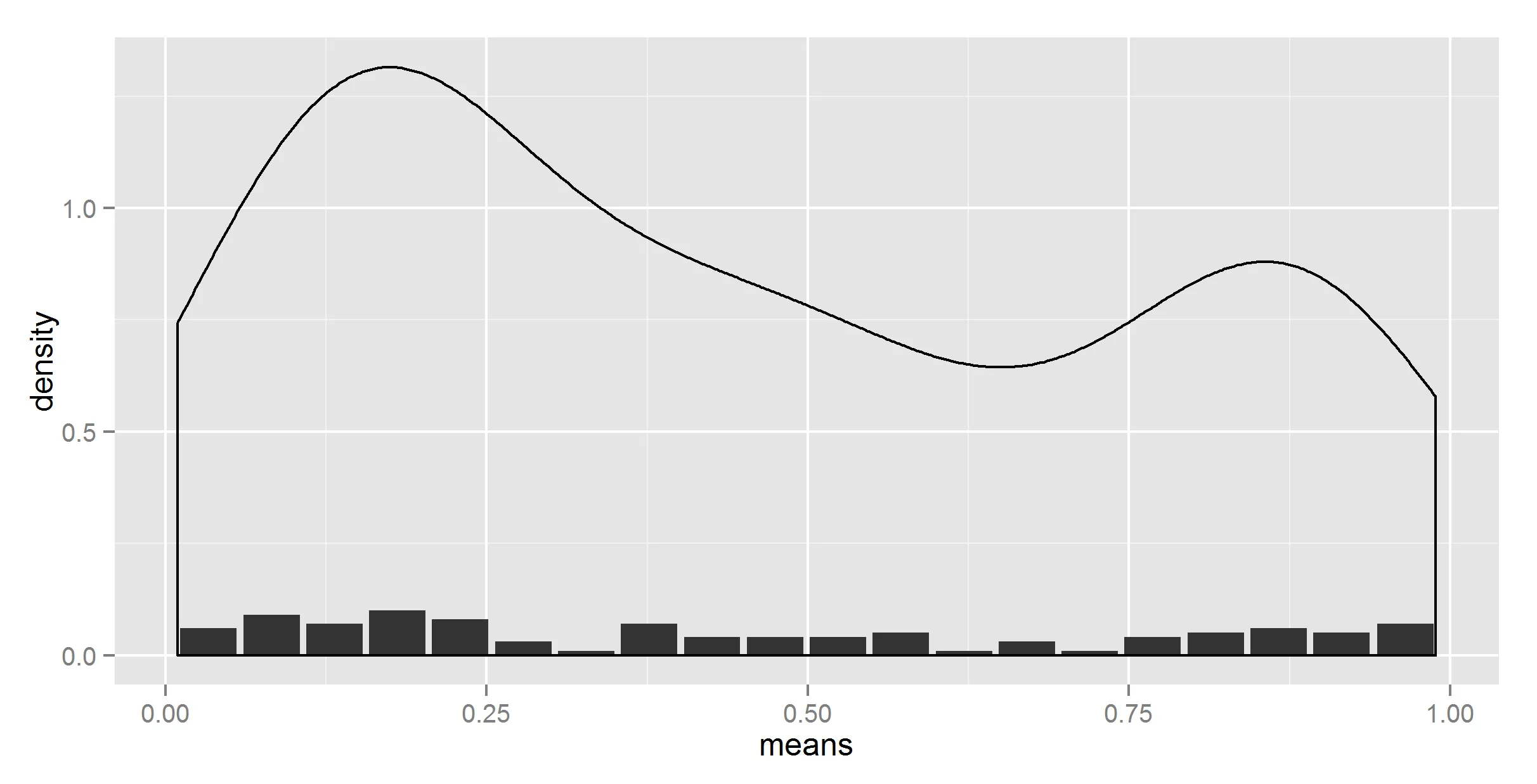
#removing the hardcoding?
divisor = nrow(t_df)
ggplot(t_df, aes(means, density)) +
  geom_bar(stat = "identity") +
  geom_density(data=t, aes(r, y = ..density../divisor), stat = 'density')

Error in eval(expr, envir, enclos) : object 'divisor' not found
好的,我几乎期望它能够正常工作。现在我尝试在这里和那里添加一些“..”,还有“..count..”和“..sum..”,第一个给出了另一个错误的结果,第二个抛出了一个错误。我还尝试使用乘法器(使用1/20),但没有成功。
#salvation with get()
divisor = nrow(t_df)
ggplot(t_df, aes(means, density)) +
  geom_bar(stat = "identity") +
  geom_density(data=t, aes(r, y = ..density../get("divisor", pos = 1)), stat = 'density')

所以,我终于得到了正确的数字(我想; 我希望)。
请告诉我有更简单的方法来做这件事。
附注: get() 技巧显然无法在函数内部使用。我本来想在此处放置一个可用的函数供将来使用,但那也不是那么容易。
runif数据下曲线下面积总和为1。你试图解决什么问题? - hrbrmstraes(y = ..density..)是错误的?你没有描述问题是什么。 - hadley