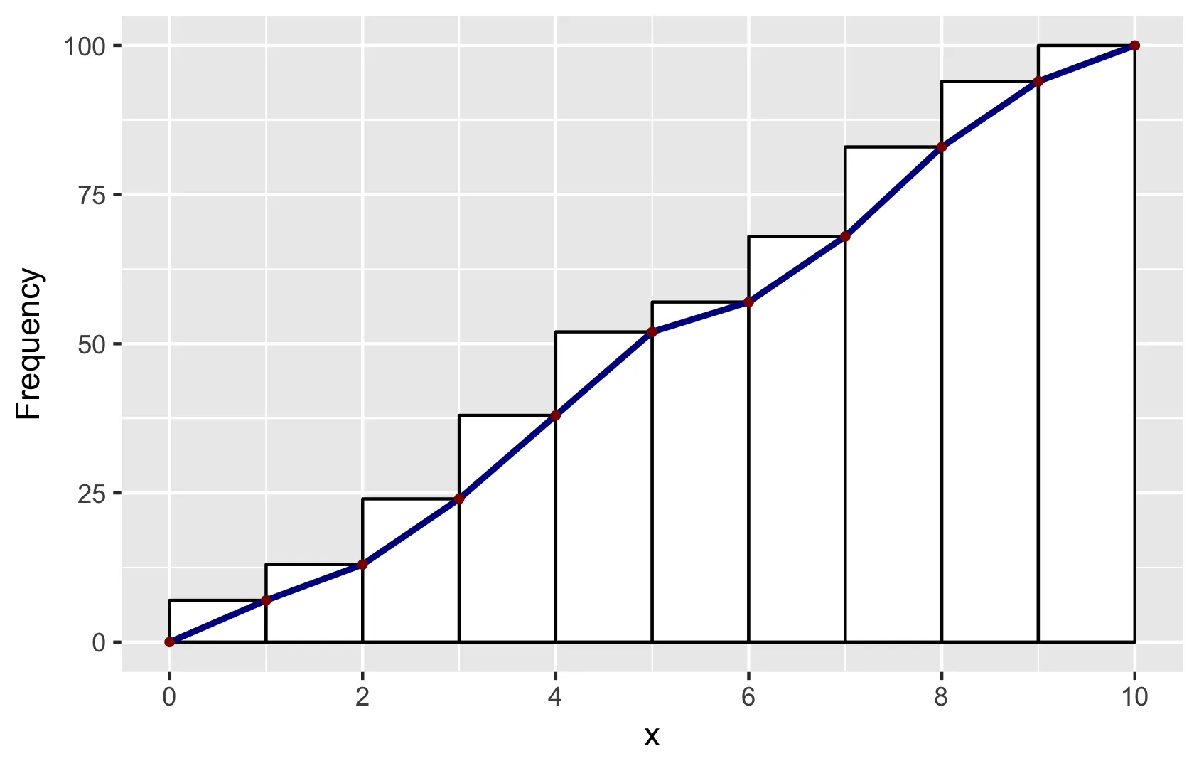
在Didzis的回答基础上,以下是一种将ggplot2(作者:hadley)数据转换为geom_line以重现base R hist外观的方法。
简要说明:为了使得柱状图与base R中的位置相同,我设置了binwidth=1和boundary=0。为了获得类似的外观,我使用了color=black和fill=white。为了获得相同的线段位置,我使用了ggplot_build。您会发现Didzis提供了其他使用此技巧的答案。
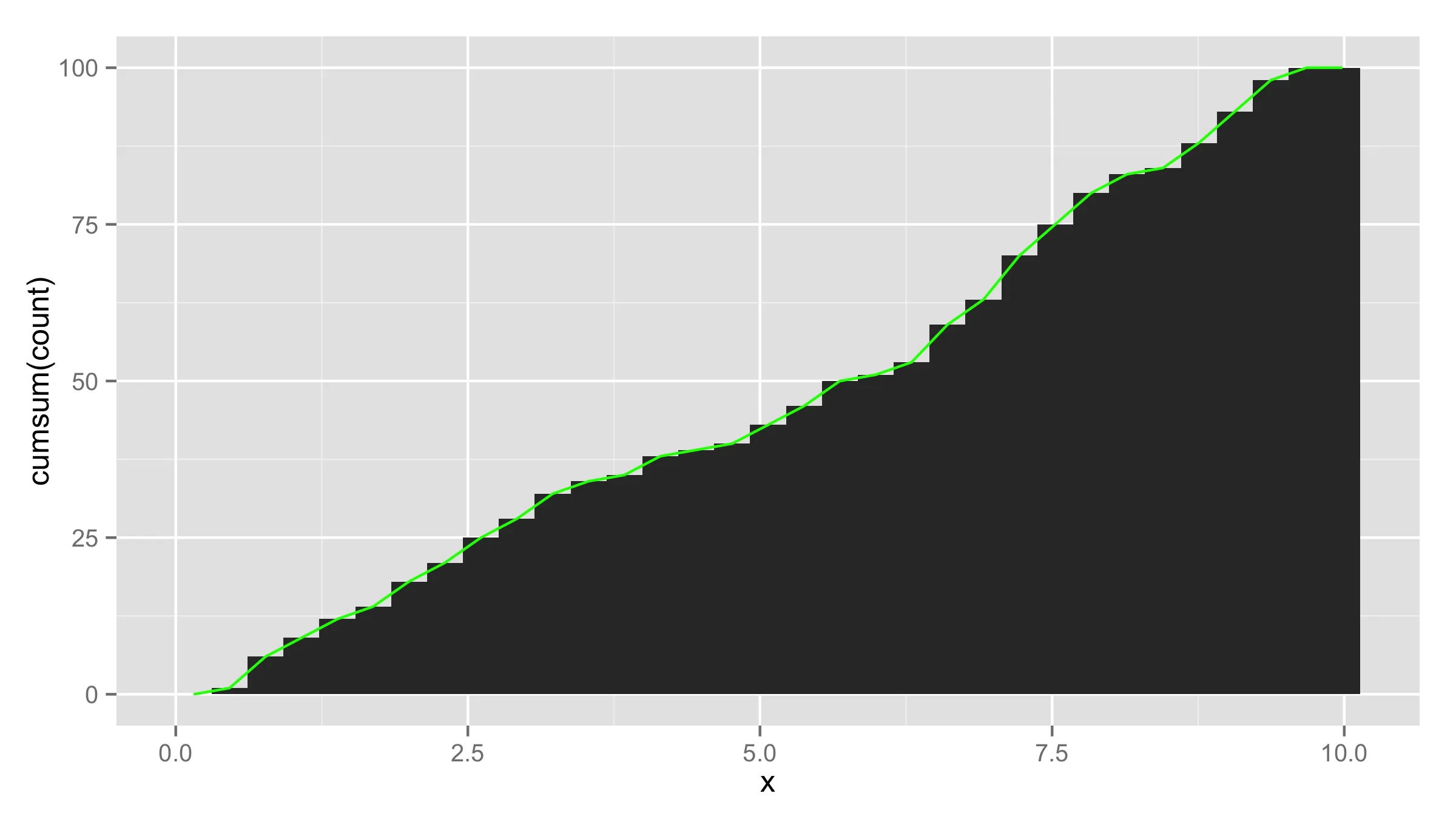
set.seed(1)
x = runif(100, 0, 10)
y = cumsum(x)
df <- data.frame(x = sort(x), y = y)
p <- ggplot(data = df, aes(x = x)) +
geom_histogram(aes(y = cumsum(..count..)), binwidth = 1, boundary = 0,
color = "black", fill = "white")
d <- ggplot_build(p)$data[[1]]
df2 <- data.frame(x = c(0, d$xmax), y = c(0, d$y))
p + geom_line(data = df2, aes(x = x, y = y),
color = "darkblue", size = 1) +
geom_point(data = df2, aes(x = x, y = y),
color = "darkred", size = 1) +
ylab("Frequency") +
scale_x_continuous(breaks = seq(0, 10, 2))
ggsave("ggplot-histogram-cumulative-2.png")
当然,可能有更简单的方法!事实上,ggplot对象还存储了x的另外两个值:最小值和最大值。因此,您可以使用此便捷函数制作其他多边形:
get_hist <- function(p, pos = 2) {
d <- ggplot_build(p)$data[[1]]
if (pos == 1) { x = d$xmin; y = d$y; }
if (pos == 2) { x = d$x; y = d$y; }
if (pos == 3) { x = c(0, d$xmax); y = c(0, d$y); }
data.frame(x = x, y = y)
}
df2 = get_hist(p, pos = 3)
theme_bw()或theme_classic()更接近。 - PatrickT