使用ggplot2绘制直方图的中心条

3

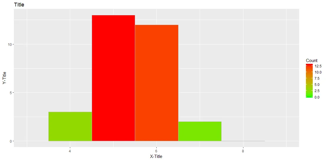
我正在尝试使用ggplot2包将条形图居中。这些条形图未对齐到相应值的中心,这可能会导致非专业读者的一些误解。我的图表如下所示:

enter image description here

为了生成图表,请使用下面的代码:
# Load data
Temp <- read.csv("http://pastebin.com/raw.php?i=mpFpjqJt", header = TRUE, stringsAsFactors=FALSE, sep = ";")
# Load package
library(ggplot2)
# Plot histogram using ggplot2
ggplot(data=Temp, aes(Temp$Score)) + 
geom_histogram(breaks=seq(0, 8, by =1), col="grey", aes(fill=..count..), binwidth = 1, origin = -0.5) 
+ scale_fill_gradient("Count", low = "green", high = "red") 
+ labs(title="Title") 
+ labs(x="X-Title", y="Y-Title") 
+ xlim(c(3,9))

我该如何将每个条形图居中到相应的x值? 编辑2017-05-29 由于下载链接可能会在未来失效,因此以下是由dput()返回的数据。
Temp <- structure(list(ID = 1:30, Score = c(6L, 6L, 6L, 5L, 5L, 5L, 6L, 
5L, 5L, 5L, 4L, 7L, 4L, 6L, 6L, 6L, 6L, 6L, 5L, 5L, 7L, 5L, 6L, 
5L, 5L, 5L, 4L, 6L, 6L, 5L)), .Names = c("ID", "Score"), class = "data.frame", 
row.names = c(NA, -30L))

你的分数是数字吗? - MLavoie
是的,没错。得分值只是数字,你可以在这里看到:http://pastebin.com/mpFpjqJt - schlomm
没有数据很难进行测试,但是尝试使用ggplot(data=Temp, aes(as.factor(Score)))... - MLavoie
2
如果分数只能取几个值,并且您想要每个值对应一个条形图,那么使用条形图可能比直方图更合适。 - Cath
1
@CathG:你说得对。范围只在1到7之间,因此条形图也可能是一个合适的方法。 - schlomm
2个回答

7

只需删除breaks参数,该参数与binwidthorigin参数冲突/重复:

# Load data
Temp <- read.csv("http://pastebin.com/raw.php?i=mpFpjqJt", header = TRUE, stringsAsFactors=FALSE, sep = ";")
# Load package
library(ggplot2)
# Plot histrogram using ggplo2
ggplot(data=Temp, aes(Temp$Score)) + 
  geom_histogram(col="grey", aes(fill=..count..), binwidth = 1, origin = -0.5) + 
  scale_fill_gradient("Count", low = "green", high = "red") + 
  labs(title="Title") + 
  labs(x="X-Title", y="Y-Title") + 
  xlim(c(3,9))

太好了 - 谢谢!这正是我在寻找的 :) - schlomm
1
ggplot2(v3.3.3)中,可以使用centerboundary代替origin(正如另一个答案所述)。 - GegznaV

7

Michael Kuhn在2015年12月的回答现在会返回一个警告:

origin已经被弃用,请使用boundary代替。

根据ggplot2版本2.1.0的发布说明

现在可以指定一个bin的boundary(即左侧或右侧的位置)或中心。origin已被弃用,推荐使用这些参数。

因此,在使用ggplot2的2.1.0及以上版本时,建议使用boundary参数中的任意一个

library(ggplot2)   # CRAN version 2.2.1 used
ggplot(data=Temp, aes(Score, fill = ..count..)) + 
  geom_histogram(col = "grey", binwidth = 1, boundary = 0.5) +
  scale_fill_gradient("Count", low = "green", high = "red") +
  labs(title = "Title") +
  labs(x = "X-Title", y = "Y-Title") +
  xlim(c(3, 9))

或者`center`参数。
...
geom_histogram(col = "grey", binwidth = 1, center = 0) +
...

结果是相同的: enter image description here 顺便说一下:我已经修复了原始代码中的一个小错误,即在 ggplot(data=Temp, aes(Temp$Score)) 中使用了 Temp$Score 而不是 ggplot(data = Temp, aes(Score))
数据
由于下载链接可能在将来失效,因此以下是通过 dput() 返回的数据:
Temp <- structure(list(ID = 1:30, Score = c(6L, 6L, 6L, 5L, 5L, 5L, 6L, 
5L, 5L, 5L, 4L, 7L, 4L, 6L, 6L, 6L, 6L, 6L, 5L, 5L, 7L, 5L, 6L, 
5L, 5L, 5L, 4L, 6L, 6L, 5L)), .Names = c("ID", "Score"), class = "data.frame", 
row.names = c(NA, -30L))

网页内容由stack overflow 提供, 点击上面的
可以查看英文原文,
原文链接