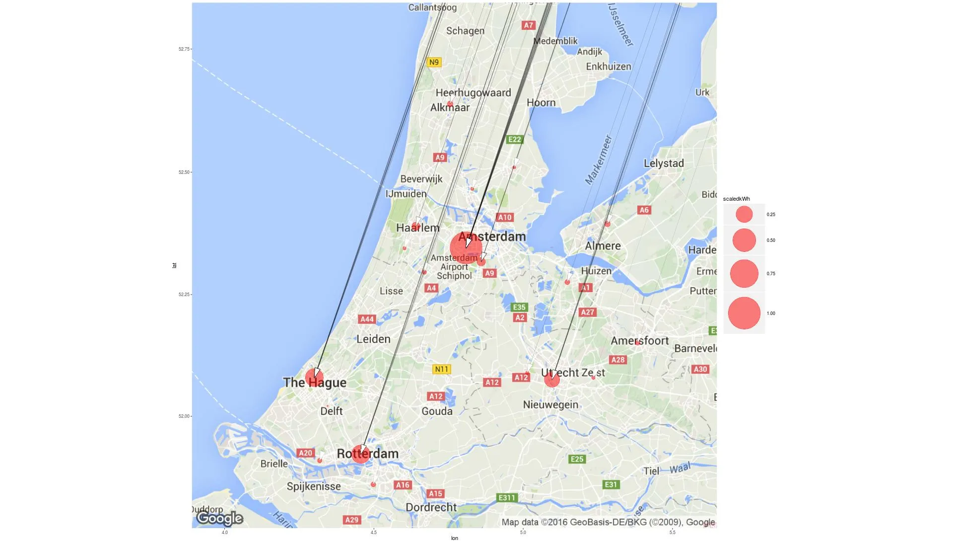
我希望制作一张荷兰地图,标注城市之间的弯曲线路。我有两个数据框,第一个名为
现在我只需要用ggmap替换ggplot()。
df_verticles,其中包含24个城市及其纬度/经度组合。第二个数据框名为df,我想使用它来绘制从组合的纬度/经度到另一个组合的弯曲线路。> head(df_vertices)
city AmountSessions totalkWh AmountRFID scaledAmount scaledkWh Latitude Longitude
1 Alkmaar 13608 104554.68 1326 0.07139012 0.026941910 52.63903 4.755538
2 Almere 11281 100841.42 930 0.05006999 0.025985067 52.39447 5.282043
3 Amersfoort 7719 67663.30 1198 0.06449876 0.017435647 52.15108 5.383069
4 Amstelveen 25794 236437.93 2616 0.14084204 0.060925915 52.31724 4.859266
5 Amsterdam 402365 3880744.86 18574 1.00000000 1.000000000 52.34560 4.808834
> head(df)
CityChargeSessions NextCity Amount sumkWh scaledAmount scaledkWh Latitude_from Longitude_from Latitude_to Longitude_to
1 Amsterdam Alkmaar 1058 8133.736 0.18438480 0.15480933 52.34560 4.808834 52.63903 4.755538
2 Amsterdam Almere 998 7254.133 0.17392820 0.13806786 52.34560 4.808834 52.39447 5.282043
3 Amsterdam Amersfoort 566 4977.404 0.09864064 0.09473489 52.34560 4.808834 52.15108 5.383069
4 Amsterdam Amstelveen 3724 24210.289 0.64900662 0.46079423 52.34560 4.808834 52.31724 4.859266
5 Almere Amsterdam 1034 8685.526 0.18020216 0.16531155 52.39447 5.282043 52.34560 4.808834
6 Amersfoort Amsterdam 579 4936.823 0.10090624 0.09396251 52.15108 5.383069 52.34560 4.808834
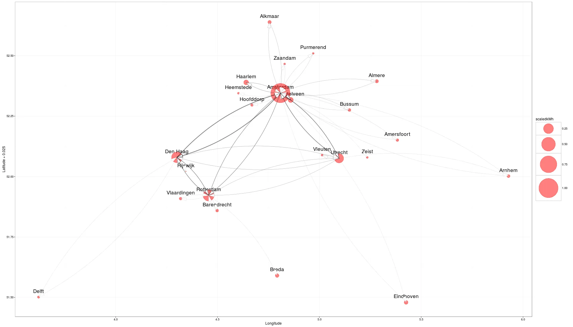
通常情况下,ggmap只是ggplot的底层,因此我决定首先在ggplot中绘制所需的图形:
ggplot_curve<- ggplot()+
geom_text(data=df_vertices, aes(x = Longitude, y = Latitude+0.025, label = df_vertices$city), size=6)+
geom_point(aes(x = Longitude, y = Latitude, size=scaledkWh), colour="red", data = df_vertices, alpha =0.5)+
scale_size_continuous(range=c(1,30))+
geom_curve(data=df, aes(x=Longitude_from, y=Latitude_from, xend=Longitude_to, yend=Latitude_to),
                    arrow=arrow(angle=15,ends="first",length=unit(0.7,"cm"),type="closed"), size= df$scaledAmount,alpha=0.5, curvature = 0.15)+
theme_bw()
现在我只需要用ggmap替换ggplot()。
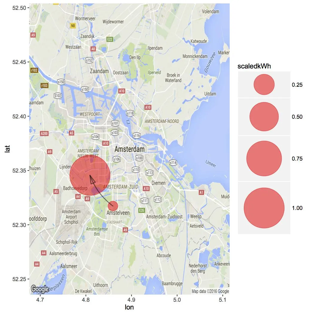
ggmap_with_curve<- ggmap(map)+
geom_point(aes(x = Longitude, y = Latitude, size=scaledkWh), colour="red", data = df_vertices, alpha =0.5)+
scale_size_continuous(range=c(1,30))+
 geom_curve(data=df, aes(x=Longitude_from, y=Latitude_from, xend=Longitude_to, yend=Latitude_to),
         arrow=arrow(angle=15,ends="first",length=unit(0.7,"cm"),type="closed"), size= df$scaledAmount,alpha=0.5, curvature = 0.15)
正如您所见,这不是我希望看到的输出结果,R 给了我这个错误信息:
geom_curve 对于非线性坐标未实现。
我尝试通过谷歌搜索解决它,但我自己无法解决。
所以我的问题是,如何获得具有所需地图作为底层的 ggplot 输出。 有人能帮帮我吗?