在R中绘制小时曲线

4

我是一名R语言的初学者,希望能得到您的帮助。

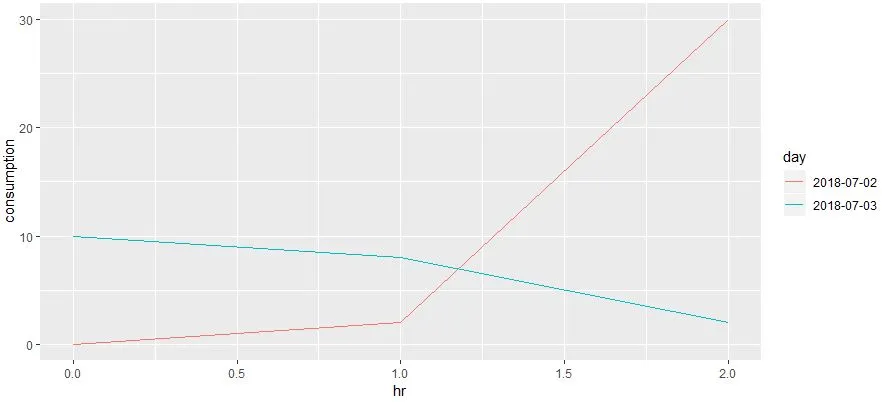
任务: 我想制作一张代表一天中每小时用水需求的图表。这个图表由不同日期的几条曲线组成(例如,请参见链接here)。

我将每天的数据分成了子列表:

    > head(aaa)
    [[1]]
                   by60min  consumption
    1  2018-07-01 00:05:00            0
    2  2018-07-01 01:05:00            0
    3  2018-07-01 02:05:00            0
    4  2018-07-01 03:05:00            0
    ....
    [[2]]
                   by60min  consumption
    25 2018-07-02 00:05:00            0
    26 2018-07-02 01:05:00            0
    27 2018-07-02 02:05:00            0
    28 2018-07-02 03:05:00            0

有时候,没有水的消耗量,我想避免将这些天数绘制到图表中。但是在这里,我卡住了。我不知道该怎么做。我的想法是删除所有使用量为零的日期,然后绘制非零日期,但我无法做到。是否有任何想法如何实现它(绘制非零日期和/或如何从列表中删除子列表)?

非常感谢您的帮助。

Luboš

附加:

# 1st step - tibble:
    aaa <- as.tibble(aaa)
    aaa
# A tibble: 1,487 x 2
    by60min             consumption
    <fct>                     <dbl>
    1 2018-07-01 00:05:00         0
    2 2018-07-01 01:05:00         0
    3 2018-07-01 02:05:00         0
    4 2018-07-01 03:05:00         0
    5 2018-07-01 04:05:00         0
    6 2018-07-01 05:05:00         0
    7 2018-07-01 06:05:00         0
    8 2018-07-01 07:05:00     0.101
    9 2018-07-01 08:05:00     0.167
   10 2018-07-01 09:05:00     0.267
   # ... with 1,477 more rows
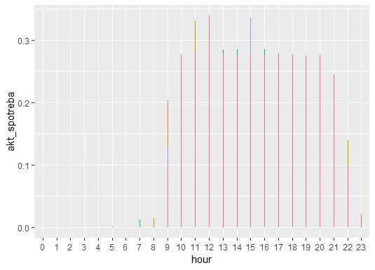
# 2nd step - plot:
    aaa %>%
      mutate(day = factor(day(ymd_hms(by60min))),
             hour = factor(hour(ymd_hms(by60min)))) %>%
      group_by(day) %>%
      filter(sum(consumption) > 0) %>%
      ggplot(mapping = aes(x = hour, y = consumption, 
                           col = day, 
                           show.legend = FALSE)) +
      geom_line(show.legend = FALSE)

# OUTPUT (the picture below) - bar graph instead of line chart - why?
# please NOTE that akt_spotreba == consumption 

enter image description here

dput(aaa) # I inserted only first three rows
structure(list(by60min = structure(c(1L, 2L, 3L, 4L, 5L, 6L, 
7L, 8L, 9L, 10L, 11L, 12L, 13L, 14L, 15L, 16L, 17L, 18L, 19L, 
20L, 21L, 22L, 23L, 24L, 25L, 26L, 27L, 28L, 29L, 30L, 31L, 32L, 

1
你好Lubos,欢迎来到SO。你能提供一个最小化、可重现的例子吗? - markus
我不明白你想要的确切图表类型。在链接中,你有一个图表,显示从0到24小时的时间和每个月的一条线。这些线是每小时的平均值吗? - Rui Barradas
1个回答

3

以下是使用tidyverse的简单示例数据集来处理你提供的内容的方法。

l1 = data.frame(by60min = c("2018-07-01 00:05:00","2018-07-01 01:05:00","2018-07-01 02:05:00"),
                consumption = 0)

l2 = data.frame(by60min = c("2018-07-02 00:05:00","2018-07-02 01:05:00","2018-07-02 02:05:00"),
                consumption = c(0,2,30))

l3 = data.frame(by60min = c("2018-07-03 00:05:00","2018-07-03 01:05:00","2018-07-03 02:05:00"),
                consumption = c(10,8,2))

l = list(l1,l2,l3)

您的原始数据如下:
[[1]]
by60min consumption
1 2018-07-01 00:05:00           0
2 2018-07-01 01:05:00           0
3 2018-07-01 02:05:00           0

[[2]]
by60min consumption
1 2018-07-02 00:05:00           0
2 2018-07-02 01:05:00           2
3 2018-07-02 02:05:00          30

[[3]]
by60min consumption
1 2018-07-03 00:05:00          10
2 2018-07-03 01:05:00           8
3 2018-07-03 02:05:00           2
library(tidyverse)
library(lubridate)

map_df(l, data.frame) %>%                         # combine list element to one dataframe
  mutate(day = factor(date(ymd_hms(by60min))),    # get day from date
         hr = hour(ymd_hms(by60min))) %>%         # get hour from date
  group_by(day) %>%                               # for each day
  filter(sum(consumption) > 0) %>%                # calculate sum of consumption and remove days where this is 0
  ungroup() %>%
  ggplot(aes(hr, consumption, col=day))+          # plot lines
  geom_line()

输出图表:

enter image description here


哇,我印象深刻!它能够正常工作,结果完全符合我的期望。非常感谢你,AntoniosK! - haraslub
Antonio,我想再次向您求助。在您为我提供解决方案之后,如果您使用tibble而不是列表来处理数据,您的代码会有什么不同?非常感谢您的帮助! - haraslub
解决方案应该是相似的,因为第一个命令将这些列表创建为数据框。 - AntoniosK
aaamist_data2是什么?没有数据我无法运行你的代码。 - AntoniosK
你能在数据的前20行上使用dput()并发布输出吗?我需要能够使用与你完全相同的数据格式。 - AntoniosK
显示剩余5条评论

网页内容由stack overflow 提供, 点击上面的
可以查看英文原文,
原文链接