每组归一化y轴的计数图

62

我在想是否可以创建一个Seaborn计数图,但是在y轴上显示其组内相对频率(百分比),而不是实际计数,这个组是由hue参数指定的。

我使用了以下方法来解决这个问题,但我无法想象这是最简单的方法:

# Plot percentage of occupation per income class
grouped = df.groupby(['income'], sort=False)
occupation_counts = grouped['occupation'].value_counts(normalize=True, sort=False)

occupation_data = [
    {'occupation': occupation, 'income': income, 'percentage': percentage*100} for 
    (income, occupation), percentage in dict(occupation_counts).items()
]

df_occupation = pd.DataFrame(occupation_data)

p = sns.barplot(x="occupation", y="percentage", hue="income", data=df_occupation)
_ = plt.setp(p.get_xticklabels(), rotation=90)  # Rotate labels

结果:

Percentage plot with seaborn

我正在使用UCI机器学习库中广为人知的成人数据集。Pandas dataframe 的创建方式如下:

# Read the adult dataset
df = pd.read_csv(
    "data/adult.data",
    engine='c',
    lineterminator='\n',

    names=['age', 'workclass', 'fnlwgt', 'education', 'education_num',
           'marital_status', 'occupation', 'relationship', 'race', 'sex',
           'capital_gain', 'capital_loss', 'hours_per_week',
           'native_country', 'income'],
    header=None,
    skipinitialspace=True,
    na_values="?"
)

这个问题有点相关,但没有使用hue参数。而在我的情况下,我不能仅仅改变y轴上的标签,因为条形的高度必须取决于组。


1
你介意分享一个 http://stackoverflow.com/help/mcve 的数据吗? - Stefan
没问题!我已经添加了链接和一些示例代码。 - Lucas van Dijk
我必须像你一样做同样的事情,最终也是通过相同的方法来实现我想要的目标(获取计数,创建新数据框,以柱状图输出)。因此,如果有更好的方法来完成这个任务,我仍然很感兴趣。 - spacetyper
现在,使用Dexplot,可以直接实现任意变量的归一化。请参见我的回答 - Ted Petrou
Googlers:按照James Arnold的回答中所示,使用statcommon_norm参数。 - trianta2
7个回答

43

使用更新版本的seaborn,您可以执行以下操作:

import numpy as np
import pandas as pd
import seaborn as sns
sns.set(color_codes=True)

df = sns.load_dataset('titanic')
df.head()

x,y = 'class', 'survived'

(df
.groupby(x)[y]
.value_counts(normalize=True)
.mul(100)
.rename('percent')
.reset_index()
.pipe((sns.catplot,'data'), x=x,y='percent',hue=y,kind='bar'))


输出

输入图像描述

更新:在条形图上方也显示百分比

如果您还想要百分比,可以执行以下操作:

import numpy as np
import pandas as pd
import seaborn as sns

df = sns.load_dataset('titanic')
df.head()

x,y = 'class', 'survived'

df1 = df.groupby(x)[y].value_counts(normalize=True)
df1 = df1.mul(100)
df1 = df1.rename('percent').reset_index()

g = sns.catplot(x=x,y='percent',hue=y,kind='bar',data=df1)
g.ax.set_ylim(0,100)

for p in g.ax.patches:
    txt = str(p.get_height().round(2)) + '%'
    txt_x = p.get_x() 
    txt_y = p.get_height()
    g.ax.text(txt_x,txt_y,txt)

在此输入图片描述


30

您可以通过设置以下属性使用sns.histplot来完成此操作:

  • stat = 'density'(这将使y轴成为密度而不是计数)
  • common_norm = False(这将独立地对每个密度进行归一化)

请参见下面的简单示例:

import numpy as np
import pandas as pd
import seaborn as sns
df = sns.load_dataset('titanic')

ax = sns.histplot(x = df['class'], hue=df['survived'], multiple="dodge", 
                  stat = 'density', shrink = 0.8, common_norm=False)

输出


2
OP,我知道这是一个老问题,但你能接受这个答案(或@Sergio B.的答案)吗?这是正确的、最新的答案。 - Itamar Mushkin
如何将百分比添加到这个程序中? - abdelgha4
3
@abdelgha4 - 使用 stat="percent"。请参考@Sergio B.的回答 - airalcorn2

28
我可以帮您进行翻译。以下是需要翻译的内容:

我可能有些困惑。你的输出结果与另一个输出结果之间的区别在哪里?

occupation_counts = (df.groupby(['income'])['occupation']
                     .value_counts(normalize=True)
                     .rename('percentage')
                     .mul(100)
                     .reset_index()
                     .sort_values('occupation'))
p = sns.barplot(x="occupation", y="percentage", hue="income", data=occupation_counts)
_ = plt.setp(p.get_xticklabels(), rotation=90)  # Rotate labels

我认为这只是列的顺序问题。

enter image description here

看起来你很在意这个,因为你传递了sort=False。但是,在你的代码中,顺序仅由机会决定(而且在Python 3.5中,字典迭代的顺序甚至每次运行都会改变)。


9
您可以使用Dexplot库进行计数以及对任何变量进行归一化处理,以获取相对频率。
count函数传递您想要计数的变量名称,它会自动产生所有唯一值的计数条形图。使用split将计数按另一个变量细分。请注意,Dexplot会自动换行x轴刻度标签。
dxp.count('occupation', data=df, split='income')

enter image description here

使用 normalize 参数对任何变量(或变量组合的列表)进行标准化计数。您也可以使用 True 对计数总和进行标准化。

dxp.count('occupation', data=df, split='income', normalize='income')

enter image description here


7

让我感到惊讶的是,Seaborn在此方面并未提供开箱即用的功能。

不过,很容易调整源代码以获得所需。以下代码使用函数“percentageplot(x,hue,data)”,与sns.countplot一样工作,但对每个组进行规范化(即将每个绿色条形图的值除以所有绿色条形图的总和)

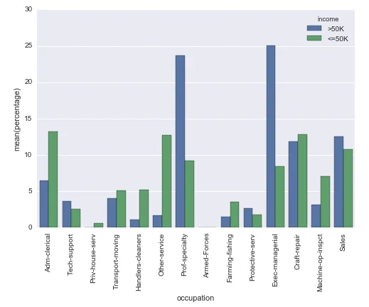
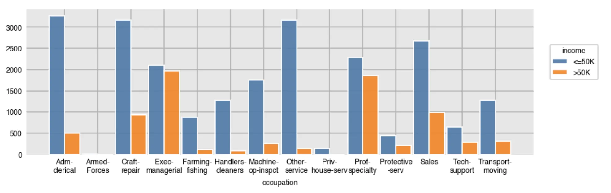
实际上,它将这个(因为苹果 vs 安卓的不同N而难以解释):

sns.countplot

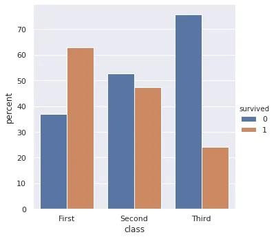
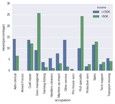
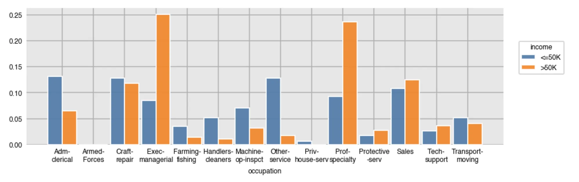
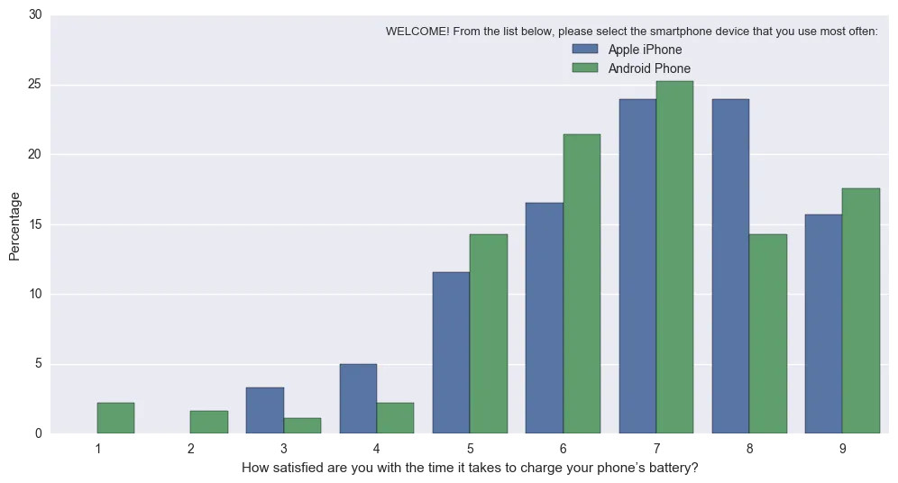
转换成这个(规范化,使得条形图反映了Apple和安卓的总比例):

Percentageplot

希望这有所帮助!

from seaborn.categorical import _CategoricalPlotter, remove_na
import matplotlib as mpl

class _CategoricalStatPlotter(_CategoricalPlotter):

    @property
    def nested_width(self):
        """A float with the width of plot elements when hue nesting is used."""
        return self.width / len(self.hue_names)

    def estimate_statistic(self, estimator, ci, n_boot):

        if self.hue_names is None:
            statistic = []
            confint = []
        else:
            statistic = [[] for _ in self.plot_data]
            confint = [[] for _ in self.plot_data]

        for i, group_data in enumerate(self.plot_data):
            # Option 1: we have a single layer of grouping
            # --------------------------------------------

            if self.plot_hues is None:

                if self.plot_units is None:
                    stat_data = remove_na(group_data)
                    unit_data = None
                else:
                    unit_data = self.plot_units[i]
                    have = pd.notnull(np.c_[group_data, unit_data]).all(axis=1)
                    stat_data = group_data[have]
                    unit_data = unit_data[have]

                # Estimate a statistic from the vector of data
                if not stat_data.size:
                    statistic.append(np.nan)
                else:
                    statistic.append(estimator(stat_data, len(np.concatenate(self.plot_data))))

                # Get a confidence interval for this estimate
                if ci is not None:

                    if stat_data.size < 2:
                        confint.append([np.nan, np.nan])
                        continue

                    boots = bootstrap(stat_data, func=estimator,
                                      n_boot=n_boot,
                                      units=unit_data)
                    confint.append(utils.ci(boots, ci))

            # Option 2: we are grouping by a hue layer
            # ----------------------------------------

            else:
                for j, hue_level in enumerate(self.hue_names):
                    if not self.plot_hues[i].size:
                        statistic[i].append(np.nan)
                        if ci is not None:
                            confint[i].append((np.nan, np.nan))
                        continue

                    hue_mask = self.plot_hues[i] == hue_level
                    group_total_n = (np.concatenate(self.plot_hues) == hue_level).sum()
                    if self.plot_units is None:
                        stat_data = remove_na(group_data[hue_mask])
                        unit_data = None
                    else:
                        group_units = self.plot_units[i]
                        have = pd.notnull(
                            np.c_[group_data, group_units]
                            ).all(axis=1)
                        stat_data = group_data[hue_mask & have]
                        unit_data = group_units[hue_mask & have]

                    # Estimate a statistic from the vector of data
                    if not stat_data.size:
                        statistic[i].append(np.nan)
                    else:
                        statistic[i].append(estimator(stat_data, group_total_n))

                    # Get a confidence interval for this estimate
                    if ci is not None:

                        if stat_data.size < 2:
                            confint[i].append([np.nan, np.nan])
                            continue

                        boots = bootstrap(stat_data, func=estimator,
                                          n_boot=n_boot,
                                          units=unit_data)
                        confint[i].append(utils.ci(boots, ci))

        # Save the resulting values for plotting
        self.statistic = np.array(statistic)
        self.confint = np.array(confint)

        # Rename the value label to reflect the estimation
        if self.value_label is not None:
            self.value_label = "{}({})".format(estimator.__name__,
                                               self.value_label)

    def draw_confints(self, ax, at_group, confint, colors,
                      errwidth=None, capsize=None, **kws):

        if errwidth is not None:
            kws.setdefault("lw", errwidth)
        else:
            kws.setdefault("lw", mpl.rcParams["lines.linewidth"] * 1.8)

        for at, (ci_low, ci_high), color in zip(at_group,
                                                confint,
                                                colors):
            if self.orient == "v":
                ax.plot([at, at], [ci_low, ci_high], color=color, **kws)
                if capsize is not None:
                    ax.plot([at - capsize / 2, at + capsize / 2],
                            [ci_low, ci_low], color=color, **kws)
                    ax.plot([at - capsize / 2, at + capsize / 2],
                            [ci_high, ci_high], color=color, **kws)
            else:
                ax.plot([ci_low, ci_high], [at, at], color=color, **kws)
                if capsize is not None:
                    ax.plot([ci_low, ci_low],
                            [at - capsize / 2, at + capsize / 2],
                            color=color, **kws)
                    ax.plot([ci_high, ci_high],
                            [at - capsize / 2, at + capsize / 2],
                            color=color, **kws)

class _BarPlotter(_CategoricalStatPlotter):
    """Show point estimates and confidence intervals with bars."""

    def __init__(self, x, y, hue, data, order, hue_order,
                 estimator, ci, n_boot, units,
                 orient, color, palette, saturation, errcolor, errwidth=None,
                 capsize=None):
        """Initialize the plotter."""
        self.establish_variables(x, y, hue, data, orient,
                                 order, hue_order, units)
        self.establish_colors(color, palette, saturation)
        self.estimate_statistic(estimator, ci, n_boot)

        self.errcolor = errcolor
        self.errwidth = errwidth
        self.capsize = capsize

    def draw_bars(self, ax, kws):
        """Draw the bars onto `ax`."""
        # Get the right matplotlib function depending on the orientation
        barfunc = ax.bar if self.orient == "v" else ax.barh
        barpos = np.arange(len(self.statistic))

        if self.plot_hues is None:

            # Draw the bars
            barfunc(barpos, self.statistic, self.width,
                    color=self.colors, align="center", **kws)

            # Draw the confidence intervals
            errcolors = [self.errcolor] * len(barpos)
            self.draw_confints(ax,
                               barpos,
                               self.confint,
                               errcolors,
                               self.errwidth,
                               self.capsize)

        else:

            for j, hue_level in enumerate(self.hue_names):

                # Draw the bars
                offpos = barpos + self.hue_offsets[j]
                barfunc(offpos, self.statistic[:, j], self.nested_width,
                        color=self.colors[j], align="center",
                        label=hue_level, **kws)

                # Draw the confidence intervals
                if self.confint.size:
                    confint = self.confint[:, j]
                    errcolors = [self.errcolor] * len(offpos)
                    self.draw_confints(ax,
                                       offpos,
                                       confint,
                                       errcolors,
                                       self.errwidth,
                                       self.capsize)

    def plot(self, ax, bar_kws):
        """Make the plot."""
        self.draw_bars(ax, bar_kws)
        self.annotate_axes(ax)
        if self.orient == "h":
            ax.invert_yaxis()

def percentageplot(x=None, y=None, hue=None, data=None, order=None, hue_order=None,
              orient=None, color=None, palette=None, saturation=.75,
              ax=None, **kwargs):

    # Estimator calculates required statistic (proportion)        
    estimator = lambda x, y: (float(len(x))/y)*100 
    ci = None
    n_boot = 0
    units = None
    errcolor = None

    if x is None and y is not None:
        orient = "h"
        x = y
    elif y is None and x is not None:
        orient = "v"
        y = x
    elif x is not None and y is not None:
        raise TypeError("Cannot pass values for both `x` and `y`")
    else:
        raise TypeError("Must pass values for either `x` or `y`")

    plotter = _BarPlotter(x, y, hue, data, order, hue_order,
                          estimator, ci, n_boot, units,
                          orient, color, palette, saturation,
                          errcolor)

    plotter.value_label = "Percentage"

    if ax is None:
        ax = plt.gca()

    plotter.plot(ax, kwargs)
    return ax

1
首先 - 这非常令人印象深刻!其次 - 我尝试运行它,但出现了“Dodge”错误...357 """当使用hue嵌套时,图形的中心位置列表。""" 358 n_levels = len(self.hue_names)--> 359 if self.dodge: 360 each_width = self.width / n_levels 361 offsets = np.linspace(0, self.width - each_width, n_levels)AttributeError:“_BarPlotter”对象没有属性“dodge”在Seaborn文档中: dodge:bool 当使用hue嵌套时是否应将元素沿分类轴移动。 - Paul
我正在使用Hue Order(可能是原因),因为我有色调的年龄组,并希望它们按升序排列。 Seaborn Dodge文档:https://seaborn.pydata.org/generated/seaborn.boxplot.html - Paul
这是一个错误信息的截图...我将尝试在你的答案中添加“dodge”。 https://ibb.co/m1Wp06 - Paul
1
看起来在我修改这段代码之后,“Dodge”参数被添加了。以下是Seaborn网站上关于添加该参数的描述。https://seaborn.pydata.org/whatsnew.html。我必须尽快查看这个。 - BirdLaw
谢谢您提供的参考。嗯,我道歉,您确实在当时回答了问题的范围。所以您肯定超出了正常的范围。 - Paul
显示剩余2条评论

6
你可以通过使用estimator关键字在Seaborn计数图中提供栏高度的估计值(沿y轴)。
ax = sns.barplot(x="x", y="x", data=df, estimator=lambda x: len(x) / len(df) * 100)

上面的代码片段来自https://github.com/mwaskom/seaborn/issues/1027
他们讨论了如何在计数图中提供百分比。此答案基于上述链接的相同主题。
在您具体问题的背景下,您可以尝试像这样做:
ax = sb.barplot(x='occupation', y='some_numeric_column', data=raw_data, estimator=lambda x: len(x) / len(raw_data) * 100, hue='income')
ax.set(ylabel="Percent")

上述代码对我起作用了(在另一个具有不同属性的数据集上)。请注意,您需要为y输入一些数字列,否则会出现错误:“ValueError:似乎没有数值变量< code > x 或< code > y 。”


2
这个答案中得知,“probability”效果最佳。
sns.histplot文档的“stat”参数中获取:
聚合统计量,用于计算每个条带中的数据。
- count:显示每个条带中的观察值数量 - frequency:显示每个条带中的观测值除以条带宽度后的值 - probability或proportion:标准化,使得条形图高度总和为1 - percent:标准化,使得条形图高度总和为100 - density:标准化,使得直方图的总面积等于1
import seaborn as sns
    
df = sns.load_dataset('titanic')
    
ax = sns.histplot(
   x = df['class'], 
   hue=df['survived'], 
   multiple="dodge",
   stat = 'probability',
   shrink = 0.5, 
   common_norm=False
)

网页内容由stack overflow 提供, 点击上面的
可以查看英文原文,
原文链接