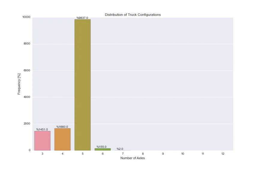
我有一个名为“AXLES”的 Pandas DataFrame 列,它可以取 3-12 之间的整数值。我正在尝试使用 Seaborn 的 countplot() 选项来实现以下绘图:
我还发现了注释的解决方法,但我不确定是否是最佳实现。
任何帮助都将不胜感激!
谢谢
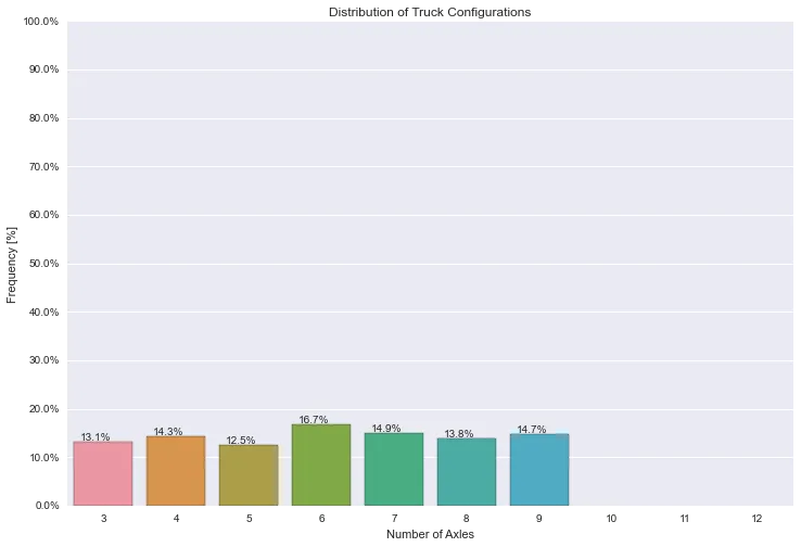
- 左 y 轴显示数据中出现这些值的频率。轴延伸范围为 [0%-100%],每 10% 标记一次。
- 右 y 轴显示实际计数,值对应于由左 y 轴确定的刻度标记(每 10% 标记一次)。
- x 轴显示条形图的类别 [3, 4, 5, 6, 7, 8, 9, 10, 11, 12]。
- 在条形上方的注释显示该类别的实际百分比。
df.AXLES.value_counts()/len(df.index) 获取频率,但我不确定如何将此信息插入 Seaborn 的 countplot()。我还发现了注释的解决方法,但我不确定是否是最佳实现。
任何帮助都将不胜感激!
谢谢
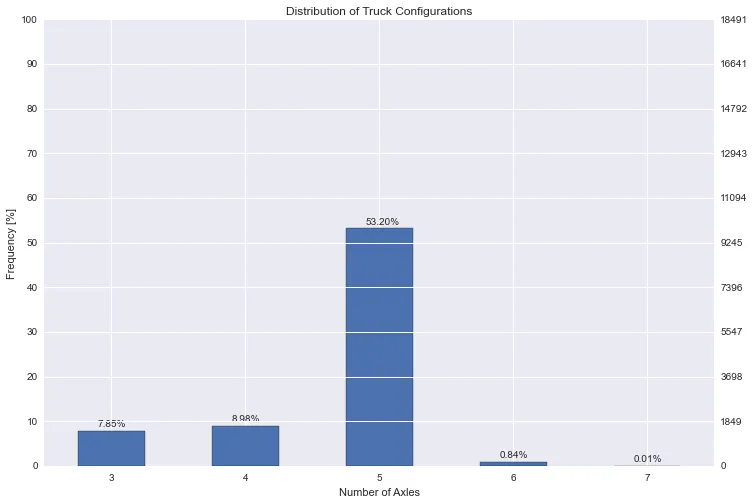
plt.figure(figsize=(12,8))
ax = sns.countplot(x="AXLES", data=dfWIM, order=[3,4,5,6,7,8,9,10,11,12])
plt.title('Distribution of Truck Configurations')
plt.xlabel('Number of Axles')
plt.ylabel('Frequency [%]')

for p in ax.patches:
        ax.annotate('%{:.1f}'.format(p.get_height()), (p.get_x()+0.1, p.get_height()+50))
编辑:
我使用Pandas的条形图代码更接近我所需的内容,放弃了Seaborn。感觉我在使用太多的变通方法,必须有更简单的方法来完成它。这种方法存在的问题:
- Pandas 的柱形图函数中没有像 Seaborn 的 countplot() 函数那样的
order关键字,所以我无法像在 countplot() 中那样绘制从 3 到 12 的所有类别。即使该类别中没有数据,我也需要将它们显示出来。 次要 y 轴会出现问题,导致条形图和注释混乱(请参见白色网格线覆盖的文本和条形)。
plt.figure(figsize=(12,8))
plt.title('货车配置分布')
plt.xlabel('轴数')
plt.ylabel('频率 [%]')

ax = (dfWIM.AXLES.value_counts()/len(df)*100).sort_index().plot(kind="bar", rot=0)
ax.set_yticks(np.arange(0, 110, 10))

ax2 = ax.twinx()
ax2.set_yticks(np.arange(0, 110, 10)*len(df)/100)

for p in ax.patches:
    ax.annotate('{:.2f}%'.format(p.get_height()), (p.get_x()+0.15, p.get_height()+1))
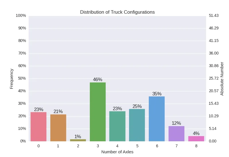
vals = ax.get_yticks()和ax.set_yticks(vals/len(df))实现。然而,一旦这么做了,由于图形的实际 y 轴比例,所有标签最终会在接近原点的底部。显然我的方法是错误的。你会怎么做呢? - marillion