我正在处理 titanic.csv 文件,并试图绘制一些图表。但是遇到了一个问题,如何重新组织x轴,以便将相同的pclass值放在一起。
我的当前代码:
titanic.groupby(['Sex', 'Pclass'])['Survived'].mean().plot(kind='bar', color=my_colors)
生成如下图表:
我想把同一班级的男女并排放置以显示生存率的差异。您有什么建议吗?
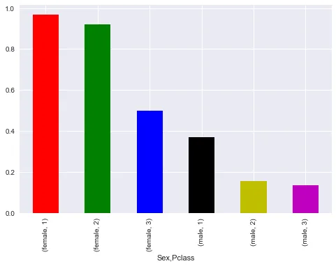
我正在处理 titanic.csv 文件,并试图绘制一些图表。但是遇到了一个问题,如何重新组织x轴,以便将相同的pclass值放在一起。
我的当前代码:
titanic.groupby(['Sex', 'Pclass'])['Survived'].mean().plot(kind='bar', color=my_colors)
生成如下图表:
我想把同一班级的男女并排放置以显示生存率的差异。您有什么建议吗?
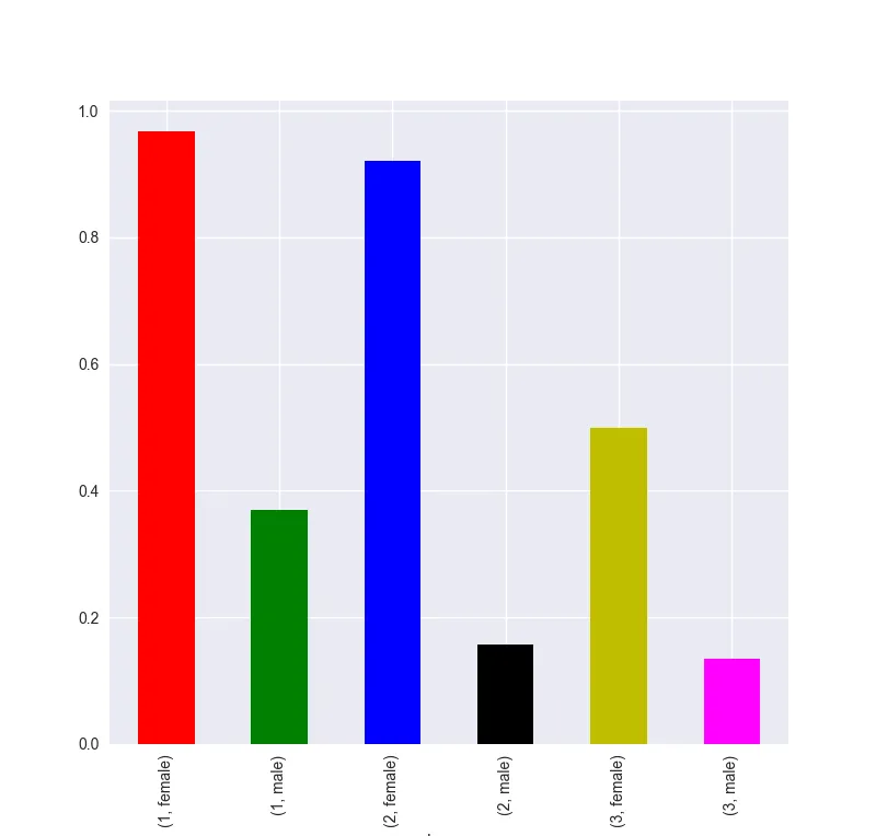
只需要在groupby中更改列的顺序:
import pandas as pd
import seaborn as sns
import matplotlib.pylab as plt

titanic = sns.load_dataset("titanic")

my_colors = ['r','g','b','k','y','magenta']
titanic.groupby(['pclass', 'sex'])['survived'].mean().plot(kind='bar', color=my_colors)
plt.show()
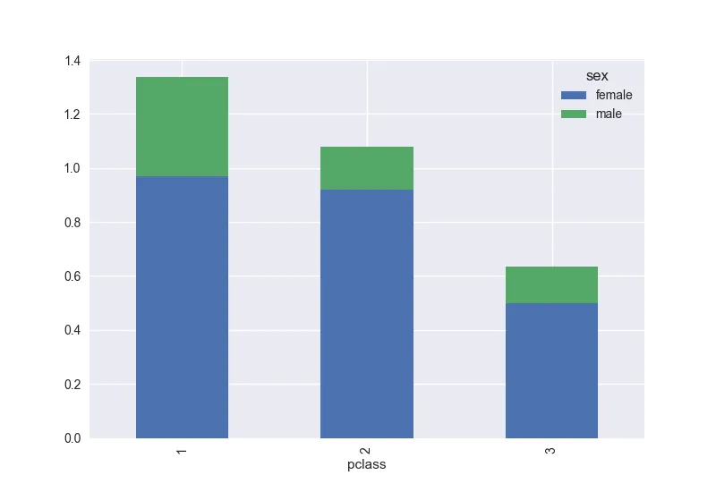
或者您可以堆叠这些条形图:
titanic.groupby(['pclass', 'sex'])['survived'].mean().unstack('sex').plot(kind='bar', stacked=True)
为什么要使用mean而不是count?该如何理解这两个术语的区别?
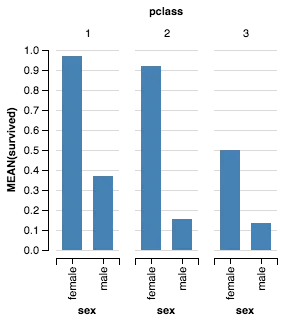
在编程方面,Altair非常方便。以下是三个不同的一行代码,可以生成这个数据集的三个不同可视化效果。
import seaborn as sns
titanic = sns.load_dataset("titanic")

from altair import *
Chart(titanic).mark_bar().encode(x='pclass:O', y='mean(survived)', column='sex').configure_cell(width=200, height=200)

Chart(titanic).mark_bar().encode(x='sex:N', y='mean(survived):Q',  column='pclass:O').configure_facet_cell(
        strokeWidth=0.0).configure_cell(width=200, height=200)
Chart(titanic).mark_bar().encode(x='pclass:O', y='mean(survived):Q', color='sex:O').configure_cell(width=200, height=200)