Pandas 分组绘图 多级索引 按顶层分组

4

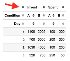
我正在努力制作一个我想要的pandas多级索引分组图。 我有以下虚拟的pandas数据框:

data = {
    'Day': [1, 1, 2, 2, 3, 3, 4, 2, 4],
    'Condition': ['A', 'B', 'A', 'A', 'A', 'B', 'B', 'B', 'A'],
    'Invest': [1100, 2002, 500, 200, 1030, 4000, 750, 5000, 320],
    'Spent': [100, 200, 100, 100, 100, 200, 50, 300, 250]
}

index = range(len(data['Day']))

columns = ['Day', 'Condition', 'Invest', 'Spent']

df = pd.DataFrame(data, index=index, columns=columns)

+----+-------+-------------+----------+---------+
|    |   Day | Condition   |   Invest |   Spent |
|----+-------+-------------+----------+---------|
|  0 |     1 | A           |     1100 |     100 |
|  1 |     1 | B           |     2002 |     200 |
|  2 |     2 | A           |      500 |     100 |
|  3 |     2 | A           |      200 |     100 |
|  4 |     3 | A           |     1030 |     100 |
|  5 |     3 | B           |     4000 |     200 |
|  6 |     4 | B           |      750 |      50 |
|  7 |     2 | B           |     5000 |     300 |
|  8 |     4 | A           |      320 |     250 |
+----+-------+-------------+----------+---------+

我可以使用以下代码获取后续的图表:
df.groupby(['Day', 'Condition']).sum()\
   .unstack()\
   .plot(subplots=True, 
    layout=(2,2),
    figsize=(8,6));

enter image description here

问题: 我希望将A和B的结果分组在一起。例如,顶部图表即(Invest, A)和(Invest, B)应该在一个图表中(同样的方式也适用于Spent)。因此,我只有2个子图而不是4个子图。我在stackoverflow上有很多示例,但仍然无法使其工作。一些人建议使用melt和seaborn,但仍未生效,我更愿意使用pandas。

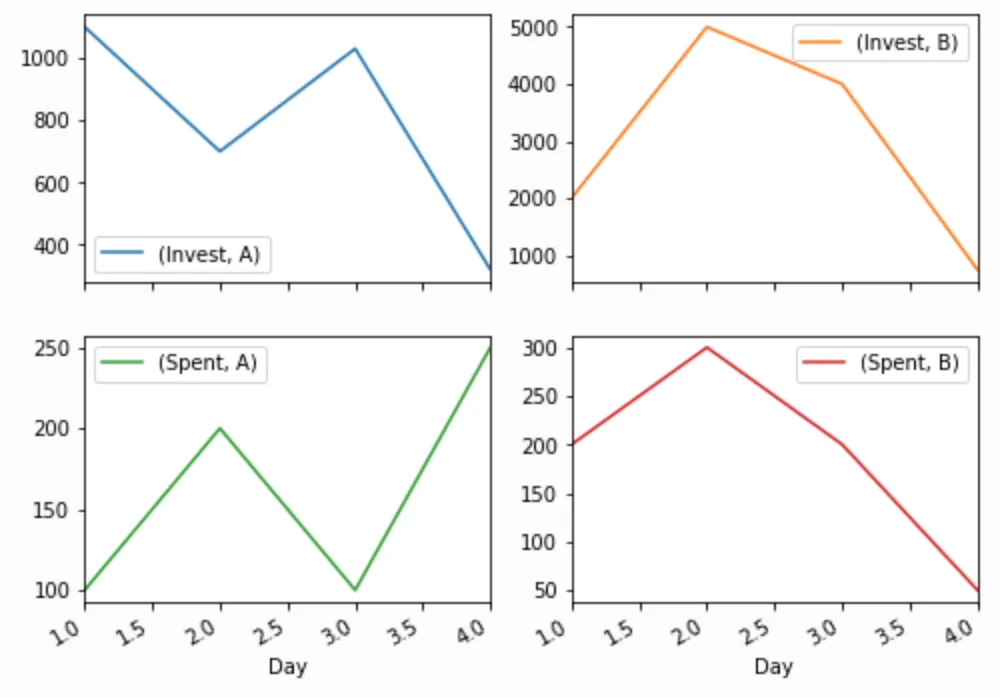
P.S.: "Top Level"是什么意思?我不确定我是否在这里使用了正确的术语,但当我取消堆叠groupby pandas时,在MultiIndex中有各种级别,我的意思是根据如下所示的顶级别对图进行分组:

df.groupby(['Day', 'Condition'])\
   .sum()\
   .unstack()

enter image description here

2个回答

3
我会这样做:
df=df.groupby(['Day', 'Condition']).sum()\
       .unstack()

df["Invest"].plot(figsize=(8,6), title="Invest")
df["Spent"].plot(figsize=(8,6), title="Spent")

plt.show()


谢谢。它像魔法一样运行。我希望我能找到另一种方法,而不必明确给出列名。到目前为止,你的方法就是有效的。接受... - TwinPenguins

0

你可以很容易地将其分成两部分。

import matplotlib as plt
df1 = df.groupby(['Day', 'Condition']).sum().unstack()

print(df1)

          Invest       Spent     
Condition      A     B     A    B
Day                              
1           1100  2002   100  200
2            700  5000   200  300
3           1030  4000   100  200
4            320   750   250   50

筛选 df1 中的“Invest”并绘制图表。(抱歉,我不知道如何将 Jupyter 的图表输出复制到这里。)

df1.loc[:,('Invest', slice(None))].plot(subplots=True, 
    layout=(1,2),
    figsize=(10,4));

现在过滤 'Spent'

df1.loc[:,('Spent', slice(None))].plot(subplots=True, 
    layout=(1,2),
    figsize=(10,4));

网页内容由stack overflow 提供, 点击上面的
可以查看英文原文,
原文链接