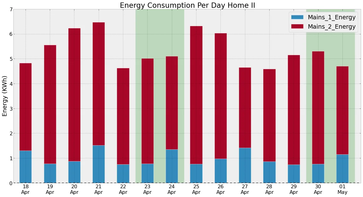
我创建了一个看起来像这样的图表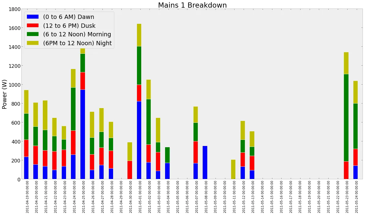
我有几个问题:
- 如何具体显示周末。我考虑的一些方法是获取对应于周末的索引,然后在xlims之间绘制透明条形图。也可以为此绘制矩形。如果可以在Pandas中简单地完成,那就最好了。
- 日期格式不太好看
以下是用于生成此图的代码
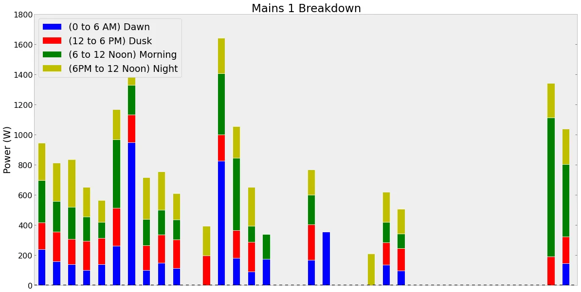
ax4=df4.plot(kind='bar',stacked=True,title='Mains 1 Breakdown');
ax4.set_ylabel('Power (W)');
idx_weekend=df4.index[df4.index.dayofweek>=5]
ax.bar(idx_weekend.to_datetime(),[1800 for x in range(10)])
ax.bar是专门用于突出周末的,但它不会产生任何可见的输出。(问题1)
对于问题2,我尝试使用Major Formatter和Locators,代码如下:
ax4=df4.plot(kind='bar',stacked=True,title='Mains 1 Breakdown');
ax4.set_ylabel('Power (W)');
formatter=matplotlib.dates.DateFormatter('%d-%b');
locator=matplotlib.dates.DayLocator(interval=1);
ax4.xaxis.set_major_formatter(formatter);
ax4.xaxis.set_major_locator(locator);
 了解DataFrame的外观可能会有所帮助。
In [122]:df4

Out[122]:
<class 'pandas.core.frame.DataFrame'>
DatetimeIndex: 36 entries, 2011-04-19 00:00:00 to 2011-05-24 00:00:00
Data columns:
(0 to 6 AM) Dawn          19  non-null values
(12 to 6 PM) Dusk         19  non-null values
(6 to 12 Noon) Morning    19  non-null values
(6PM to 12 Noon) Night    20  non-null values
dtypes: float64(4)