Seaborn绘图共享x轴

5

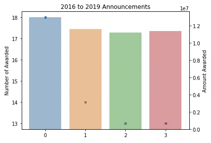
我想绘制数据框中的两列(一列作为条形图,另一列作为散点图)。我可以使用Matplotlib实现,但我想使用Seaborn。

以下是代码:

import matplotlib.pyplot as plt
import seaborn as sns
import pandas as pd

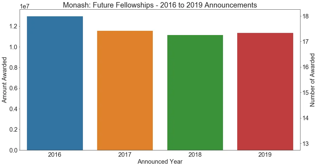
df = pd.DataFrame({'Announced Year': [2016, 2017, 2018, 2019],
              'Amount Awarded': [12978216, 11582629, 11178338, 11369267],
              'Number of Awarded': [18, 14, 13, 13]})

fig, ax1 = plt.subplots()

ax2 = ax1.twinx()

sns.scatterplot(x="Announced Year", y="Number of Awarded", data=df, ax=ax2)
sns.barplot(x="Announced Year", y="Amount Awarded", data=df, ax=ax1)

fig.tight_layout()  # otherwise the right y-label is slightly clipped

plt.title('2016 to 2019 Announcements')

This is the image I get, where I can't see the scatterplot


这个回答解决了你的问题吗?如何在Seaborn中叠加两个图形? - Mykola Zotko
不行。这正是我在代码中所做的,但不起作用。 - DCN
1
“散点图”是一种数值图,而“条形图”是一种“分类”图,因此很难将它们放在同一张图上。Matplotlib的“bar”和“scatter”都是数值型的,所以可以很好地工作。 - ImportanceOfBeingErnest
1个回答

4
您可以使用x=np.arange(0,len(df))而不是x="Announced Year"来绘制共享x轴的散点图
fig, ax1 = plt.subplots()

ax2 = ax1.twinx()

sns.barplot(x="Announced Year", y="Amount Awarded", data=df, ax=ax2, alpha=.5)
sns.scatterplot(x=np.arange(0,len(df)), y="Number of Awarded", data=df, ax=ax1)

fig.tight_layout()  # otherwise the right y-label is slightly clipped

plt.title('2016 to 2019 Announcements')

enter image description here


网页内容由stack overflow 提供, 点击上面的
可以查看英文原文,
原文链接