我有一个函数,它返回特定列的绘图。
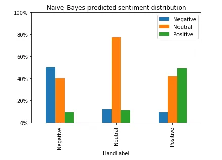
def class_distribution(colname):
    df = tweets_best.groupby(["HandLabel", colname]).size().to_frame("size")
    df['percentage'] = df.groupby(level=0).transform(lambda x: (x / x.sum()).round(2))
    df_toPlot = df[["percentage"]]

    plot = df_toPlot.unstack().plot.bar()
    plt.legend(df_toPlot.index.get_level_values(level = 1))
    plt.title("{} predicted sentiment distribution".format(colname))
    plt.ylim((0,1))
    plt.gca().yaxis.set_major_formatter(PercentFormatter(1))
    return plot.get_figure()
一个示例输出看起来像这样
nb = class_distribution("Naive_Bayes")
plt.figure()
plt.subplot(1,2,1)
nb
plt.subplot(1,2,2)
sn
我得到
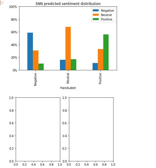
我肯定不会期望这种情况发生
提前感谢您的帮助!
plt.subplot(1,2,1) \n plt.bar(x,y)而是使用:plt.subplot(1,2,1) \n class_distribution(colname)- GKrochplt.subplot(2, 2, ...)。然后通过plt.subplot(2, 2, i)选择其中一个子图,其中i = (1, 2, 3, 4),然后绘制您想要绘制的内容。 - a_guestplt.subplot(1,2,i)代码的情况完全相同。 - GKroch