首先,是的一个类似的问题之前已经被问过了,但我仍然无法解决我的具体问题。
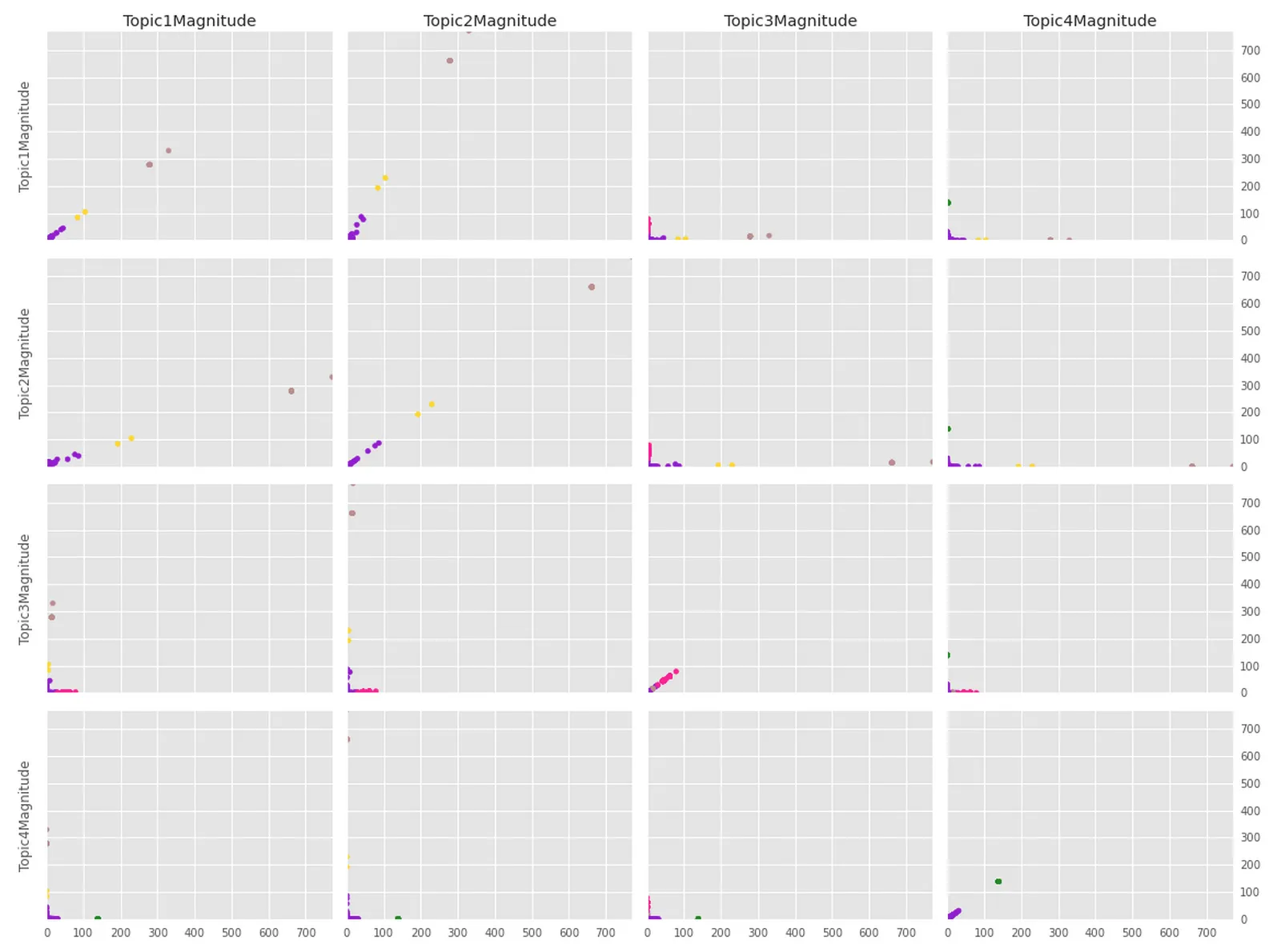
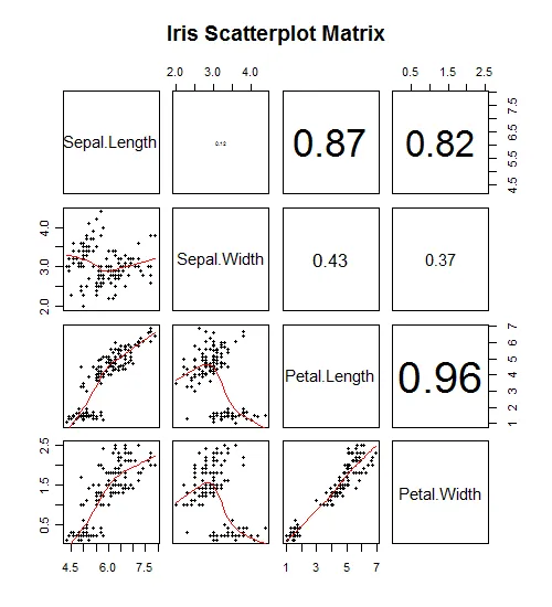
我有一个pandas数据框和一个标签列表,它们来自我对其执行的KMeans聚类操作。数据框是4维的,因此在绘图时不太友好,因此我一直在尝试开发一个函数,该函数将绘制一个N x N子图的图形,其中每个子图都是两个维度之间的投影(非常像相关图),由聚类标签着色。类似于这样的东西:有点(但不完全)像这样:
更重要的是,这是我的代码:
import pandas as pd
import numpy as np
import matplotlib, random
import matplotlib.pyplot as plt
def plot_clusters(data=None, labels=None, seed=500, size="m"):
    if data is None or labels is None:
        raise Exception('null data')
    elif not isinstance(data, (pd.DataFrame, np.ndarray)):
        raise Exception('data must be a dataframe or matrix')
    elif len(data) < 1:
        raise Exception('empty data')
    elif not all(isinstance(item, (int, np.int, np.int0, np.int8, np.int16, np.int32, np.int64)) for item in labels):
        raise Exception('labels must be list of ints')
    elif not isinstance(size, str) and not size.lower() in ['s','m','l']:
        raise Exception('size must be a string in the list: ["s","m","l"]')

    ## Copy data, get dims
    plt.style.use('ggplot')
    dat = np.copy(data if isinstance(data, np.ndarray) else data.as_matrix())
    dims = dat.shape[1]
    names = data.columns.values[:] if isinstance(data, pd.DataFrame) else ['dim'+str(i+1) for i in range(dims)]

    ## Get all the colors, create clusters based on the label
    all_colors = [(n,h) for n,h in matplotlib.colors.cnames.iteritems()]
    if not seed is None:
        random.seed(seed)
    random.shuffle(all_colors)
    colors = [all_colors[label][1] for label in labels] ## Get colors assigned by label factor levels

    ## Set up axes
    multi = 1 if size.lower() == 's' else 1.5 if size.lower() == 'm' else 2
    fig, axes = plt.subplots(figsize=reduce(lambda x,y: tuple([x*multi,y*multi]),(8,6)), nrows=dims, ncols=dims) ## Must be NxN

    ## Now loop
    idx_ct = 0
    columns = [[r[d] for r in dat] for d in range(dims)]
    y_min, y_max = np.min(dat), np.max(dat)
    for i in range(dims):
        for j in range(dims):
            axes[i,j].plot(x=np.array(columns[i]), y=np.array(columns[j]), color=colors)
            axes[i,j].set_ylim([y_min, y_max])
            axes[i,j].set_xlim([y_min, y_max])
            axes[i,j].margins(0)

            ## Set the labels on the y-axis
            if j == 0: ## Only the left-most col gets the label
                axes[i,j].set_ylabel(names[i])
            if j == dims-1:
                axes[i,j].get_yaxis().tick_right()
            else:
                axes[i,j].get_yaxis().set_ticklabels([])


            ## Set the labels on the X-axis
            if i == 0: ## Only the top-most row gets the label
                axes[i,j].set_title(names[j])
            if i < dims-1:
                axes[i,j].get_xaxis().set_ticklabels([])

            idx_ct += 1

    fig.tight_layout()
    plt.show()

## Plot the clusters
plot_clusters(data=topic_maps_n, labels=labels, size='l')
请注意,
data可以是pandas DataFrame或numpy矩阵,labels是一个与数据框长度相同的列表(仅由整数组成)。以下是data可能的示例:
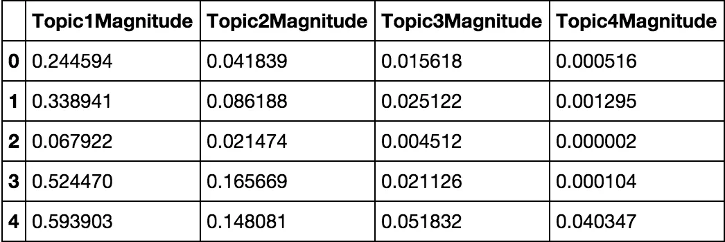
data = pandas.DataFrame.from_records(numpy.array([[2.44593742e-01, 4.18387124e-02, 1.56175780e-02, 5.15885742e-04],
             [3.38941458e-01, 8.61882075e-02, 2.51219235e-02, 1.29532576e-03],
             [6.79218190e-02, 2.14741500e-02, 4.51219203e-03, 1.53073947e-06],
             [5.24470045e-01, 1.65668947e-01, 2.11256296e-02, 1.03752391e-04],
             [5.93903485e-01, 1.48081357e-01, 5.18316207e-02, 4.03474064e-02]]),
             columns=['Topic1Magnitude','Topic2Magnitude','Topic3Magnitude','Topic4Magnitude'])
标签可以简单地(任意)为:
labels = [0,0,1,0,1]
如果有人能帮我找出我哪里错了,我会非常感激。