Matplotlib中x轴的间断问题

51

我想要实现的最佳方式是使用自己的图像:

enter image description here

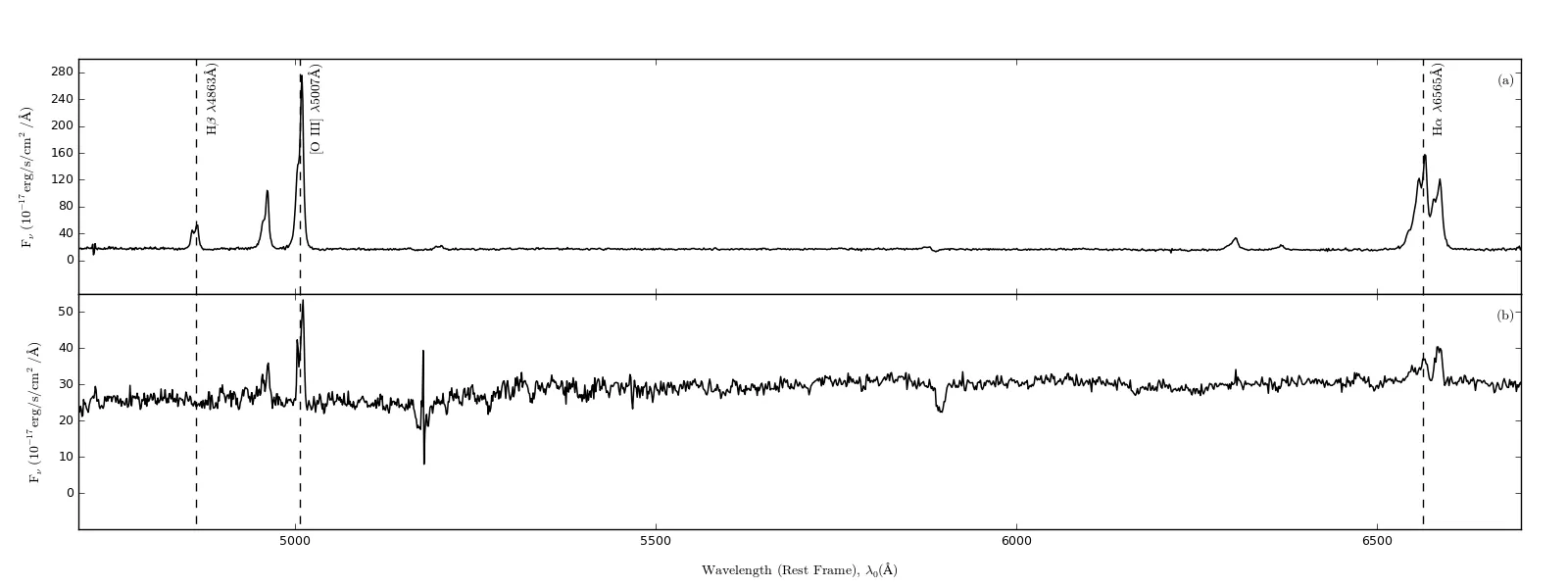
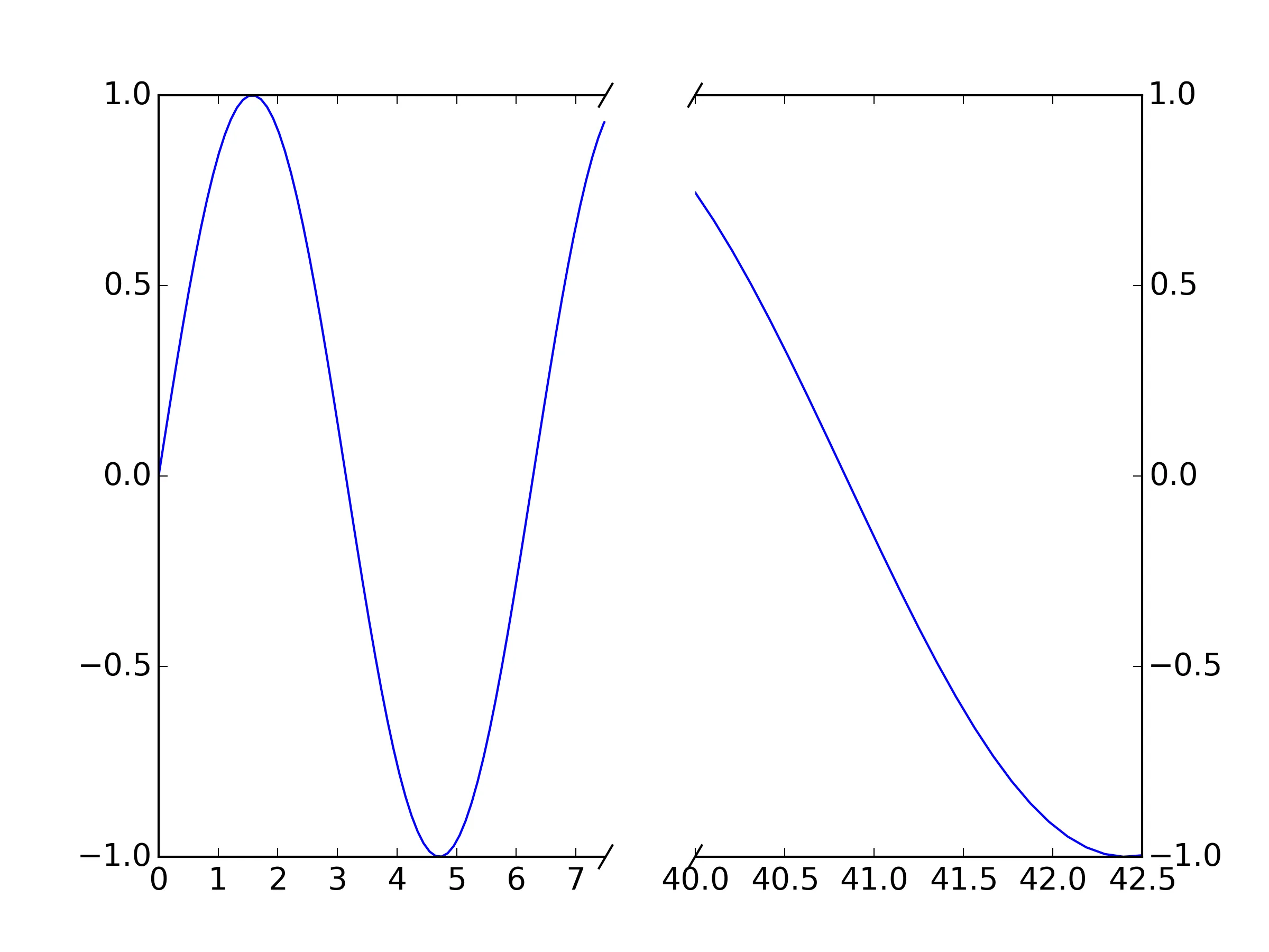
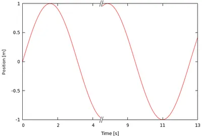
现在我的频谱图中有很多死空间,特别是在5200到6300之间。我的问题非常简单,如何添加一个漂亮的小断点,看起来类似于这个(图片来源于网络):

enter image description here

我正在使用以下设置进行绘图:

nullfmt = pyplot.NullFormatter()

fig = pyplot.figure(figsize=(16,6))

gridspec_layout1= gridspec.GridSpec(2,1)
gridspec_layout1.update(left=0.05, right=0.97, hspace=0, wspace=0.018)
pyplot_top      = fig.add_subplot(gridspec_layout1[0])
pyplot_bottom   = fig.add_subplot(gridspec_layout1[1])

pyplot_top.xaxis.set_major_formatter(nullfmt)

我相信使用gridpsec是可行的,但非常需要一份高级教程来详细介绍如何实现。

如果之前有任何关于gridSpec的处理方式的问题,我向您道歉,因为我已经广泛查找了,但还没有找到任何信息。

我已经成功地完成了这个过程,基本上就是这样:

enter image description here

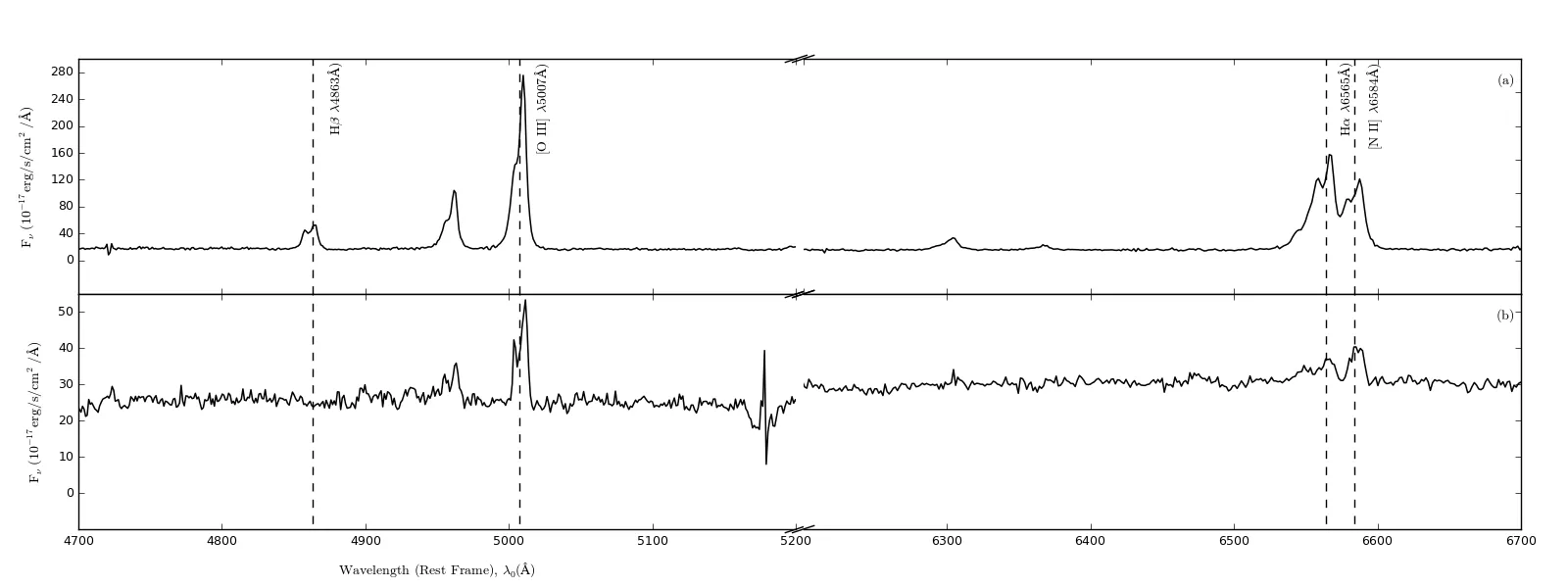
然而,我的断点线不够陡峭,我应该怎么改变它们呢?(我已经使用了下面的示例答案)


1
这个示例有帮助吗? - CT Zhu
这并不完全符合您的情况,但我在这里为Y轴实现了相同的功能:https://bitbucket.org/gehrmann/breakable_axes_subplot 您可以很容易地将其修改为X轴。 - Vladyslav Savchenko
2个回答

44
你可以直接参考 matplotlib 示例,来适应 x 轴的中断。
"""
Broken axis example, where the x-axis will have a portion cut out.
"""
import matplotlib.pylab as plt
import numpy as np


x = np.linspace(0,10,100)
x[75:] = np.linspace(40,42.5,25)

y = np.sin(x)

f, (ax, ax2) = plt.subplots(1, 2, sharey=True, facecolor='w')

# plot the same data on both axes
ax.plot(x, y)
ax2.plot(x, y)

ax.set_xlim(0, 7.5)
ax2.set_xlim(40, 42.5)

# hide the spines between ax and ax2
ax.spines['right'].set_visible(False)
ax2.spines['left'].set_visible(False)
ax.yaxis.tick_left()
ax.tick_params(labelright='off')
ax2.yaxis.tick_right()

# This looks pretty good, and was fairly painless, but you can get that
# cut-out diagonal lines look with just a bit more work. The important
# thing to know here is that in axes coordinates, which are always
# between 0-1, spine endpoints are at these locations (0, 0), (0, 1),
# (1, 0), and (1, 1).  Thus, we just need to put the diagonals in the
# appropriate corners of each of our axes, and so long as we use the
# right transform and disable clipping.

d = .015  # how big to make the diagonal lines in axes coordinates
# arguments to pass plot, just so we don't keep repeating them
kwargs = dict(transform=ax.transAxes, color='k', clip_on=False)
ax.plot((1-d, 1+d), (-d, +d), **kwargs)
ax.plot((1-d, 1+d), (1-d, 1+d), **kwargs)

kwargs.update(transform=ax2.transAxes)  # switch to the bottom axes
ax2.plot((-d, +d), (1-d, 1+d), **kwargs)
ax2.plot((-d, +d), (-d, +d), **kwargs)

# What's cool about this is that now if we vary the distance between
# ax and ax2 via f.subplots_adjust(hspace=...) or plt.subplot_tool(),
# the diagonal lines will move accordingly, and stay right at the tips
# of the spines they are 'breaking'

plt.show()

matplotlib broken x-axis example

针对您的需求,只需将数据绘制两次(一次在每个轴上,axax2),并适当设置xlim。 "断点线"应该移动以匹配新的断点,因为它们是以相对轴坐标而不是数据坐标绘制的。

断点线只是未剪切的绘图线条,绘制在一对点之间。例如,ax.plot((1-d, 1+d), (-d, +d), **kwargs)在第一个轴上绘制了点(1-d,-d)(1+d,+d)之间的断点线:这是右下角的一个。如果要更改渐变,请适当更改这些值。例如,要使其更陡峭,请尝试ax.plot((1-d/2, 1+d/2), (-d, +d), **kwargs)


1
断点线只是未修剪的绘图线条:请参见我的编辑。 - xnx
1
太好了 - 很高兴能帮到你! - xnx
1
这很棒,但如果我需要改变子图的宽度(通过将 gridspec_kw={'width_ratios': [1, 3]} 传递给 plt.subplots(...)),右侧图中对角线的角度会发生变化。有什么办法可以解决这个问题吗? - inkalchemist1994
1
@carla 是的,它代表“宽度空间”(而“hspace”是高度空间不是水平空间-很容易混淆) - Luismi98
1
@SamThomas,我不确定我理解那些拒绝你的编辑的评审人员的推理,但是"off"似乎仍然在最新稳定版本的Matplotlib中被接受,所以出于对那些使用早期版本的人们的考虑,我倾向于保留它,直到它失效为止。 - xnx
显示剩余6条评论

38

xnx提供的解决方案是一个不错的开始,但是存在一个问题,即两个图中x轴的比例尺不同。如果左图和右图的范围相同,则不会有问题,但如果它们不相等,subplot 仍将给出两个图相等的宽度,因此两个图之间的x轴刻度将不同(与xnx的示例一样)。我开发了一个包,brokenaxes 来解决这个问题。


3
谢谢!完美地运作了。 - arie64
3
太棒了! - Ami Tavory
1
有没有办法将brokenaxes作为插图添加到一个图形中? - user668074
@user668074 很好的问题。我认为将破碎的坐标轴作为插图是一个不寻常的用例,但应该是可行的。我没有尝试过这样做,但我认为你最好使用 GridSpec 来放置你的坐标轴,然后将 subplot_spec 传递给 brokenaxes - ben.dichter
2
在创建破碎轴时,使用despine=False解决了问题 :) (是的,在提问之前我应该先阅读文档!) - carla
显示剩余2条评论

网页内容由stack overflow 提供, 点击上面的
可以查看英文原文,
原文链接