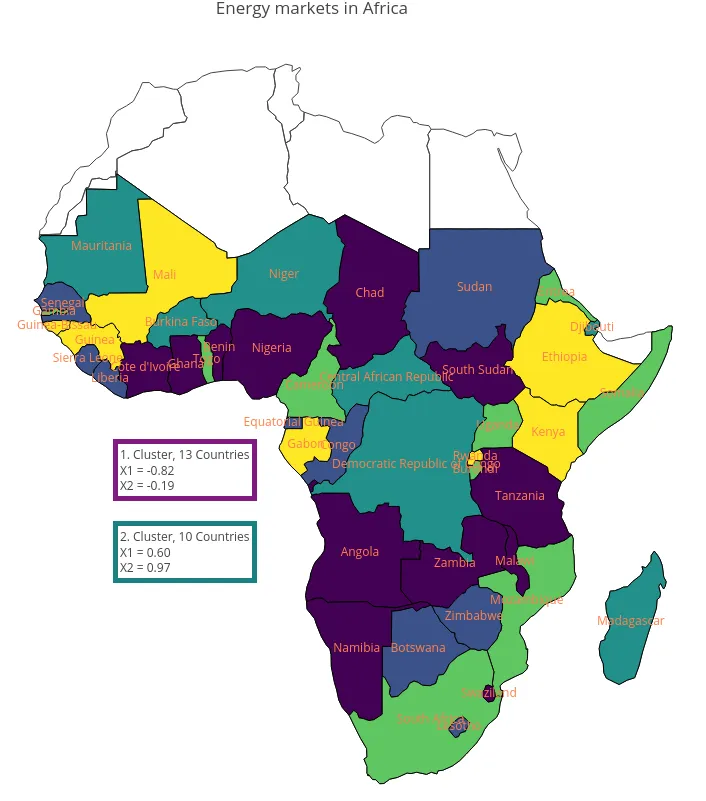
使用自定义图例并永久显示国家名称的区域地图

4
以下代码根据层次聚类(使用 hclust()cutree())创建了一个区域地图(Choropleth map):
library(plotly)
library(cluster)

hc <- hclust(dist(df), method = "complete")
df$member <- cutree(hc, 5)

cluster.means = (as.data.frame(aggregate(df[,-1], list(cluster= df$member), mean)))[,-4]

g = list(
  scope = 'africa',
  showframe = T,
  showland = T,
  landcolor = toRGB("white")
)

plot_ly(df, z = member, type = 'choropleth', locations = Country,
              locationmode = 'country names', text = Country, hoverinfo = "text") %>% 
        layout(geo = g, title = "Energy markets in Africa")

现在我想要更改两件事情:
  1. 永久显示国家名称,即不仅在RStudio中悬停在交互式图表上时才显示。我尝试应用这篇文章的答案到我的代码中,但没有成功。
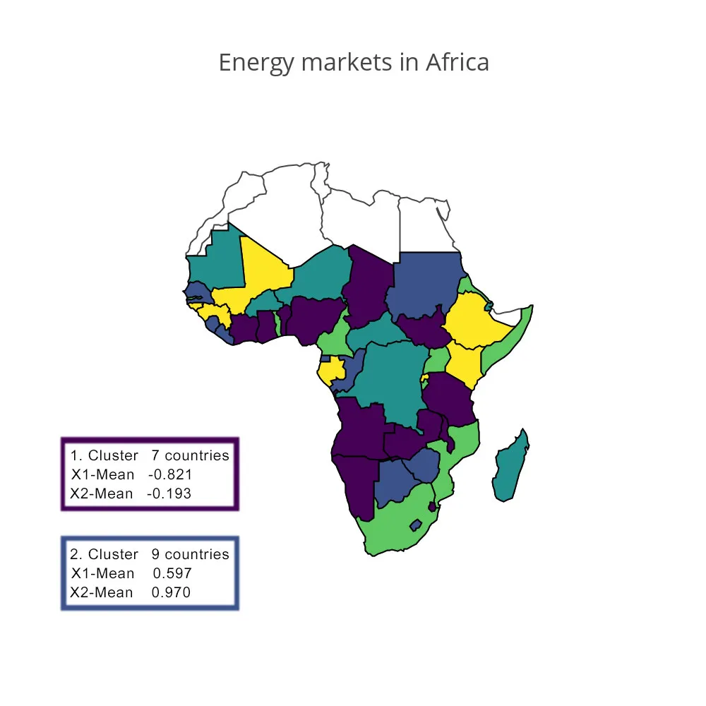
  2. 非连续比例尺。理想情况下,我希望完全没有比例尺,但是有5个盒子,每个盒子对应一个簇,具有以下三个特征: (1) 盒子的颜色应该与其在区域分布图中的颜色相对应 (2) 每个盒子应包含分配给它的国家数量,即相应的簇 (3) 每个盒子应包含两个变量(X1,X2)的相应簇均值,这些变量包含在cluster.means

我已经附上了一个这样的示例图,展示了我所想要的内容(它不必完全相同,只需传达思想即可)。

An exemplary choroplot containing only 2, instead of 5 boxes

任何帮助、建议、提示都会受到高度赞赏!

(缩放后)数据如下:

df <- structure(list(Country = structure(1:50, .Label = c("Angola", 
"Benin", "Botswana", "Burkina Faso", "Burundi", "Cabo Verde", 
"Cameroon", "Central African Republic", "Chad", "Comoros", "Congo", 
"Cote d'Ivoire", "Democratic Republic of Congo", "Djibouti", 
"Equatorial Guinea", "Eritrea", "Ethiopia", "Gabon", "Gambia", 
"Ghana", "Guinea", "Guinea-Bissau", "Kenya", "Lesotho", "Liberia", 
"Madagascar", "Malawi", "Mali", "Mauritania", "Mauritius", "Mozambique", 
"Namibia", "Niger", "Nigeria", "Reunion", "Rwanda", "Sao Tome and Principe", 
"Senegal", "Seychelles", "Sierra Leone", "Somalia", "South Africa", 
"South Sudan", "Sudan", "Swaziland", "Tanzania", "Togo", "Uganda", 
"Zambia", "Zimbabwe"), class = "factor"), X1 = c(-0.18, -1.03, 
0.6, 1.55, 0.22, 0.26, 0.76, 2.15, -1.43, 0.99, 1.79, -0.39, 
1.73, 1.57, 1.11, -0.09, -1.49, -0.46, -0.48, -1.22, -0.78, -1.46, 
-1.22, 0.35, 0.45, 1.29, -1.37, -0.61, 0.92, -1.3, 0.42, -1.18, 
1.4, -0.83, 0.06, -0.76, -0.19, -0.37, -0.63, 0.64, 0.93, 0.33, 
-0.76, -0.21, -0.59, -0.41, -0.74, 0.39, -1.1, 1.35), X2 = c(-0.22, 
-0.42, 0.72, -0.59, -1.27, 0.64, -1.35, -1.4, -0.35, -1.43, 1.07, 
-0.01, -0.51, 0.11, 1.14, -0.89, 0.77, 1.45, -1.67, -0.83, 0.71, 
0.92, 1.63, 1.68, 0.23, -0.18, 0.07, 0.8, -0.02, 0.82, -0.72, 
-0.41, -0.26, 0.02, -1.68, 1.67, 0.18, 0.98, 1.45, 0.31, -1.23, 
-1.38, -0.63, 1.41, -0.12, 0, -1.3, -1.64, 0.21, 1.52)), .Names = c("Country", 
"X1", "X2"), row.names = c(NA, -50L), class = "data.frame")
1个回答

5

"理想情况下,我希望完全没有比例尺": 通过在plot_ly()中添加参数showscale=F来实现。

"永久显示国家名称": 通过添加scattergeo绘图图层来实现,如此帖子所述,但有一个小区别。因为你的数据框包含国家名称列,而不是国家代码列,所以需要添加参数locationmode = 'country names'

p <- plot_ly(df, z = member, type = 'choropleth', 
             locations = Country, locationmode = 'country names', 
             text = Country, hoverinfo = "text", 
             showscale=F, inherit =F) %>% 
     layout(geo = g, title = "Energy markets in Africa") %>%
     add_trace(type="scattergeo",
             locationmode = 'country names', locations = Country, 
             text = Country, mode="text", 
             textfont = list(color=rgb(1,0.5,0.3),  size =12)) 

您需要尝试不同的色彩方案,以找到一个既可以有效显示聚类,又能使永久国家名称标签清晰可见的方案。当地图缩小时,永久性国家名称标签彼此重叠时,您可能无法做太多有用的事情。如果您额外努力,在每个标签上指定一个纬度-经度位置,而不是依赖于它们的默认位置,这可能有助于通过更好地分离标签来改善地图的外观。我假设您要求永久标签,只会在适当的缩放下使用地图。
为了添加您所描述的文本框,您可以使用注释布局(每个集群一个注释)。我在此展示如何添加具有紫色边框和第二个青绿色文本框。您需要根据最终使用的颜色方案进行调整。
box1 <- list(
  x = 0.3,
  y = 0.5,
  yanchor = "top",
  borderpad = 2,
  bordercolor = rgb(0.5,0.1,0.5),     # set this same as color of cluster 1
  borderwidth = 5,
  text = paste("1. Cluster,  ", 
               sum(df$member==1),     # number of countries in cluster
               " Countries<br>X1 = ", # use <br> for line breaks
               format(round(cluster.means[1,]$X1, 2), nsmall = 2), 
               "<br>X2 = ", 
               format(round(cluster.means[1,]$X2, 2), nsmall = 2)),
  align = "left",
  showarrow = F)

box2 <- list(
  x = 0.3,
  y = 0.4,
  yanchor = "top",
  borderpad = 2,
  bordercolor = rgb(0.1,0.5,0.5),
  borderwidth = 5,
  text = paste("2. Cluster,  ", 
               sum(df$member==2), 
               " Countries<br>X1 = ", 
               format(round(cluster.means[2,]$X1, 2), nsmall = 2), 
               "<br>X2 = ", 
               format(round(cluster.means[2,]$X2, 2), nsmall = 2)),
  align = "left",
  showarrow = F)

p %>% layout(annotations = list(box1, box2))

enter image description here


哇!太棒了,谢谢 :-) 我有一个问题:我正在添加其他的方框,并使每个方框的y-value比上面小0.1。最后我会像这样将它们全部连接起来 box = list(box1,box2,box3,box4,box5) 并将 box 分配给 annotations。但不幸的是,方框之间的距离不总是相同的...为什么? - Jonathan Rhein
注释的默认锚点是“自动”的。不幸的是,这意味着plotly会根据最接近给定y坐标的锚点位置来选择将每个框锚定到x、y位置的方式。解决方法很简单。在每个注释列表中添加一行yanchor = "top"即可。我已经编辑了答案。 - dww
还更正了paste()语句中的一个括号位置(现已更正),并增加了文本框周围的填充以改善外观。 - dww
好的,非常棒,谢谢!我可以再问一个问题吗:我该如何调整标题字体的大小,例如“非洲能源市场”? - Jonathan Rhein
1
最好将其他问题作为新问题发布,而不是评论。否则,它们无法被搜索或对寻找此信息的其他用户有用。您可能可以在参考资料中找到答案。如果在搜索文档、其他SO问题和尝试一些可能的答案后仍然卡住了,那么请考虑将其作为新问题提出。如果我的答案有用并解决了您的原始问题,则可以考虑接受并投票支持它。谢谢。 - dww

网页内容由stack overflow 提供, 点击上面的
可以查看英文原文,
原文链接