空间数据:空间数据
收成数据:收成数据
代码:
## Loading packages
library(rgdal)
library(plyr)
library(maps)
library(maptools)
library(mapdata)
library(ggplot2)
library(RColorBrewer)
library(foreign)
library(sp)
## Loading shapefiles and .csv files
#Morocco <- readOGR(dsn=".", layer="Morocco_adm0")
MoroccoReg <- readOGR(dsn=".", layer="Morocco_adm1")
MoroccoYield <- read.csv(file = "F:/Purdue University/RA_Position/PhD_ResearchandDissert/PhD_Draft/Country-CGE/RMaps_Morocco/Morocco_Yield.csv", header=TRUE, sep=",", na.string="NA", dec=".", strip.white=TRUE)
## Reorder the data in the shapefile based on the category variable "ID_1" and change to dataframe
MoroccoReg <- MoroccoReg[order(MoroccoReg$ID_1), ]
MoroccoReg.df <- fortify(MoroccoReg)
## Add the yield impacts column to shapefile from the .csv file by "ID_1"
## Note that in the .csv file, I just added the column "ID_1" to match it with the shapefile
MoroccoReg.df <- cbind(MoroccoReg.df,MoroccoYield,by = 'ID_1')
## Check the structure and contents of shapefile
attributes(MoroccoReg.df)
## Define new theme for map
## I have found this function on the website
theme_map <- function (base_size = 12, base_family = "") {
theme_gray(base_size = base_size, base_family = base_family) %+replace%
theme(
axis.line=element_blank(),
axis.text.x=element_blank(),
axis.text.y=element_blank(),
axis.ticks=element_blank(),
axis.ticks.length=unit(0.3, "lines"),
axis.ticks.margin=unit(0.5, "lines"),
axis.title.x=element_blank(),
axis.title.y=element_blank(),
legend.background=element_rect(fill="white", colour=NA),
legend.key=element_rect(colour="white"),
legend.key.size=unit(1.5, "lines"),
legend.position="right",
legend.text=element_text(size=rel(1.2)),
legend.title=element_text(size=rel(1.4), face="bold", hjust=0),
panel.background=element_blank(),
panel.border=element_blank(),
panel.grid.major=element_blank(),
panel.grid.minor=element_blank(),
panel.margin=unit(0, "lines"),
plot.background=element_blank(),
plot.margin=unit(c(1, 1, 0.5, 0.5), "lines"),
plot.title=element_text(size=rel(1.8), face="bold", hjust=0.5),
strip.background=element_rect(fill="grey90", colour="grey50"),
strip.text.x=element_text(size=rel(0.8)),
strip.text.y=element_text(size=rel(0.8), angle=-90)
)
}
## Plotting
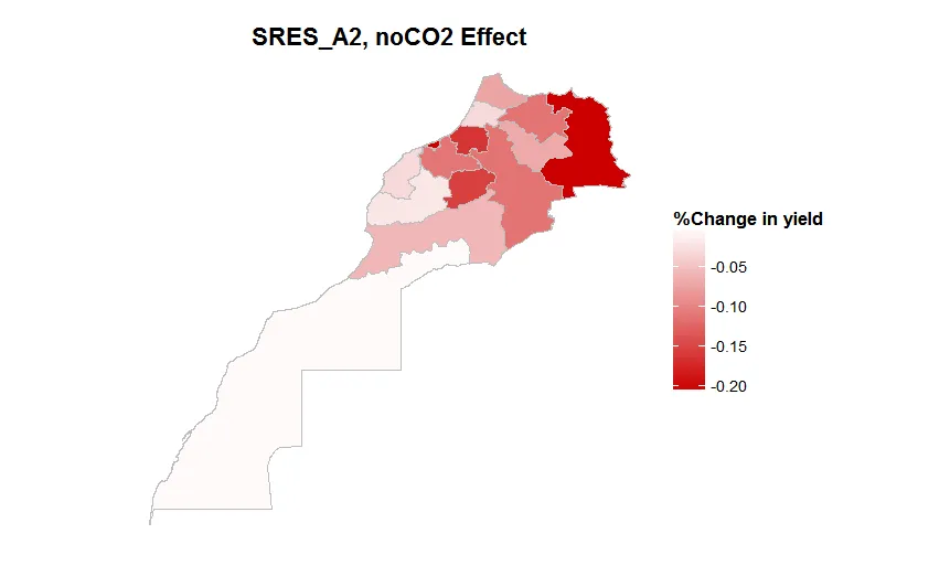
MoroccoRegMap1 <- ggplot(data = MoroccoReg.df, aes(long, lat, group = group))
MoroccoRegMap1 <- MoroccoRegMap1 + geom_polygon(aes(fill = A2Med_noCO2))
MoroccoRegMap1 <- MoroccoRegMap1 + geom_path(colour = 'gray', linestyle = 2)
#MoroccoRegMap <- MoroccoRegMap + scale_fill_gradient(low = "#CC0000",high = "#006600")
MoroccoRegMap1 <- MoroccoRegMap1 + scale_fill_gradient2(name = "%Change in yield",low = "#CC0000",mid = "#FFFFFF",high = "#006600")
MoroccoRegMap1 <- MoroccoRegMap1 + labs(title="SRES_A2, noCO2 Effect")
MoroccoRegMap1 <- MoroccoRegMap1 + coord_equal() + theme_map()
MoroccoRegMap1
结果:
问题:
在收益数据中,我有一个列描述了与列“ID_1”中每个条目对应的标签。我想要实现两件事:
1)绘制地图并将“ID_1”变量条目添加为地图上的标签,从而识别每个区域;
2)生成第二个图例,除了捕获数据中的值的图例之外,还包括“ID_1”中的条目及其在数据框架中的“标签”列中对应的描述。
希望我清楚地表达了我的问题。
谢谢。


.shp, .prj, .dbf, .csv, .shx。readOGR(...)查找所有这些文件。 我在这里找到了摩洛哥行政区域 shapefile,但是当我使用它时,您的代码无法运行。 您能否上传所有Morocco_adm1.*文件? - jlhoward