从这里下载世界边界geo.json文件。https://github.com/johan/world.geo.json
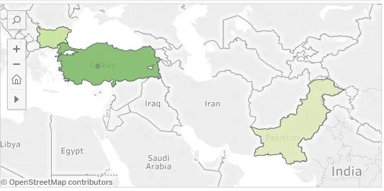
我想在全球地图上突出显示三个国家,并根据该国家的项目数量用渐变色进行着色。
我的步骤如下:
首先下载世界边界geo.json文件并将其作为底图进行阅读;然后尝试突出显示数据中的国家多边形。但结果是所有世界国家都被随机着色并使用了三个国家的信息进行标记。这是否是地理数据框子集问题?
WorldCountry <-geojsonio::geojson_read("./GeoData/countries.geo.json", what = "sp")

#Dataframe for choropleth map
Country <- c("Bulgaria","Pakistan","Turkey")
Projects <- c(2,1,6)
data <- data.frame(Country,Projects)

#basemap
Map <- leaflet(WorldCountry) %>% addTiles() %>% addPolygons()

#set bin and color for choropleth map
bins <- c(0,1,2,3,4,5,6,7,8,9,10,Inf)
pal <- colorBin("YlOrRd", domain = data$Projects, bins = bins)

#set labels
labels <- sprintf(
  "<strong>%s</strong><br/>%g projects <sup></sup>",
  data$Country, data$Projects) %>% lapply(htmltools::HTML)

#add polygons,labels and mouse over effect
Map %>% addPolygons(
  fillColor = ~pal(data$Projects),
  weight = 2,
  opacity = 1,
  color = 'white',
  dashArray = '3',
  fillOpacity = 0.7,
  highlight = highlightOptions(
     weight = 5,
    color = "#666",
    dashArray = "",
    fillOpacity = 0.7,
    bringToFront = TRUE),
  label = labels,
  labelOptions = labelOptions(
    style = list("font-weight" = "normal", padding = "3px 8px"),
    textsize = "15px",
    direction = "auto")
)
我期望的是像这样的东西: