Plotly Choropleth地图:显示国家名称

4
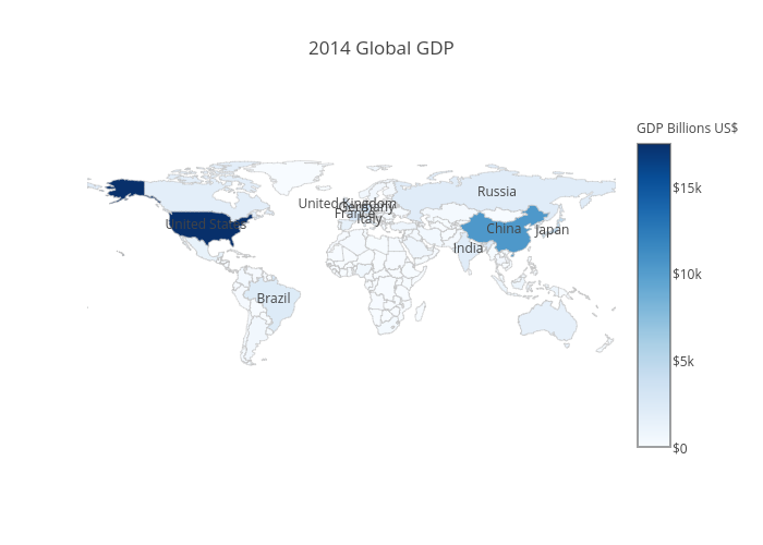
考虑以下的R代码,用于在plotly中生成面积分布图:
#devtools::install_github("ropensci/plotly")
library(plotly)

df <- read.csv('https://raw.githubusercontent.com/plotly/datasets/master/2014_world_gdp_with_codes.csv')

# light grey boundaries
l <- list(color = toRGB("grey"), width = 0.5)

# specify map projection/options
g <- list(
  showframe = FALSE,
  showcoastlines = FALSE,
  projection = list(type = 'Mercator')
)

plot_ly(df, z = GDP..BILLIONS., text = COUNTRY, locations = CODE, type = 'choropleth',
        color = GDP..BILLIONS., colors = 'Blues', marker = list(line = l),
        colorbar = list(tickprefix = '$', title = 'GDP Billions US$'),
        filename="r-docs/world-choropleth") %>%
  layout(title = '2014 Global GDP<br>Source:<a href="https://www.cia.gov/library/publications/the-world-factbook/fields/2195.html">CIA World Factbook</a>',
         geo = g)

有没有内置的plotly选项可以在地图上显示国家名称?如果没有,编写此代码的聪明方式是什么?
查看示例:https://plot.ly/r/choropleth-maps/ plotly的安装说明:https://plot.ly/r/getting-started/

如果您真的需要国家名称来帮助人们理解地理位置,也许条形图是这种可视化的更好选择。另外,由于 plotly 不在 CRAN 中,一些人可能需要安装说明。最后,国家名称在弹出窗口中(这也是使用交互式可视化的实际目的)。 - hrbrmstr
@hrbrmstr,重点在于美化地图而不是教授地理知识 ;) - kanimbla
我们对于什么样的统计地图才算是“美观”存在不同的看法。 - hrbrmstr
没问题。你提到的安装说明很有道理。我添加了一个解释链接。 - kanimbla
1个回答

7
您可以通过添加一个新的scattergeo跟踪器,并将mode设置为"text"来显示国家标签,以仅显示标签。
以下是示例。我使用dplyr过滤出前10行。
df <- read.csv('https://raw.githubusercontent.com/plotly/datasets/master/2014_world_gdp_with_codes.csv')

# light grey boundaries
l <- list(color = toRGB("grey"), width = 0.5)

# specify map projection/options
g <- list(
  showframe = FALSE,
  showcoastlines = FALSE,
  projection = list(type = 'Mercator')
)

p <- (plot_ly(df, z = GDP..BILLIONS., text = COUNTRY, locations = CODE, type = 'choropleth',
        color = GDP..BILLIONS., colors = 'Blues', marker = list(line = l),
        colorbar = list(tickprefix = '$', title = 'GDP Billions US$'),
        inherit = FALSE, # don't pass arguments into the next trace
        filename="r-docs/choropleth-with-country-labels") %>%
  layout(title = '2014 Global GDP',
         geo = g) %>% 
  dplyr::arrange(dplyr::desc(GDP..BILLIONS.)))[seq(1, 10), ] %>%
  add_trace(type="scattergeo", # view all scattergeo properties here: https://plot.ly/r/reference/#scattergeo
            locations = CODE, text = COUNTRY, mode="text")

这是用plotly在R中制作的带有国家标签的区域填充图的示例

全屏交互版本


网页内容由stack overflow 提供, 点击上面的
可以查看英文原文,
原文链接