我在plotly社区论坛中发布了这篇文章,但完全没有活动!希望你能在这里提供帮助:
我有地图时间序列数据,一些国家没有数据,
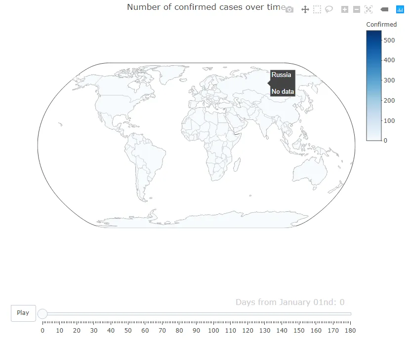
请注意,缺少数据的国家(例如俄罗斯)具有与所有其他国家一样多的数据点,问题不在于它们未出现在传递给Plotly的数据框中。
我有地图时间序列数据,一些国家没有数据,
plotly根本不会绘制它们。我可以将它们轮廓化并使其看起来不同,但似乎没有任何地方显示数据缺失(即我想要一个图例条目)。我该如何实现这一点?以下是一个示例:library(plotly)
library(dplyr)
data = read.csv('https://github.com/lc5415/COVID19/raw/master/data.csv')
l <- list(color = toRGB("grey"), width = 0.5)
g <- list(
scope = 'world',
countrycolor = toRGB('grey'),
showframe = T,
showcoastlines = TRUE,
projection = list(type = 'natural earth')
)
map.time = data %>%
plot_geo() %>%
add_trace(z = ~Confirmed, color = ~Confirmed, frame = ~Date, colors = 'Blues',
text = ~Country, locations = ~Alpha.3.code, marker = list(line = l)) %>%
colorbar(title = 'Confirmed') %>%
layout(
title = 'Number of confirmed cases over time',
geo = g
) %>%
animation_opts(redraw = F) %>%
animation_slider(
currentvalue = list(
prefix = paste0("Days from ",
format(StartDate, "%B %dnd"),": "))) %>%
plotly_build()
map.time
请注意,缺少数据的国家(例如俄罗斯)具有与所有其他国家一样多的数据点,问题不在于它们未出现在传递给Plotly的数据框中。