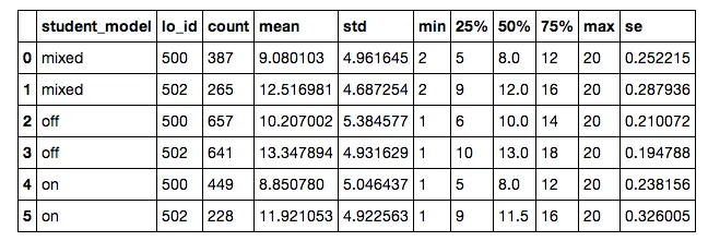
我将首先生成以下DataFrame,然后在pandas中生成一个图表:
plotData=resultData.groupby(['student_model','lo_id']).describe().nShots.unstack().reset_index()
plotData['se'] = plotData['std']/np.sqrt(plotData['count'])
生成的数据框长这样:
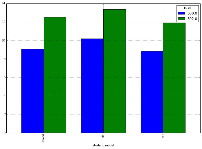
 然后我进行透视并绘制如下:
plotData.pivot(index='student_model',columns='lo_id',values='mean').plot(kind='bar')
导致如下结果:
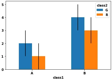
...plot(kind='bar', yerr=???)),但我不知道如何正确格式化它以使其正常工作。有什么想法吗?