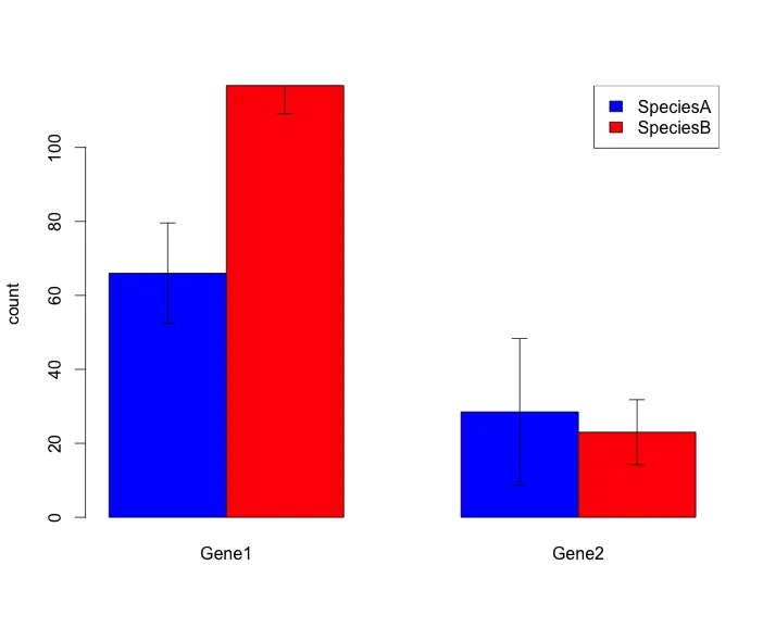
我想绘制一个带误差条的分组条形图。这是我目前能够得到的图表类型,对我所需的内容来说还不错:
以下是我的脚本:
#create dataframe
Gene<-c("Gene1","Gene2","Gene1","Gene2")
count1<-c(12,14,16,34)
count2<-c(4,7,9,23)
count3<-c(36,22,54,12)
count4<-c(12,24,35,23)
Species<-c("A","A","B","B")
df<-data.frame(Gene,count1,count2,count3,count4,Species)
df

mean1<-mean(as.numeric(df[1,][c(2,3,4,5)]))
mean2<-mean(as.numeric(df[2,][c(2,3,4,5)]))
mean3<-mean(as.numeric(df[3,][c(2,3,4,5)]))
mean4<-mean(as.numeric(df[4,][c(2,3,4,5)]))
Gene1SpeciesA.stdev<-sd(as.numeric(df[1,][c(2,3,4,5)]))
Gene2SpeciesA.stdev<-sd(as.numeric(df[2,][c(2,3,4,5)]))
Gene1SpeciesB.stdev<-sd(as.numeric(df[3,][c(2,3,4,5)]))
Gene2SpeciesB.stdev<-sd(as.numeric(df[4,][c(2,3,4,5)]))

ToPlot<-c(mean1,mean2,mean3,mean4)

#plot barplot
plot<-matrix(ToPlot,2,2,byrow=TRUE)   #with 2 being replaced by the number of genes!
tplot<-t(plot)
BarPlot <- barplot(tplot, beside=TRUE,ylab="count",
                names.arg=c("Gene1","Gene2"),col=c("blue","red"))

#add legend
legend("topright",
       legend = c("SpeciesA","SpeciesB"),
       fill = c("blue","red"))

#add error bars
ee<-matrix(c(Gene1SpeciesA.stdev,Gene2SpeciesA.stdev,Gene1SpeciesB.stdev,Gene2SpeciesB.stdev),2,2,byrow=TRUE)*1.96/sqrt(4)
tee<-t(ee)
error.bar(BarPlot,tplot,tee)
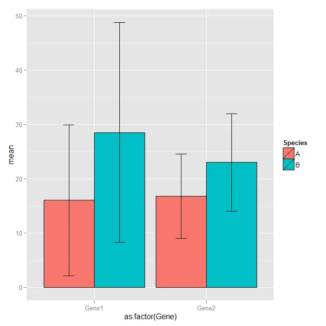
问题是我需要对50个基因和4个物种进行操作,所以我的脚本会变得非常冗长,我想这并不是最优的...我试图在这里寻求帮助,但我无法找到更好的方法来实现我想要的功能。如果我不需要误差线,我可以修改这个脚本,但棘手的部分是如何混合ggplot美丽的条形图和误差线! ;)
如果您有任何优化我的脚本的想法,我将非常感激!
非常感谢!
t(plot)你完全颠倒了基因 ;) - Colonel Beauvel