我知道使用ggplot2会更容易,但我需要使用lattice完成。
这是我的例子:
data <- structure(c(0.67, 0.67, 0.76, 0.66, 0.71, 0.6, 0.52, 0.6, 0.71, 0.76,
0.76, 0.71, 0.6, 0.61, 0.9, 0.5, 0.58, 0.84, 0.68, 0.88,
0.89, 0.96, 1, 0.95, 1, 1, 0.98, 0.78, 0.98, 1,
1, 0.99, 1, 1, 0.95, 0.92, 1, 0.91, 1, 0.87,
0.91, 0.72, 0.73, 0.55, 0.82, 0.87, 0.64, 0.75, 0.75, 1,
0.81, 0.79, 1, 0.74, 0.57, 0.84, 1, 0.95, 0.78, 0.95), .Dim = c(20L, 3L),
.Dimnames =     list(
c("1", "2", "3", "4", "5", "6", "7", "8", "9", "10", "11",
"12", "13", "14", "15", "16", "17", "18", "19", "20"), c("A",
"B", "C")))

means <- apply(data, 2, mean)

errors <- apply(data, 2, sd)

plot.data <- data.frame(colnames(data), means, errors)

colnames(plot.data) <- c("var", "mean", "error")

plot.data<-cbind(rbind(plot.data,plot.data),p=c(rep('n',3),rep('m',3)))
plot.data<-cbind(rbind(plot.data,plot.data),mb=c(rep('j',6),rep('k',6)))
绘图
library(lattice)
library(latticeExtra)
prepanel.ci <- function(x, y, lx, ux, subscripts,...) {
x <- as.numeric(x)
lx <- as.numeric(lx[subscripts])
ux <- as.numeric(ux[subscripts])
list(ylim = range(0, x, ux, lx, finite = TRUE))
}


panel.ci <- function(x, y, lx, ux, subscripts,...) {
x <- as.numeric(x)
y <- as.numeric(y)
lx <- as.numeric(lx[subscripts])
ux <- as.numeric(ux[subscripts])
panel.barchart(x, y, ...)
panel.arrows( x, lx, x, ux, col = 'black',
             length = 0.25, unit = "native",
             angle=90 ,code = 2)
}

p <- useOuterStrips(barchart(mean~var|p+mb, data=plot.data,stack=F,
          lx=plot.data$mean,
          ux=plot.data$mean+plot.data$error,
          panel=panel.ci,
          prepanel=prepanel.ci))
print(p)
然后我可以正确地添加误差线,如图1所示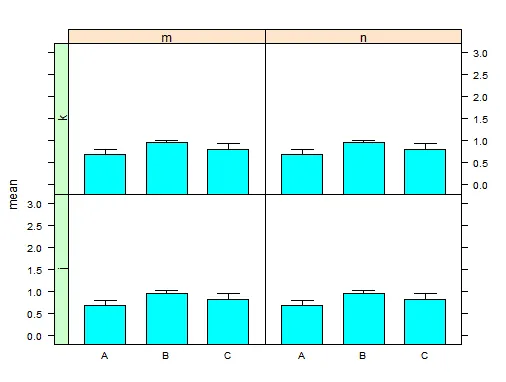
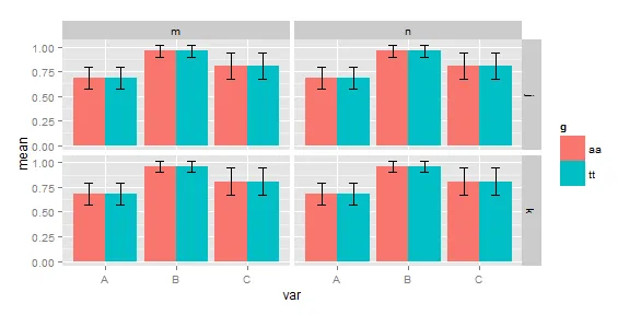
当我添加一个组因子g时。
plot.data<-cbind(rbind(plot.data,plot.data),g=c(rep('aa',12),rep('tt',12)))

p<-useOuterStrips(barchart(mean~var|p+mb, group=g, plot.data))

print(p)
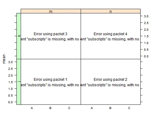
现在我添加了误差条,但出了问题:
p <- useOuterStrips(barchart(mean~var|p+mb, group=g, data=plot.data,stack=F,
          lx=plot.data$mean,
          ux=plot.data$mean+plot.data$error,
          panel=panel.ci,
          prepanel=prepanel.ci))
print(p)
有什么想法吗?