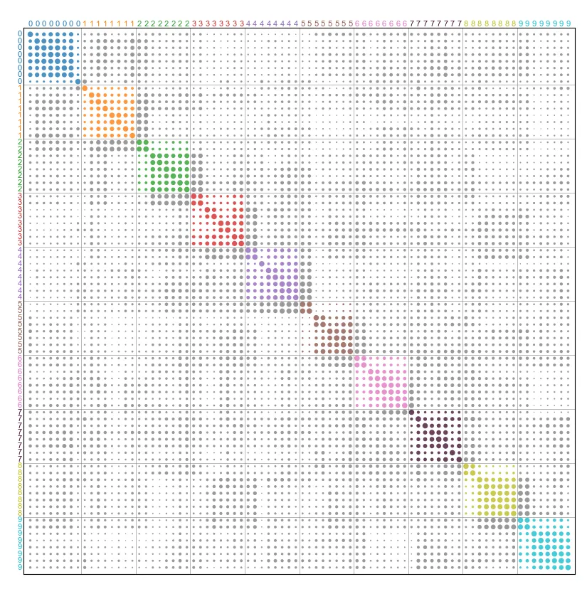
我想知道是否有一些用于在matplotlib中查看混淆矩阵的模板,其呈现方式类似,我不知道具体术语。
我尝试使用您的图2做了类似的事情。这是我使用手写数字数据的代码。
import numpy as np
from scipy import ndimage
from matplotlib import pyplot as plt
from sklearn import manifold, datasets
from scipy.spatial.distance import pdist, squareform
from scipy.cluster.hierarchy import leaves_list, linkage

def get_small_Xy(X, y, n=8):
    X = np.vstack([X[y==e][0:n] for e in np.unique(y)])
    y = np.hstack([[e]*n for e in np.unique(y)])
    return X, y

# Load digit data
X_, y_ = datasets.load_digits(return_X_y=True)

# get a small set of data
X, y = get_small_Xy(X_, y_)

# Get similarity matrix
D = 1-squareform(pdist(X, metric='cosine'))

Z = linkage(D, method='ward')
ind = leaves_list(Z)
D = D[ind, :]
D = D[:, ind]

# labels and colors related
lbs = np.array([i if i==j else 10 for i in y for j in y])
colors = np.array(['C{}'.format(i) for i in range(10)]+['gray'])
colors[7] = '#413c39'
c = colors[lbs]


font1 = {'family': 'Arial',
        'weight': 'normal',
        'size': 8,
        }

fig, ax = plt.subplots(1, 1, figsize=(10, 10))

n = np.product(X.shape[0])
xx, yy = np.meshgrid(range(n), range(n))
xy = np.stack([xx.ravel(), yy.ravel()]).T


ax.scatter(xy[:, 0], xy[:, 1], s=D**4*30, fc=c, ec=None, alpha=0.8)
ax.set_xlim(-1, n)
ax.set_ylim(n, -1)

ax.tick_params(top=False, bottom=False, left=False, right=False, labelleft=False, labelbottom=False)

# place text
for i, e in enumerate(y):
    ax.text(-1.2, i, e, ha='right', va='center', fontdict=font1, c=colors[e])

for i, e in enumerate(y):
    ax.text(i, -1, e, ha='center', va='bottom', fontdict=font1, c=colors[e])

# draw lines
for e in np.where(np.diff(y))[0]:
    ax.axhline(e+0.5, color='gray', lw=0.5, alpha=0.8)
    ax.axvline(e+0.5, color='gray', lw=0.5, alpha=0.8)
其中一个问题是所有点的 alpha 值似乎无法在一次运行中使用不同的值来设置。