如何使用caret软件包来可视化混淆矩阵

28

我想要将混淆矩阵中的数据可视化,是否有一个函数可以直接输入混淆矩阵并将其可视化(绘制成图表)?

以下是我想要实现的例子(Matrix$nnet只是包含分类结果的表格):

Confusion$nnet <- confusionMatrix(Matrix$nnet)
plot(Confusion$nnet)

我的Confusion$nnet$table看起来像这样:

    prediction (I would also like to get rid of this string, any help?)
    1  2
1   42 6
2   8 28

2
@static_rtti,既然您发布了悬赏,请问您能否提供任何有关所需绘图类型的详细信息或示例? - camille
1
@static_rtti 这里有一些例子(https://dev59.com/3loU5IYBdhLWcg3wCjrx,https://dev59.com/5lvUa4cB1Zd3GeqPr0aT,https://dev59.com/P3zaa4cB1Zd3GeqPMSq3和https://dev59.com/dKTja4cB1Zd3GeqPJe3B),看起来符合描述。说实话,如果今天发布这个问题,我感觉它会被关闭为过于宽泛。 - camille
1
我认为Camille说得很有道理。然而,现在补充详细规范也不算太晚,而且我也曾经感觉R中的混淆矩阵选项并不是很好。因此,我在shiny/htmltools中实现了https://github.com/tarobjtu/matrix的一个版本。在这个版本中,你可以与矩阵进行“交互”。所以你点击某个矩阵元素,与该矩阵元素相关的数据就会显示出来。这样回答你的问题是否足够,或者RLave的回答已经值得你“接受”了呢? - Tonio Liebrand
8个回答

44
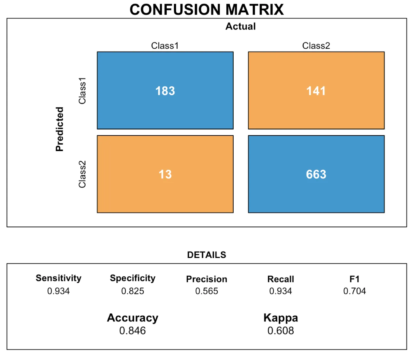
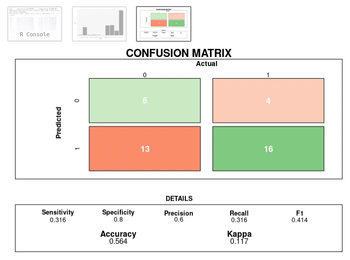
您可以在R中使用rect功能来布局混淆矩阵。在这里,我们将创建一个函数,允许用户传递由caret软件包创建的cm对象,以生成可视化结果。
让我们先创建一个评估数据集,正如在caret演示中所做的那样。
# construct the evaluation dataset
set.seed(144)
true_class <- factor(sample(paste0("Class", 1:2), size = 1000, prob = c(.2, .8), replace = TRUE))
true_class <- sort(true_class)
class1_probs <- rbeta(sum(true_class == "Class1"), 4, 1)
class2_probs <- rbeta(sum(true_class == "Class2"), 1, 2.5)
test_set <- data.frame(obs = true_class,Class1 = c(class1_probs, class2_probs))
test_set$Class2 <- 1 - test_set$Class1
test_set$pred <- factor(ifelse(test_set$Class1 >= .5, "Class1", "Class2"))

现在让我们使用caret来计算混淆矩阵:

# calculate the confusion matrix
cm <- confusionMatrix(data = test_set$pred, reference = test_set$obs)

现在我们创建一个函数,根据需要布置矩形,以更具视觉吸引力的方式展示混淆矩阵

draw_confusion_matrix <- function(cm) {

  layout(matrix(c(1,1,2)))
  par(mar=c(2,2,2,2))
  plot(c(100, 345), c(300, 450), type = "n", xlab="", ylab="", xaxt='n', yaxt='n')
  title('CONFUSION MATRIX', cex.main=2)

  # create the matrix 
  rect(150, 430, 240, 370, col='#3F97D0')
  text(195, 435, 'Class1', cex=1.2)
  rect(250, 430, 340, 370, col='#F7AD50')
  text(295, 435, 'Class2', cex=1.2)
  text(125, 370, 'Predicted', cex=1.3, srt=90, font=2)
  text(245, 450, 'Actual', cex=1.3, font=2)
  rect(150, 305, 240, 365, col='#F7AD50')
  rect(250, 305, 340, 365, col='#3F97D0')
  text(140, 400, 'Class1', cex=1.2, srt=90)
  text(140, 335, 'Class2', cex=1.2, srt=90)

  # add in the cm results 
  res <- as.numeric(cm$table)
  text(195, 400, res[1], cex=1.6, font=2, col='white')
  text(195, 335, res[2], cex=1.6, font=2, col='white')
  text(295, 400, res[3], cex=1.6, font=2, col='white')
  text(295, 335, res[4], cex=1.6, font=2, col='white')

  # add in the specifics 
  plot(c(100, 0), c(100, 0), type = "n", xlab="", ylab="", main = "DETAILS", xaxt='n', yaxt='n')
  text(10, 85, names(cm$byClass[1]), cex=1.2, font=2)
  text(10, 70, round(as.numeric(cm$byClass[1]), 3), cex=1.2)
  text(30, 85, names(cm$byClass[2]), cex=1.2, font=2)
  text(30, 70, round(as.numeric(cm$byClass[2]), 3), cex=1.2)
  text(50, 85, names(cm$byClass[5]), cex=1.2, font=2)
  text(50, 70, round(as.numeric(cm$byClass[5]), 3), cex=1.2)
  text(70, 85, names(cm$byClass[6]), cex=1.2, font=2)
  text(70, 70, round(as.numeric(cm$byClass[6]), 3), cex=1.2)
  text(90, 85, names(cm$byClass[7]), cex=1.2, font=2)
  text(90, 70, round(as.numeric(cm$byClass[7]), 3), cex=1.2)

  # add in the accuracy information 
  text(30, 35, names(cm$overall[1]), cex=1.5, font=2)
  text(30, 20, round(as.numeric(cm$overall[1]), 3), cex=1.4)
  text(70, 35, names(cm$overall[2]), cex=1.5, font=2)
  text(70, 20, round(as.numeric(cm$overall[2]), 3), cex=1.4)
}  

最后,将我们使用caret计算混淆矩阵时计算出的cm对象传入:

draw_confusion_matrix(cm)

以下是结果:

来自caret包的混淆矩阵可视化


33
您可以使用内置的fourfoldplot。例如,
ctable <- as.table(matrix(c(42, 6, 8, 28), nrow = 2, byrow = TRUE))
fourfoldplot(ctable, color = c("#CC6666", "#99CC99"),
             conf.level = 0, margin = 1, main = "Confusion Matrix")

在此输入图片描述


有没有办法不手动输入数字,而只声明一个列表或其他类似的东西呢?(例如 c(42, 6, 8, 28) -> c(datafromtable))? - shish
我是这样做的:ctable <- as.table(matrix(c(Confusion$nnet$table), nrow = 2, byrow = TRUE)) fourfoldplot(ctable, color = c("#CC6666", "#99CC99"), conf.level = 0, margin = 1, main = "混淆矩阵"). 感谢您的帮助! - shish
那么你将conf.level=0设置为混淆矩阵的含义。对吗? - Léo Léopold Hertz 준영
仅仅是为了阐述答案,假设你有一个混淆矩阵(confusionMatrix),要将其转换成表格,cmtable<-as.table(as.matrix(cm)) - ameet chaubal
4
在混淆矩阵中使用四格图是一个不好的主意,因为这种图是加权的,基于行和列的边际总数。你能看到对角线相反的角落有42和28个计数,但它们在大小/面积上无法区分吗?四格图通常用于分析概率比,而默认的加权方式可以实现这一点,无论独立频率如何。如果你用它来表示二元混淆矩阵,它可能会完全误导你。你可能会错过你有一个可怕的FP或FN率的事实。你可以通过设置std = "all.max"来解决这个问题。 - julianhatwell

21
你可以使用来自 yardstick 的函数 conf_mat() 再加上 autoplot(),以便在几行代码中获得漂亮的结果。此外,您仍然可以使用基本的 ggplot 语法来调整样式。
library(yardstick)
library(ggplot2)


# The confusion matrix from a single assessment set (i.e. fold)
cm <- conf_mat(truth_predicted, obs, pred)

autoplot(cm, type = "heatmap") +
  scale_fill_gradient(low="#D6EAF8",high = "#2E86C1")

在此输入图片描述


作为进一步自定义的示例,使用ggplot语法还可以添加图例:

+ theme(legend.position = "right")

更改图例的名称也非常简单:+ labs(fill="legend_name")

enter image description here

数据示例:

set.seed(123)
truth_predicted <- data.frame(
  obs = sample(0:1,100, replace = T),
  pred = sample(0:1,100, replace = T)
)
truth_predicted$obs <- as.factor(truth_predicted$obs)
truth_predicted$pred <- as.factor(truth_predicted$pred)

哦,这已经接近我想要的了,谢谢! - static_rtti

16

我非常喜欢@Cybernetic制作的漂亮混淆矩阵可视化,并进行了两个调整,以希望进一步改进它:

1)我用类别的实际值替换了Class1和Class2。 2)我用一个基于百分位数生成红色(misses)和绿色(hits)的函数替换了橙色和蓝色。这个想法是快速看到问题/成功在哪里以及它们的大小。

屏幕截图和代码:

更新后的混淆矩阵

draw_confusion_matrix <- function(cm) {

  total <- sum(cm$table)
  res <- as.numeric(cm$table)

  # Generate color gradients. Palettes come from RColorBrewer.
  greenPalette <- c("#F7FCF5","#E5F5E0","#C7E9C0","#A1D99B","#74C476","#41AB5D","#238B45","#006D2C","#00441B")
  redPalette <- c("#FFF5F0","#FEE0D2","#FCBBA1","#FC9272","#FB6A4A","#EF3B2C","#CB181D","#A50F15","#67000D")
  getColor <- function (greenOrRed = "green", amount = 0) {
    if (amount == 0)
      return("#FFFFFF")
    palette <- greenPalette
    if (greenOrRed == "red")
      palette <- redPalette
    colorRampPalette(palette)(100)[10 + ceiling(90 * amount / total)]
  }

  # set the basic layout
  layout(matrix(c(1,1,2)))
  par(mar=c(2,2,2,2))
  plot(c(100, 345), c(300, 450), type = "n", xlab="", ylab="", xaxt='n', yaxt='n')
  title('CONFUSION MATRIX', cex.main=2)

  # create the matrix 
  classes = colnames(cm$table)
  rect(150, 430, 240, 370, col=getColor("green", res[1]))
  text(195, 435, classes[1], cex=1.2)
  rect(250, 430, 340, 370, col=getColor("red", res[3]))
  text(295, 435, classes[2], cex=1.2)
  text(125, 370, 'Predicted', cex=1.3, srt=90, font=2)
  text(245, 450, 'Actual', cex=1.3, font=2)
  rect(150, 305, 240, 365, col=getColor("red", res[2]))
  rect(250, 305, 340, 365, col=getColor("green", res[4]))
  text(140, 400, classes[1], cex=1.2, srt=90)
  text(140, 335, classes[2], cex=1.2, srt=90)

  # add in the cm results
  text(195, 400, res[1], cex=1.6, font=2, col='white')
  text(195, 335, res[2], cex=1.6, font=2, col='white')
  text(295, 400, res[3], cex=1.6, font=2, col='white')
  text(295, 335, res[4], cex=1.6, font=2, col='white')

  # add in the specifics 
  plot(c(100, 0), c(100, 0), type = "n", xlab="", ylab="", main = "DETAILS", xaxt='n', yaxt='n')
  text(10, 85, names(cm$byClass[1]), cex=1.2, font=2)
  text(10, 70, round(as.numeric(cm$byClass[1]), 3), cex=1.2)
  text(30, 85, names(cm$byClass[2]), cex=1.2, font=2)
  text(30, 70, round(as.numeric(cm$byClass[2]), 3), cex=1.2)
  text(50, 85, names(cm$byClass[5]), cex=1.2, font=2)
  text(50, 70, round(as.numeric(cm$byClass[5]), 3), cex=1.2)
  text(70, 85, names(cm$byClass[6]), cex=1.2, font=2)
  text(70, 70, round(as.numeric(cm$byClass[6]), 3), cex=1.2)
  text(90, 85, names(cm$byClass[7]), cex=1.2, font=2)
  text(90, 70, round(as.numeric(cm$byClass[7]), 3), cex=1.2)

  # add in the accuracy information 
  text(30, 35, names(cm$overall[1]), cex=1.5, font=2)
  text(30, 20, round(as.numeric(cm$overall[1]), 3), cex=1.4)
  text(70, 35, names(cm$overall[2]), cex=1.5, font=2)
  text(70, 20, round(as.numeric(cm$overall[2]), 3), cex=1.4)
}

8

这里是一个基于 ggplot2 的简单想法,可以根据需要进行更改。我正在使用来自此链接的数据:

#data
confusionMatrix(iris$Species, sample(iris$Species))
newPrior <- c(.05, .8, .15)
names(newPrior) <- levels(iris$Species)

cm <-confusionMatrix(iris$Species, sample(iris$Species))

现在cm是一个混淆矩阵对象,可以提取一些有用的信息用于回答问题:
# extract the confusion matrix values as data.frame
cm_d <- as.data.frame(cm$table)
# confusion matrix statistics as data.frame
cm_st <-data.frame(cm$overall)
# round the values
cm_st$cm.overall <- round(cm_st$cm.overall,2)

# here we also have the rounded percentage values
cm_p <- as.data.frame(prop.table(cm$table))
cm_d$Perc <- round(cm_p$Freq*100,2)

现在我们已经准备好绘制图表了:

library(ggplot2)     # to plot
library(gridExtra)   # to put more
library(grid)        # plot together

# plotting the matrix
cm_d_p <-  ggplot(data = cm_d, aes(x = Prediction , y =  Reference, fill = Freq))+
  geom_tile() +
  geom_text(aes(label = paste("",Freq,",",Perc,"%")), color = 'red', size = 8) +
  theme_light() +
  guides(fill=FALSE) 

# plotting the stats
cm_st_p <-  tableGrob(cm_st)

# all together
grid.arrange(cm_d_p, cm_st_p,nrow = 1, ncol = 2, 
             top=textGrob("Confusion Matrix and Statistics",gp=gpar(fontsize=25,font=1)))

enter image description here


百分比与整数比例并不是非常具有信息性。最好是按行或列进行划分。 - undefined

3

我知道这可能有点晚了,但我一直在寻找一个解决方案。 根据上面的一些先前的答案,再加上这个帖子。 使用ggplot2包和基本的table函数,我编写了这个简单的函数来绘制一个漂亮的彩色混淆矩阵:

conf_matrix <- function(df.true, df.pred, title = "", true.lab ="True Class", pred.lab ="Predicted Class",
                        high.col = 'red', low.col = 'white') {
  #convert input vector to factors, and ensure they have the same levels
  df.true <- as.factor(df.true)
  df.pred <- factor(df.pred, levels = levels(df.true))
  
  #generate confusion matrix, and confusion matrix as a pecentage of each true class (to be used for color) 
  df.cm <- table(True = df.true, Pred = df.pred)
  df.cm.col <- df.cm / rowSums(df.cm)
  
  #convert confusion matrices to tables, and binding them together
  df.table <- reshape2::melt(df.cm)
  df.table.col <- reshape2::melt(df.cm.col)
  df.table <- left_join(df.table, df.table.col, by =c("True", "Pred"))
  
  #calculate accuracy and class accuracy
  acc.vector <- c(diag(df.cm)) / c(rowSums(df.cm))
  class.acc <- data.frame(Pred = "Class Acc.", True = names(acc.vector), value = acc.vector)
  acc <- sum(diag(df.cm)) / sum(df.cm)
  
  #plot
  ggplot() +
    geom_tile(aes(x=Pred, y=True, fill=value.y),
              data=df.table, size=0.2, color=grey(0.5)) +
    geom_tile(aes(x=Pred, y=True),
              data=df.table[df.table$True==df.table$Pred, ], size=1, color="black", fill = 'transparent') +
    scale_x_discrete(position = "top",  limits = c(levels(df.table$Pred), "Class Acc.")) +
    scale_y_discrete(limits = rev(unique(levels(df.table$Pred)))) +
    labs(x=pred.lab, y=true.lab, fill=NULL,
         title= paste0(title, "\nAccuracy ", round(100*acc, 1), "%")) +
    geom_text(aes(x=Pred, y=True, label=value.x),
              data=df.table, size=4, colour="black") +
    geom_text(data = class.acc, aes(Pred, True, label = paste0(round(100*value), "%"))) +
    scale_fill_gradient(low=low.col, high=high.col, labels = scales::percent,
                        limits = c(0,1), breaks = c(0,0.5,1)) +
    guides(size=F) +
    theme_bw() +
    theme(panel.border = element_blank(), legend.position = "bottom",
          axis.text = element_text(color='black'), axis.ticks = element_blank(),
          panel.grid = element_blank(), axis.text.x.top = element_text(angle = 30, vjust = 0, hjust = 0)) +
    coord_fixed()

} 

你可以直接复制粘贴这个函数,然后保存到你的全局环境中。
以下是一个例子:
mydata <- data.frame(true = c("a", "b", "c", "a", "b", "c", "a", "b", "c"),
                     predicted = c("a", "a", "c", "c", "a", "c", "a", "b", "c"))

conf_matrix(mydata$true, mydata$predicted, title = "Conf. Matrix Example")

enter image description here


太棒了!继续保持。 - Amin Shn
最好在每一行下方(例如,在出现次数下方)添加比率。 - undefined

0

最简单的方法,包含插入符号:

library(caret)
library(yardstick)
library(ggplot2)

训练模型

plsFit <- train(
  y ~ .,
  data = trainData
)

从模型获取预测

plsClasses <- predict(plsFit, newdata = testdata)

truth_predicted<-data.frame(
  obs = testdata$y,
  pred = plsClasses
)

生成矩阵。注意obs和pred不是字符串

cm <- conf_mat(truth_predicted, obs, pred)

图表

autoplot(cm, type = "heatmap") +
  scale_fill_gradient(low="#D6EAF8",high = "#2E86C1")

0

cvms 还有一些花里胡哨的东西,比如 plot_confusion_matrix()


# Create targets and predictions data frame
data <- data.frame(
  "target" = c("A", "B", "A", "B", "A", "B", "A", "B",
               "A", "B", "A", "B", "A", "B", "A", "A"),
  "prediction" = c("B", "B", "A", "A", "A", "B", "B", "B",
                   "B", "B", "A", "B", "A", "A", "A", "A"),
  stringsAsFactors = FALSE
)

# Evaluate predictions and create confusion matrix
eval <- evaluate(
  data = data,
  target_col = "target",
  prediction_cols = "prediction",
  type = "binomial"
)

eval

> # A tibble: 1 x 19
>   `Balanced Accuracy` Accuracy    F1 Sensitivity Specificity `Pos Pred Value` `Neg Pred Value`   AUC `Lower CI`
>                 <dbl>    <dbl> <dbl>       <dbl>       <dbl>            <dbl>            <dbl> <dbl>      <dbl>
> 1               0.690    0.688 0.667       0.714       0.667            0.625             0.75 0.690      0.447
> # … with 10 more variables: Upper CI <dbl>, Kappa <dbl>, MCC <dbl>, Detection Rate <dbl>,
> #   Detection Prevalence <dbl>, Prevalence <dbl>, Predictions <list>, ROC <named list>, Confusion Matrix <list>,
> #   Process <list>

# Plot confusion matrix
# Either supply confusion matrix tibble directly
plot_confusion_matrix(eval[["Confusion Matrix"]][[1]])

# Or plot first confusion matrix in evaluate() output
plot_confusion_matrix(eval)

Confusion matrix plot

输出是一个 ggplot 对象。


网页内容由stack overflow 提供, 点击上面的
可以查看英文原文,
原文链接