七年后,正确格式化数据的最佳方法是使用
tidyr 而不是
reshape。
使用
tidyr 中的
gather,非常容易重新格式化数据以获得预期的三列(
person 为 y 轴,
fruit 为 x 轴,
count 为值):
library("dplyr")
library("tidyr")
hm <- readr::read_csv("people,apple,orange,peach
mike,1,0,6
sue,0,0,1
bill,3,3,1
ted,1,1,0")
hm <- hm %>%
gather(fruit, count, apple:peach)
数据现在看起来像这样:
people fruit count
<chr> <chr> <dbl>
1 mike apple 1
2 sue apple 0
3 bill apple 3
4 ted apple 1
5 mike orange 0
6 sue orange 0
7 bill orange 3
8 ted orange 1
9 mike peach 6
10 sue peach 1
11 bill peach 1
12 ted peach 0
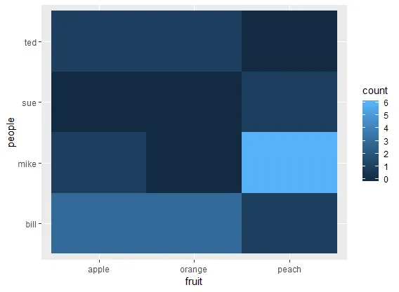
太好了!让我们开始绘图吧。使用ggplot2绘制热图的基本几何图形是geom_tile,我们将为其提供美学x、y和fill。
library("ggplot2")
ggplot(hm, aes(x=x, y=y, fill=value)) + geom_tile()
好的,还不错,但我们可以做得更好。
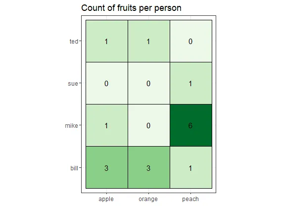
- 对于热力图,我喜欢使用黑白主题
theme_bw(),可以去掉灰色背景。
我也喜欢使用RColorBrewer中的调色板(使用direction=1来获取较高值的深色,否则为-1)。有很多可用的调色板:Reds、Blues、Spectral、RdYlBu(红黄蓝)、RdBu(红蓝)等。下面我使用了“Greens”。运行RColorBrewer::display.brewer.all()来查看调色板的外观。
如果你想要正方形的瓷砖,只需使用coord_equal()。
我经常发现图例没有用处,但这取决于你特定的用例。你可以用guides(fill=F)隐藏fill图例。
你可以使用geom_text(或geom_label)在瓷砖上方打印值。它需要美学x、y和label,但在我们的情况下,x和y是继承的。你还可以通过传递size=count作为美学将更高的值打印得更大——在这种情况下,你还需要传递size=F到guides来隐藏大小图例。
你可以通过向geom_tile传递一个color来在瓷砖周围绘制线条。
把所有东西放在一起:
ggplot(hm, aes(x=fruit, y=people, fill=count)) +
geom_tile(color="black") +
theme_bw() +
coord_equal() +
scale_fill_distiller(palette="Greens", direction=1) +
geom_text(aes(label=count), color="black") +
guides(fill=F) +
labs(title = "Count of fruits per person")
要移除任何内容,只需删除对应的行。
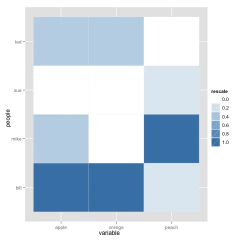
ggplot2和其他包肯定有一些变化,删除了recale函数或将其转移到其他函数中。你需要使用scales包中的rescale函数,将数字向量重新缩放为指定的最小值和最大值。我已更新代码以实现完全可重复性。 - Geek On Acid