使用ggplot2绘制每列的热力图

6

我将使用这个R脚本:

tableau <- read.table(
  text = 
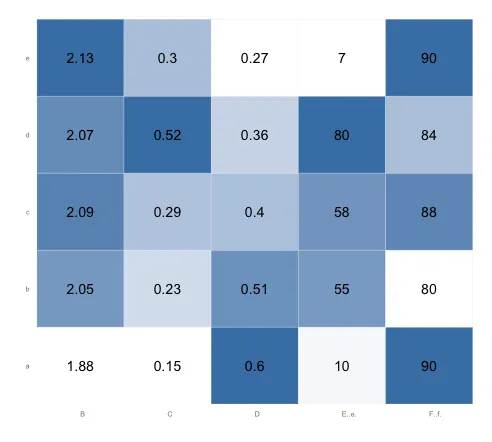
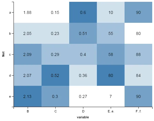
    "Net    B   C   D   E.(e)   F.(f)
a   1.88    0.15    0.60    10.00   90.00
b   2.05    0.23    0.51    55.00   80.00
c   2.09    0.29    0.40    58.00   88.00
d   2.07    0.52    0.36    80.00   84.00
e   2.13    0.30    0.27    7.00    90.00",
  header = TRUE)

library(plyr)
library(reshape)
library(ggplot2)
library(scales)
tableau.m <- melt(tableau)
tableau.m <- ddply(tableau.m, .(variable), transform, rescale = rescale(value))

(p <- ggplot(tableau.m, aes(variable, Net)) + 
    geom_tile(aes(fill = rescale), colour = "white") + 
    scale_fill_gradient(low = "white", high = "steelblue"))

base_size <- 9
p + theme_grey(base_size = base_size) + 
  labs(x = "", y = "") + scale_x_discrete(expand = c(0, 0)) + 
  scale_y_discrete(expand = c(0, 0)) + 
  theme(legend.position = "none", axis.ticks = element_blank(), 
        axis.text.x = element_text(size = base_size * 0.8, angle = 0, 
                                   hjust = 0, colour = "grey50"))

tableau.s <- ddply(tableau.m, .(variable), transform, rescale = scale(value))

last_plot() %+% tableau.s

我获得了这个图:

输入图片说明

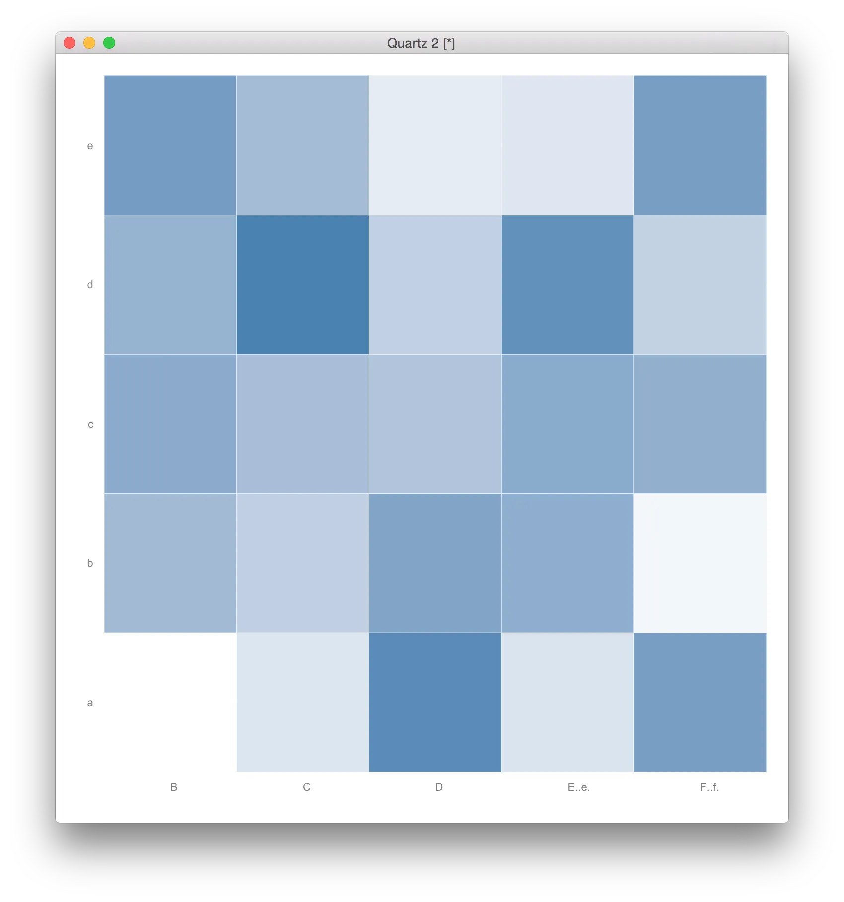
其中深蓝色表示较高的值,白色表示较低的值。

如果可能的话,我该如何更改此代码,使得:

  1. 表中的值在矩阵图的每个对应单元格中显示?
  2. 热图的范围不是基于整个矩阵计算,而是针对每列进行计算。因此,对于每个类别:B、C、D、E(e)和 F(f),白色表示该列的较低值,深蓝色表示该列的较高值?

谢谢!

2个回答

9

要在每个单元格中添加文本标签value,您可以使用geom_text

p <- ggplot(tableau.m, aes(variable, Net)) + 
      geom_tile(aes(fill = rescale), colour = "white") + 
      scale_fill_gradient(low = "white", high = "steelblue") +
      geom_text(aes(label=value))

# Add the theme formatting
base_size <- 9
p + theme_grey(base_size = base_size) + 
  labs(x = "", y = "") + scale_x_discrete(expand = c(0, 0)) + 
  scale_y_discrete(expand = c(0, 0)) + 
  theme(legend.position = "none", axis.ticks = element_blank(), 
        axis.text.x = element_text(size = base_size * 0.8, 
                                   angle = 0, hjust = 0, colour = "grey50"))

对于你的第二个问题,你当前的代码已经处理了这个问题。变量rescale分别对每一列进行缩放,因为你已经按variable进行了分组操作。由于rescalefill变量,因此每一列的值都被重新缩放为0到1,以设置颜色值。你不需要tableau.s … last.plot…的代码。
运行上面的代码后,图表如下所示。请注意,在每一列中,最低值为白色,最高值为钢蓝色。(你可能想将边框颜色从“白色”改为“gray90”,这样相邻的白色正方形之间就会有一个边框):

enter image description here


嗨@eipi10,我意识到第一列应该与其他列相反地进行缩放。也就是说,1.88应该是最暗的,而2.13应该是白色的。有没有办法仅针对一列反转缩放?(我应该为此提出一个新问题吗?) - Lucien S.
我实际上去发了一个新的问题... http://stackoverflow.com/questions/30078074/rescaling-with-plyr-ddply-in-r 干杯! - Lucien S.

2

使用 tidyrdplyr 进行数据重塑为长格式,再使用 ggvis 绘制热图的类似思路:

library(dplyr)
library(ggvis)
library(tidyr)

tableau %>% 
  gather(variable, value, -Net) %>%
  group_by(variable) %>%
  mutate(scale = percent_rank(value)) %>%
  mutate_each(funs(factor(.)), -value, -scale) %>%
  ggvis(~variable, ~Net, fill=~scale) %>%
  layer_rects(width = band(), height = band(), stroke := NA) %>%
  layer_text(
    x = prop("x", ~variable, scale = "xcenter"),
    y = prop("y", ~Net, scale = "ycenter", ),
    text:=~value, fontSize := 14, fontWeight := "bold", fill:="black", 
    baseline:="middle", align:="center") %>%
  scale_nominal("x", padding = 0, points = FALSE) %>%
  scale_nominal("y", padding = 0, points = FALSE) %>% 
  scale_nominal("x", name = "xcenter", padding = 1, points = TRUE) %>%
  scale_nominal("y", name = "ycenter", padding = 1, points = TRUE) %>%
  scale_numeric("fill", range = c("white", "steelblue")) %>%
  add_axis("x", properties = axis_props(grid = list(stroke = NA))) %>%
  add_axis("y", properties = axis_props(grid = list(stroke = NA))) %>%
  hide_legend("fill")

这将会得到:

在此输入图片描述


网页内容由stack overflow 提供, 点击上面的
可以查看英文原文,
原文链接