Python Matplotlib使用散点数据集绘制热图

5
我正在编写一个脚本,用于在二维散点数据上制作热力图。以下是我尝试做的玩具示例:
import numpy as np
from matplotlib.pyplot import*
x = [1,2,3,4,5]
y = [1,2,3,4,5]
heatmap, xedges, yedges = np.histogram2d(x, y, bins=50)
extent = [xedges[0], xedges[-1], yedges[0], yedges[-1]]
imshow(heatmap, extent = extent)

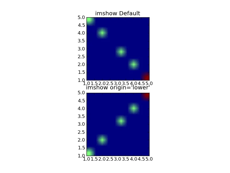
我认为最“温暖”的区域应该沿着y=x,但实际上它们出现在y=-x+5上,即热图以相反的方向读取列表。我不确定为什么会这样。有什么建议吗?
谢谢。
2个回答

3

尝试使用imshow参数origin=lower。默认情况下,它将数组的(0,0)元素设置在左上角。

例如:

import numpy as np
import matplotlib.pyplot as plt
x = [1,2,3,4,5,5]
y = [1,2,3,4,5,5]
heatmap, xedges, yedges = np.histogram2d(x, y, bins=10)
extent = [xedges[0], xedges[-1], yedges[0], yedges[-1]]
fig = plt.figure()
ax1 = fig.add_subplot(211)
ax1.imshow(heatmap, extent = extent)
ax1.set_title("imshow Default");
ax2 = fig.add_subplot(212)
ax2.imshow(heatmap, extent = extent,origin='lower')
ax2.set_title("imshow origin='lower'");

fig.savefig('heatmap.png')

生成:

在此输入图片描述


0
为了保持热力图的外观与散点图中所看到的一致,实际上应该使用以下代码:
ax2.imshow(heatmap.T, extent = extent,origin='lower')

网页内容由stack overflow 提供, 点击上面的
可以查看英文原文,
原文链接