我有一组X、Y数据点(约10k),很容易绘制成散点图,但我想把它们表示为热力图。
我查看了Matplotlib中的示例,它们似乎都已经开始用热力图单元格值生成图像。
是否有一种方法可以将一堆不同的x、y转换为热力图(其中具有更高频率的x、y区域会更“热”)?
我有一组X、Y数据点(约10k),很容易绘制成散点图,但我想把它们表示为热力图。
我查看了Matplotlib中的示例,它们似乎都已经开始用热力图单元格值生成图像。
是否有一种方法可以将一堆不同的x、y转换为热力图(其中具有更高频率的x、y区域会更“热”)?
如果您不想使用六边形,可以使用numpy的histogram2d函数:
import numpy as np
import numpy.random
import matplotlib.pyplot as plt

# Generate some test data
x = np.random.randn(8873)
y = np.random.randn(8873)

heatmap, xedges, yedges = np.histogram2d(x, y, bins=50)
extent = [xedges[0], xedges[-1], yedges[0], yedges[-1]]

plt.clf()
plt.imshow(heatmap.T, extent=extent, origin='lower')
plt.show()
这将生成一个50x50的热力图。如果你想要,比如说512x384,你可以在调用histogram2d时加上bins=(512, 384)。
示例: 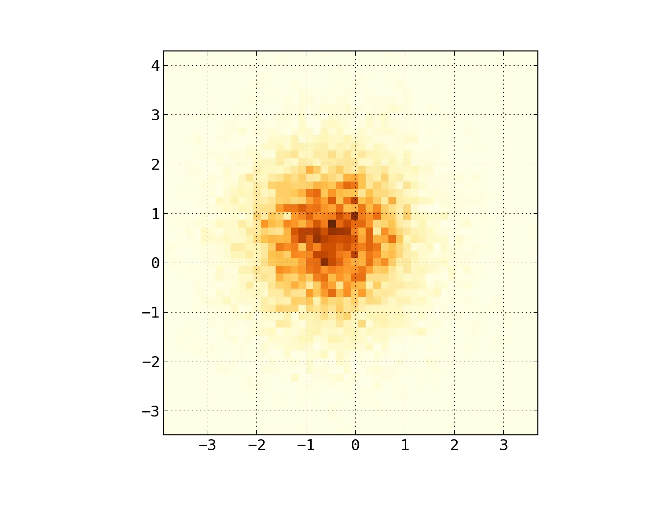
axes实例,可以添加标题、轴标签等,然后像其他典型的matplotlib图一样进行正常的savefig()操作。 - gotgenesplt.savefig('filename.png')不起作用吗?如果您想获取一个轴实例,请使用Matplotlib的面向对象接口:fig = plt.figure() ax = fig.gca() ax.imshow(...) fig.savefig(...) - ptomatoimshow()与scatter()处于同一类别的函数。我真的不明白为什么imshow()会将一个二维浮点数组转换为适当颜色的块,而我确实知道scatter()应该如何处理这样的数组。 - gotgenesplt.imshow(heatmap.T, extent=extent, origin='lower'),其中extent是图像位置范围参数,origin指定原点位置在底部。 - Jamie, plt.imshow(heatmap, norm=LogNorm()), plt.colorbar()`。记得导入相应的库和模块。 - tommy.carstensenfrom matplotlib import pyplot as PLT
from matplotlib import cm as CM
from matplotlib import mlab as ML
import numpy as NP
n = 1e5
x = y = NP.linspace(-5, 5, 100)
X, Y = NP.meshgrid(x, y)
Z1 = ML.bivariate_normal(X, Y, 2, 2, 0, 0)
Z2 = ML.bivariate_normal(X, Y, 4, 1, 1, 1)
ZD = Z2 - Z1
x = X.ravel()
y = Y.ravel()
z = ZD.ravel()
gridsize=30
PLT.subplot(111)
# if 'bins=None', then color of each hexagon corresponds directly to its count
# 'C' is optional--it maps values to x-y coordinates; if 'C' is None (default) then
# the result is a pure 2D histogram
PLT.hexbin(x, y, C=z, gridsize=gridsize, cmap=CM.jet, bins=None)
PLT.axis([x.min(), x.max(), y.min(), y.max()])
cb = PLT.colorbar()
cb.set_label('mean value')
PLT.show()
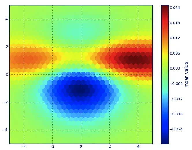
gridsize=参数?我想选择这样的参数,使六边形相互接触而不重叠。我注意到gridsize=100会产生较小的六边形,但应该如何选择适当的值呢? - Alexander Cska编辑:为了更好地近似Alejandro的答案,请参见下面。
我知道这是一个旧问题,但想向Alejandro的答案中添加一些内容:如果你想要一个漂亮平滑的图像而不使用py-sphviewer,你可以使用np.histogram2d,并将高斯滤波器(来自scipy.ndimage.filters)应用于热力图:
import numpy as np
import matplotlib.pyplot as plt
import matplotlib.cm as cm
from scipy.ndimage.filters import gaussian_filter


def myplot(x, y, s, bins=1000):
    heatmap, xedges, yedges = np.histogram2d(x, y, bins=bins)
    heatmap = gaussian_filter(heatmap, sigma=s)

    extent = [xedges[0], xedges[-1], yedges[0], yedges[-1]]
    return heatmap.T, extent


fig, axs = plt.subplots(2, 2)

# Generate some test data
x = np.random.randn(1000)
y = np.random.randn(1000)

sigmas = [0, 16, 32, 64]

for ax, s in zip(axs.flatten(), sigmas):
    if s == 0:
        ax.plot(x, y, 'k.', markersize=5)
        ax.set_title("Scatter plot")
    else:
        img, extent = myplot(x, y, s)
        ax.imshow(img, extent=extent, origin='lower', cmap=cm.jet)
        ax.set_title("Smoothing with  $\sigma$ = %d" % s)

plt.show()
产生:
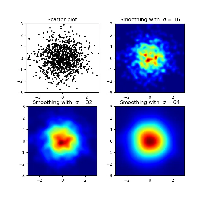
聚合散点图和s=16, 在Agape Gal'lo上面绘制 (点击以查看更好的视图):
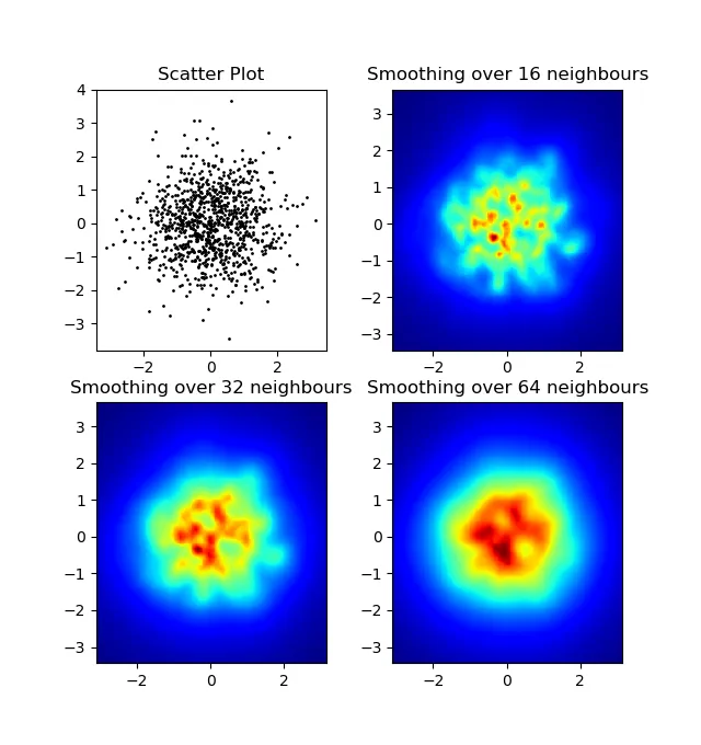
我注意到我的高斯滤波方法和Alejandro的方法的一个区别是,他的方法比我的方法更好地显示局部结构。因此,我在像素级别实现了一个简单的最近邻方法。该方法计算每个像素在数据中最接近的n个点的距离倒数之和。这种方法在高分辨率下非常耗费计算资源,我认为有更快的方法,所以如果您有任何改进,请告诉我。
更新:正如我所怀疑的那样,使用Scipy的scipy.cKDTree可以得到一个更快的方法。请参见Gabriel的答案来了解实现。
无论如何,这是我的代码:
import numpy as np
import matplotlib.pyplot as plt
import matplotlib.cm as cm
def data_coord2view_coord(p, vlen, pmin, pmax):
dp = pmax - pmin
dv = (p - pmin) / dp * vlen
return dv
def nearest_neighbours(xs, ys, reso, n_neighbours):
im = np.zeros([reso, reso])
extent = [np.min(xs), np.max(xs), np.min(ys), np.max(ys)]
xv = data_coord2view_coord(xs, reso, extent[0], extent[1])
yv = data_coord2view_coord(ys, reso, extent[2], extent[3])
for x in range(reso):
for y in range(reso):
xp = (xv - x)
yp = (yv - y)
d = np.sqrt(xp**2 + yp**2)
im[y][x] = 1 / np.sum(d[np.argpartition(d.ravel(), n_neighbours)[:n_neighbours]])
return im, extent
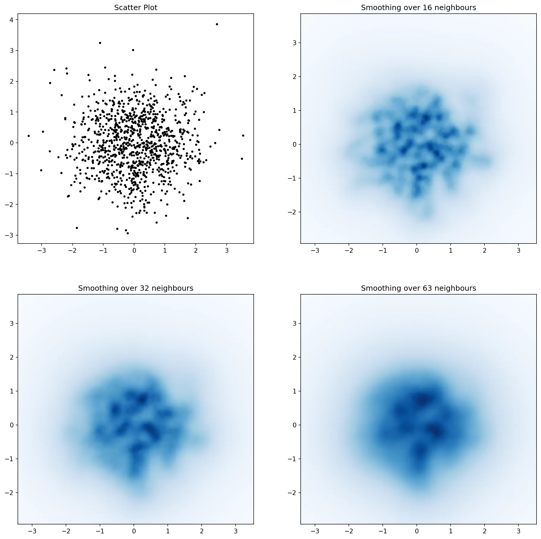
n = 1000
xs = np.random.randn(n)
ys = np.random.randn(n)
resolution = 250
fig, axes = plt.subplots(2, 2)
for ax, neighbours in zip(axes.flatten(), [0, 16, 32, 64]):
if neighbours == 0:
ax.plot(xs, ys, 'k.', markersize=2)
ax.set_aspect('equal')
ax.set_title("Scatter Plot")
else:
im, extent = nearest_neighbours(xs, ys, resolution, neighbours)
ax.imshow(im, origin='lower', extent=extent, cmap=cm.jet)
ax.set_title("Smoothing over %d neighbours" % neighbours)
ax.set_xlim(extent[0], extent[1])
ax.set_ylim(extent[2], extent[3])
plt.show()
结果:
myplot函数中,将range参数添加到np.histogram2d中:np.histogram2d(x, y, bins=bins, range=[[-5, 5], [-3, 4]]),并在for循环中设置轴的x和y限制:ax.set_xlim([-5, 5]) ax.set_ylim([-3, 4])。此外,默认情况下,imshow保持与轴的比例相同(因此在我的示例中为10:7),但如果您希望它与绘图窗口匹配,则将参数aspect='auto'添加到imshow中。 - Jurgy不要使用np.hist2d生成相当难看的直方图,我想重复利用py-sphviewer,这是一个Python包,用于使用自适应平滑核呈现粒子模拟,并且可以轻松地从pip安装(请参阅网页文档)。考虑以下基于示例的代码:
import numpy as np
import numpy.random
import matplotlib.pyplot as plt
import sphviewer as sph

def myplot(x, y, nb=32, xsize=500, ysize=500):
    xmin = np.min(x)
    xmax = np.max(x)
    ymin = np.min(y)
    ymax = np.max(y)

    x0 = (xmin+xmax)/2.
    y0 = (ymin+ymax)/2.

    pos = np.zeros([len(x),3])
    pos[:,0] = x
    pos[:,1] = y
    w = np.ones(len(x))

    P = sph.Particles(pos, w, nb=nb)
    S = sph.Scene(P)
    S.update_camera(r='infinity', x=x0, y=y0, z=0,
                    xsize=xsize, ysize=ysize)
    R = sph.Render(S)
    R.set_logscale()
    img = R.get_image()
    extent = R.get_extent()
    for i, j in zip(xrange(4), [x0,x0,y0,y0]):
        extent[i] += j
    print extent
    return img, extent

fig = plt.figure(1, figsize=(10,10))
ax1 = fig.add_subplot(221)
ax2 = fig.add_subplot(222)
ax3 = fig.add_subplot(223)
ax4 = fig.add_subplot(224)


# Generate some test data
x = np.random.randn(1000)
y = np.random.randn(1000)

#Plotting a regular scatter plot
ax1.plot(x,y,'k.', markersize=5)
ax1.set_xlim(-3,3)
ax1.set_ylim(-3,3)

heatmap_16, extent_16 = myplot(x,y, nb=16)
heatmap_32, extent_32 = myplot(x,y, nb=32)
heatmap_64, extent_64 = myplot(x,y, nb=64)

ax2.imshow(heatmap_16, extent=extent_16, origin='lower', aspect='auto')
ax2.set_title("Smoothing over 16 neighbors")

ax3.imshow(heatmap_32, extent=extent_32, origin='lower', aspect='auto')
ax3.set_title("Smoothing over 32 neighbors")

#Make the heatmap using a smoothing over 64 neighbors
ax4.imshow(heatmap_64, extent=extent_64, origin='lower', aspect='auto')
ax4.set_title("Smoothing over 64 neighbors")

plt.show()
它会生成以下图像:
如您所见,这些图像看起来非常漂亮,我们能够识别出其中的不同子结构。这些图像是通过在一个由平滑长度定义的特定域内每个点分配给定权重来构建的,平滑长度又由距离最近的nb邻居的距离(我选择了16、32和64作为示例)确定。因此高密度区域通常比低密度区域分布在更小的区域内。
函数myplot只是我编写的一个非常简单的函数,目的是将x,y数据提供给py-sphviewer进行处理。
pip3 install py-sphviewer 和上述代码时出现了 ValueError: Max 127 dimensions allowed 错误。Python 版本为 3.8.6。 - nmz787import numpy as np
import matplotlib.pyplot as plt
x = np.random.randn(100000)
y = np.random.randn(100000)
plt.hist2d(x,y,bins=100)
plt.show()
Seaborn现在有了jointplot函数,这在这里应该能很好地工作:
import numpy as np
import seaborn as sns
import matplotlib.pyplot as plt

# Generate some test data
x = np.random.randn(8873)
y = np.random.randn(8873)

sns.jointplot(x=x, y=y, kind='hex')
plt.show()
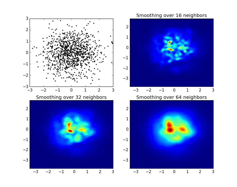
fig = plt.figure(figsize=(12, 12)) 创建图形,然后使用 ax=plt.gca() 获取当前轴,最后在 jointplot 函数中添加参数 ax=ax。 - wordsforthewise这里是Jurgy的最近邻方法,但使用scipy.cKDTree实现。在我的测试中,它大约快了100倍。
import numpy as np
import matplotlib.pyplot as plt
import matplotlib.cm as cm
from scipy.spatial import cKDTree


def data_coord2view_coord(p, resolution, pmin, pmax):
    dp = pmax - pmin
    dv = (p - pmin) / dp * resolution
    return dv


n = 1000
xs = np.random.randn(n)
ys = np.random.randn(n)

resolution = 250

extent = [np.min(xs), np.max(xs), np.min(ys), np.max(ys)]
xv = data_coord2view_coord(xs, resolution, extent[0], extent[1])
yv = data_coord2view_coord(ys, resolution, extent[2], extent[3])


def kNN2DDens(xv, yv, resolution, neighbours, dim=2):
    """
    """
    # Create the tree
    tree = cKDTree(np.array([xv, yv]).T)
    # Find the closest nnmax-1 neighbors (first entry is the point itself)
    grid = np.mgrid[0:resolution, 0:resolution].T.reshape(resolution**2, dim)
    dists = tree.query(grid, neighbours)
    # Inverse of the sum of distances to each grid point.
    inv_sum_dists = 1. / dists[0].sum(1)

    # Reshape
    im = inv_sum_dists.reshape(resolution, resolution)
    return im


fig, axes = plt.subplots(2, 2, figsize=(15, 15))
for ax, neighbours in zip(axes.flatten(), [0, 16, 32, 63]):

    if neighbours == 0:
        ax.plot(xs, ys, 'k.', markersize=5)
        ax.set_aspect('equal')
        ax.set_title("Scatter Plot")
    else:

        im = kNN2DDens(xv, yv, resolution, neighbours)

        ax.imshow(im, origin='lower', extent=extent, cmap=cm.Blues)
        ax.set_title("Smoothing over %d neighbours" % neighbours)
        ax.set_xlim(extent[0], extent[1])
        ax.set_ylim(extent[2], extent[3])

plt.savefig('new.png', dpi=150, bbox_inches='tight')
最初的问题是...如何将散点值转换为网格值,对吗?histogram2d可以计算每个单元格的频率,但是如果您需要除了频率之外的其他数据,则需要进行一些额外的工作。
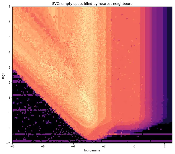
x = data_x # between -10 and 4, log-gamma of an svc
y = data_y # between -4 and 11, log-C of an svc
z = data_z #between 0 and 0.78, f1-values from a difficult dataset
我有一个数据集,其中包含X和Y坐标的Z结果。然而,我在感兴趣的区域之外计算了一些点(存在大间隙),而在一个小的感兴趣的区域内则有大量的点。
是的,在这里变得更加困难但也更有趣。一些库(抱歉):
from matplotlib import pyplot as plt
from matplotlib import cm
import numpy as np
from scipy.interpolate import griddata
今天我的图形引擎是pyplot, cm是一系列颜色映射,其中一些选择很有趣。 numpy用于计算, griddata用于将值附加到固定网格。
最后一个特别重要,因为xy点的频率在我的数据中不是均匀分布的。首先,让我们从一些边界开始,适合我的数据和任意网格大小。原始数据还具有超出这些x和y边界的数据点。
#determine grid boundaries
gridsize = 500
x_min = -8
x_max = 2.5
y_min = -2
y_max = 7
因此,我们已经定义了一个网格,其x和y的最小和最大值之间有500个像素。
在我的数据中,高度感兴趣的区域有比500个更多的值;而在低感兴趣区域,总网格中甚至不到200个值;在 x_min 和 x_max 的图形边界之间,甚至更少。
因此,为了得到一张漂亮的图片,任务是对高感兴趣的值进行平均,并填补其他地方的空白。
现在我要定义我的网格。对于每个 xx-yy 对,我想要有一个颜色。
xx = np.linspace(x_min, x_max, gridsize) # array of x values
yy = np.linspace(y_min, y_max, gridsize) # array of y values
grid = np.array(np.meshgrid(xx, yy.T))
grid = grid.reshape(2, grid.shape[1]*grid.shape[2]).T
这个奇怪的形状是为什么? scipy.griddata需要一个形状为(n, D)的数组。
Griddata通过预定义的方法计算网格中每个点的值。 我选择了“nearest” - 空的网格点将被最近邻居的值填充。这看起来好像信息较少的区域有更大的单元格(即使事实并非如此)。可以选择插值“linear”,然后信息较少的区域看起来就不那么锐利了。但这只是品味问题。
points = np.array([x, y]).T # because griddata wants it that way
z_grid2 = griddata(points, z, grid, method='nearest')
# you get a 1D vector as result. Reshape to picture format!
z_grid2 = z_grid2.reshape(xx.shape[0], yy.shape[0])
现在,我们将转交给matplotlib来显示图表
fig = plt.figure(1, figsize=(10, 10))
ax1 = fig.add_subplot(111)
ax1.imshow(z_grid2, extent=[x_min, x_max,y_min, y_max,  ],
            origin='lower', cmap=cm.magma)
ax1.set_title("SVC: empty spots filled by nearest neighbours")
ax1.set_xlabel('log gamma')
ax1.set_ylabel('log C')
plt.show()
在V形的尖端附近,我在寻找最佳位置时进行了大量计算,而其他地方的不太有趣的部分则具有较低的分辨率。
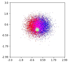
histplot(
    X,
    Y,
    labels,
    bins=2000,
    range=((-3,3),(-3,3)),
    normalize_each_label=True,
    colors = [
        [1,0,0],
        [0,1,0],
        [0,0,1]],
    gain=50)
heatmap_cells,对应你最终图像中的单元格,并将其初始化为全部为零。x_scale 和 y_scale。选择这些因子使得所有数据点都将落在热图数组的范围内。x_value 和 y_value 的原始数据点:
heatmap_cells[floor(x_value/x_scale),floor(y_value/y_scale)]+=1