ggplot并列geom_bar()

36

我想使用geom_bar()函数创建一个并排的条形图,基于这个数据框:
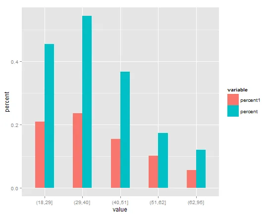
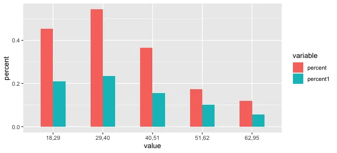
> dfp1
   value   percent1   percent
1 (18,29] 0.20909091 0.4545455
2 (29,40] 0.23478261 0.5431034
3 (40,51] 0.15492958 0.3661972
4 (51,62] 0.10119048 0.1726190
5 (62,95] 0.05660377 0.1194969

将数值放在x轴上,将百分比作为并排柱状图。我尝试使用以下代码:

p = ggplot(dfp1, aes(x = value, y= c(percent, percent1)), xlab="Age Group")
p = p + geom_bar(stat="identity", width=.5)  

然而,我遇到了这个错误:Error: Aesthetics must either be length one, or the same length as the dataProblems:value。我的percent和percent1与value的长度相同,所以我很困惑。感谢您的帮助。

2个回答

55

你需要先对数据进行融合,使用value作为融合的关键变量。默认情况下,它会创建另一个名为value的变量,所以你需要将其重命名(我将其称为percent)。然后,使用fill绘制新数据集,以将数据分组,并使用position = "dodge"将柱状图并排放置 (而不是堆叠在一起)。

library(reshape2)
library(ggplot2)
dfp1 <- melt(dfp1)
names(dfp1)[3] <- "percent"
ggplot(dfp1, aes(x = value, y= percent, fill = variable), xlab="Age Group") +
   geom_bar(stat="identity", width=.5, position = "dodge")  

在此输入图片描述


3
如何在dodge条形图中使用geom_text(aes(x=, y=, label=mylabels))选项,以便在每个条形上获得居中的标签? - skan

6

类似于David的回答,这里是使用tidyr:: pivot_longer在绘图前重塑数据的一个整洁宇宙选项:

library(tidyverse)

dfp1 %>% 
  pivot_longer(-value, names_to = "variable", values_to = "percent") %>% 
  ggplot(aes(x = value, y = percent, fill = variable), xlab="Age Group") + 
  geom_bar(stat = "identity", position = "dodge", width = 0.5)

enter image description here


1
有没有一种方法可以按百分比的总和对值(横坐标)进行排序? - Joe
1
xlab = "Age Group"是什么意思? - Caddisfly
@Caddisfly 这是要设置 x 轴标签。但应该是 xlab("年龄组")。 - wake_wake

网页内容由stack overflow 提供, 点击上面的
可以查看英文原文,
原文链接