使用ggplot绘制并列的条形图

3

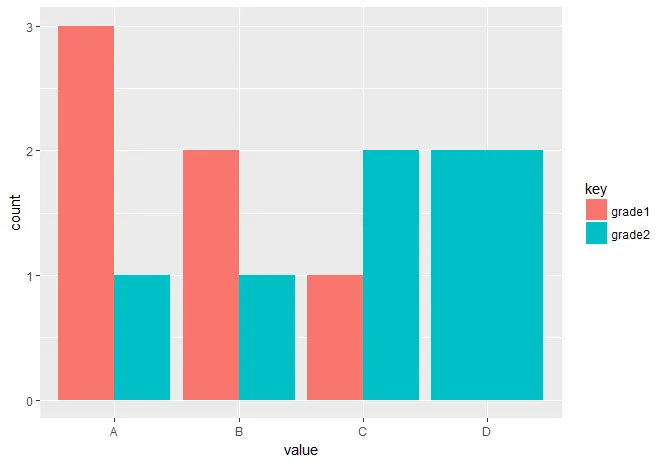
我正在尝试显示一个并排的条形图,比较2列中每个字母等级的计数。(A并排,B并排等)

> dat = data.frame(grade1 = c('A','A','A','B','B','C'), grade2 = c('A','B','C','C','D','D'))
> dat
  grade1 grade2
1      A      A
2      A      B
3      A      C
4      B      C
5      B      D
6      C      D
> ggplot(dat, aes(x=grade1, fill=grade2)) +
   geom_bar(position=position_dodge())

我想得到这样的结果,x轴上有4个标签(A、B、C、D)。我应该使用特定的dplyr函数吗?

https://i0.wp.com/martinsbioblogg.files.wordpress.com/2014/03/means-barplot.png


您的问题不够清晰,请解释清楚。 - Koundy
@koundy https://i0.wp.com/martinsbioblogg.files.wordpress.com/2014/03/means-barplot.png - ghost
1个回答

5

您需要将数据框转换为整洁的格式。为此,可以使用tidyr包的gather函数。为确保使用有序因子对字母等级进行正确排序是适当的:

library(tidyr)
library(ggplot2)

dat <- data.frame(grade1 = c('A','A','A','B','B','C'), grade2 = c('A','B','C','C','D','D'))

tidy_dat <- gather(dat)
tidy_dat[,2] <- ordered(tidy_dat[,2], levels = c('A','B','C','D'))

ggplot(tidy_dat, aes(x= value, fill = key))+
   geom_bar(position = 'dodge')

enter image description here


刚刚想到,但这个甚至更好。谢谢您,先生! - ghost

网页内容由stack overflow 提供, 点击上面的
可以查看英文原文,
原文链接