使用ggplot绘制包含2列数据的堆积条形图

3

我想创建一个堆叠条形图,展示数据框df的内容,但不想对数据进行转换,以便更易于理解。我的数据如下:

#Code
year <- c(1:5)
burglaries <- c(234,211,201,150,155)
robberies <- c(12, 19,18,23,25)
total <- burglaries + robberies
df <- data.frame(year, burglaries, robberies, total)

#Output
print(df)

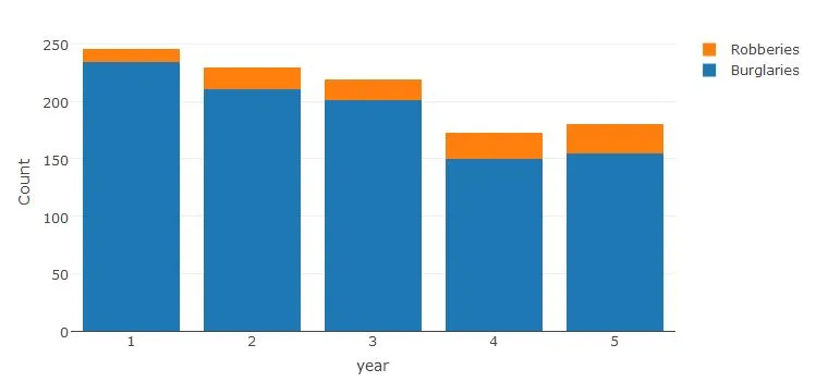
  year burglaries robberies total
1    1        234        12   246
2    2        211        19   230
3    3        201        18   219
4    4        150        23   173
5    5        155        25   180

我可以通过以下方式转换数据集来创建所需的图表:

我可以通过以下方式转换我的数据集来创建所需的图表:

df2 <- rbind(
        data.frame(year, "count" = burglaries, "type"="burglaries"),
        data.frame(year, "count" = robberies, "type"="robberies")
)

ggplot(df2, aes(x=year, y=count, fill=type)) +
    geom_bar(stat="identity")

在这里输入图片描述

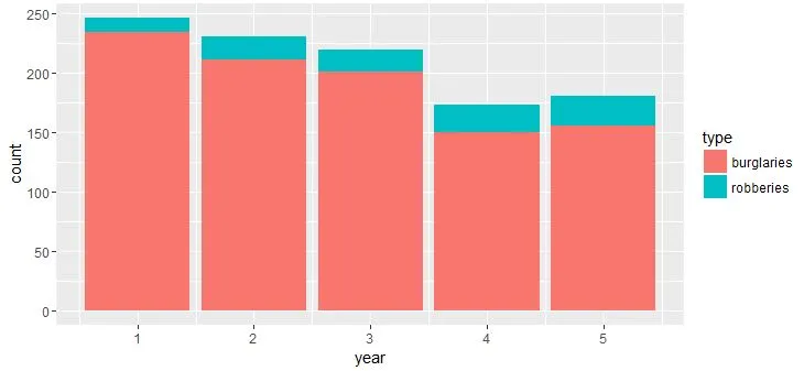
有没有办法使用数据框df创建相同的图形?虽然我可以转换数据,但我担心这会使程序更难以理解并且容易出错(我使用的数据集非常大)。


1
你正在违背 ggplot 的特定设计方式。ggplot 希望你首先转换(融合、收集、整理,无论你想如何称呼它)你的数据。因此,简短的答案是否定的,不太可能。 - joran
2个回答

3

我进行了一些额外的研究,发现库plotly中的plot_ly()函数可以让您做到这一点。这里是更多信息的链接:plotly网站

plot_ly(data=df, x = ~year, y = ~burglaries, type = 'bar', name = 'Burglaries') %>%
    add_trace(y = ~robberies, name = 'Robberies') %>%
    layout(yaxis = list(title = 'Count'), barmode = 'stack')

enter image description here


2
最终需要进行转换,但更优雅的做法是使用tidyr:
df %>% 
   select(-total) %>% 
   gather(type, count, burglaries:robberies) %>% 
   ggplot(., aes(x=year, y=count, fill=forcats::fct_rev(type))) +
   geom_bar(stat="identity")

网页内容由stack overflow 提供, 点击上面的
可以查看英文原文,
原文链接