我尝试制作一个变宽度的堆叠条形图,其中宽度表示分配平均值的数量,而高度表示分配的数量。
以下是我可以复现的数据:
我也看了mekko包,但似乎只适用于条形图。
以下是我最终想要的内容(不基于上面的数据):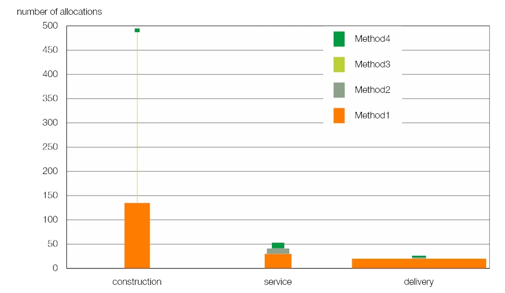 有什么办法可以解决我的问题吗?
以下是我可以复现的数据:
procedure = c("method1","method2", "method3", "method4","method1","method2", "method3", "method4","method1","method2", "method3","method4")
sector =c("construction","construction","construction","construction","delivery","delivery","delivery","delivery","service","service","service","service")
number = c(100,20,10,80,75,80,50,20,20,25,10,4)
amount_mean = c(1,1.2,0.2,0.5,1.3,0.8,1.5,1,0.8,0.6,0.2,0.9)

data0 = data.frame(procedure, sector, number, amount_mean)
当使用geom_bar并在aes中包含宽度时,会出现以下错误消息:
position_stack requires non-overlapping x intervals. Furthermore, the bars are no longer stacked.
bar<-ggplot(data=data0,aes(x=sector,y=number,fill=procedure, width = amount_mean)) +
geom_bar(stat="identity")
我也看了mekko包,但似乎只适用于条形图。
以下是我最终想要的内容(不基于上面的数据):
有什么办法可以解决我的问题吗?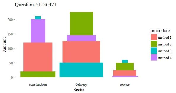
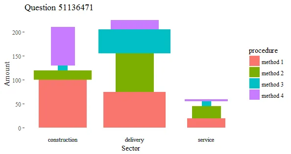
geom_rect。 - Richard Telfordgeom_tile来做,它可以让你设置一个矩形的中心点,然后设置它的宽度和高度,但是看起来有些奇怪。 - camille