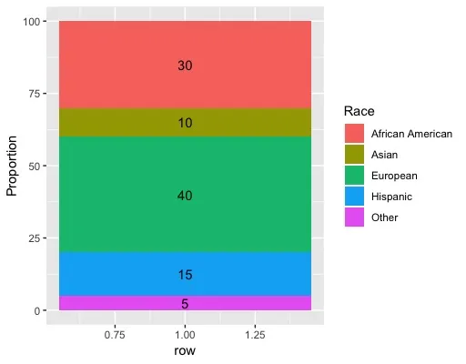
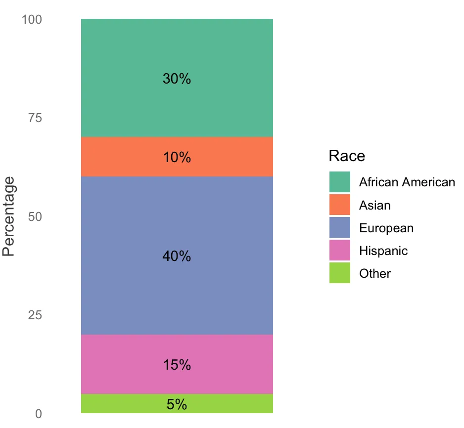
Ancestry <- data.frame(Race = c("European", "African American", "Asian", "Hispanic", "Other"), Proportion = c(40, 30, 10, 15, 5))
Ancestry %>%
ggplot(aes(y = Proportion, fill = Race)) +
  geom_bar(stat="identity", colour="white")
运行上述代码会给我以下错误:
Warning in min(x, na.rm = na.rm) :
  no non-missing arguments to min; returning Inf
Warning in max(x, na.rm = na.rm) :
  no non-missing arguments to max; returning -Inf
Warning in min(diff(sort(x))) :
  no non-missing arguments to min; returning Inf
Warning in x - width/2 :
  longer object length is not a multiple of shorter object length
Warning in x + width/2 :
  longer object length is not a multiple of shorter object length
Error in data.frame(list(y = c(40, 30, 10, 15, 5), fill = c(3L, 1L, 2L,  :
  arguments imply differing number of rows: 5, 2947
我希望创建一个类似于这个的堆叠条形图:
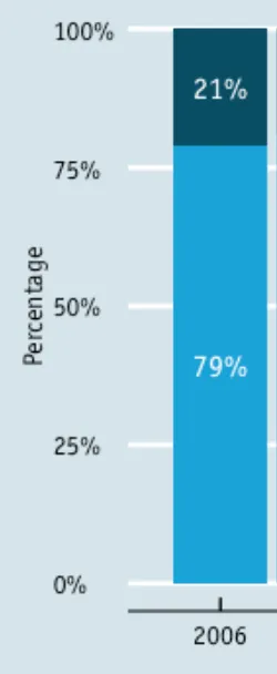


aes(x = "2006")代替虚拟变量。 - Benjamin Ziepert