我正在尝试创建一个标记的堆积条形图,其中只有一根条形。我的堆栈不总是足够大以适应文本,因此我希望对于不能适应堆栈的标签,可以有指向其右侧标签的引线。或者,如果所有标签都在堆栈右侧且带有引线,那也可以。
我的数据框大致如下:
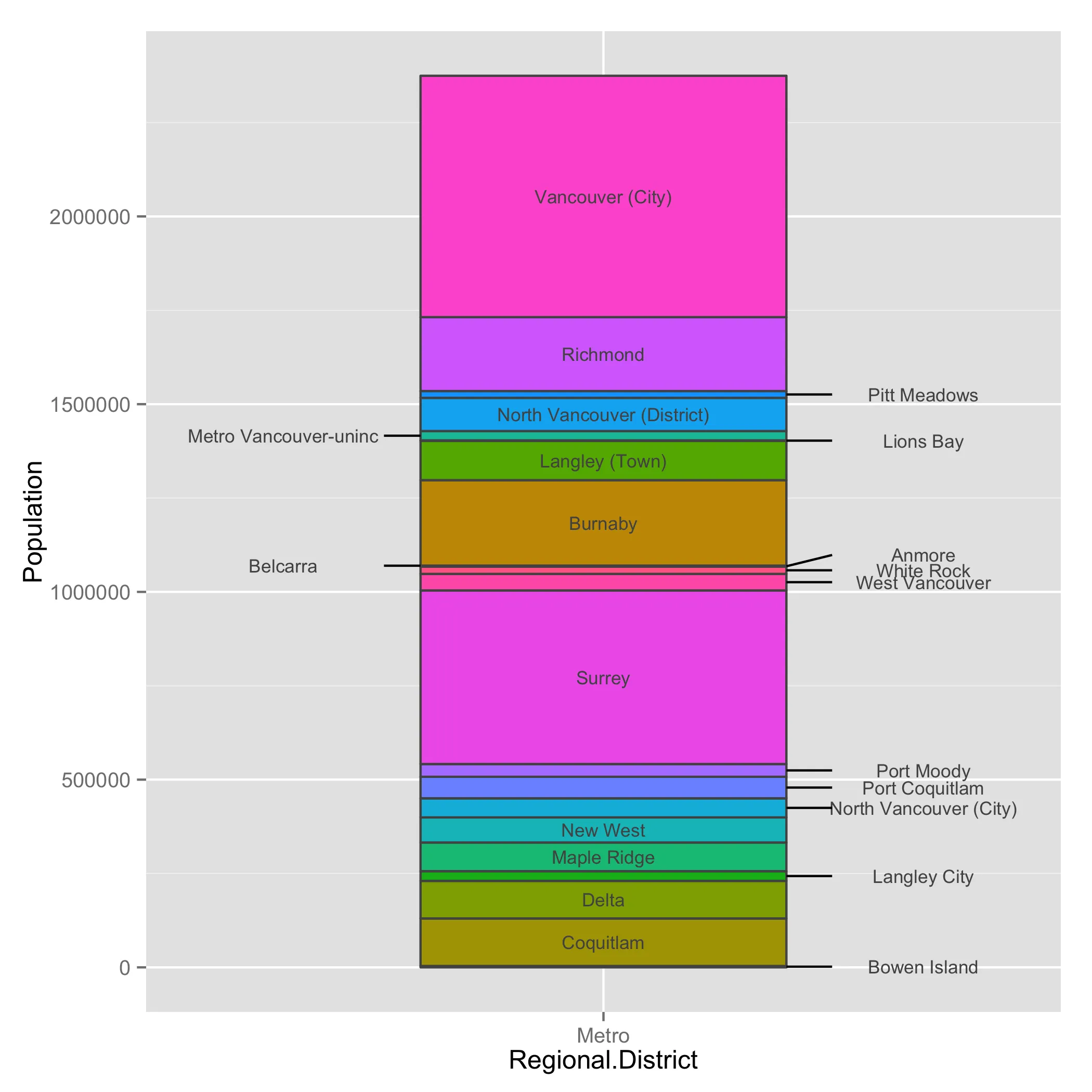
这是我目前已经实现的内容: 这是我想要实现的内容:
 这是我的代码:
我的数据框大致如下:
Regional.District   Municipality Population.2010        mp
Metro               Bowen Island            3678    1839.0
Metro                  Coquitlam          126594   66975.0
Metro                      Delta          100000  180272.0
Metro               Langley City           25858  243201.0
Metro                Maple Ridge           76418  294339.0
Metro                   New West           66892  365994.0
Metro     North Vancouver (City)           50725  424802.5
Metro             Port Coquitlam           57431  478880.5
Metro                 Port Moody           33933  524562.5
Metro                     Surrey          462345  772701.5
Metro             West Vancouver           44058 1025903.0
Metro                 White Rock           19278 1057571.0
Metro                     Anmore            2203 1068311.5
Metro                   Belcarra             690 1069758.0
Metro                    Burnaby          227389 1183797.5
Metro             Langley (Town)          104697 1349840.5
Metro                  Lions Bay            1395 1402886.5
Metro      Metro Vancouver-uninc           24837 1416002.5
Metro North Vancouver (District)           88370 1472606.0
Metro               Pitt Meadows           18136 1525859.0
Metro                   Richmond          196858 1633356.0
Metro           Vancouver (City)          642843 2053206.5
这是我目前已经实现的内容:
这是我想要实现的内容:
这是我的代码:library(ggplot2)
ggplot(muns, aes(x = Regional.District, y = Population.2010, fill = Municipality)) +
geom_bar(stat = 'identity', colour = 'gray32', width = 0.6, show_guide = FALSE) +
geom_text(aes(y = muns$mp, label = muns$Municipality), colour = 'gray32')
这是否可以自动化? 我可以不使用ggplot2来完成这个任务。谢谢!