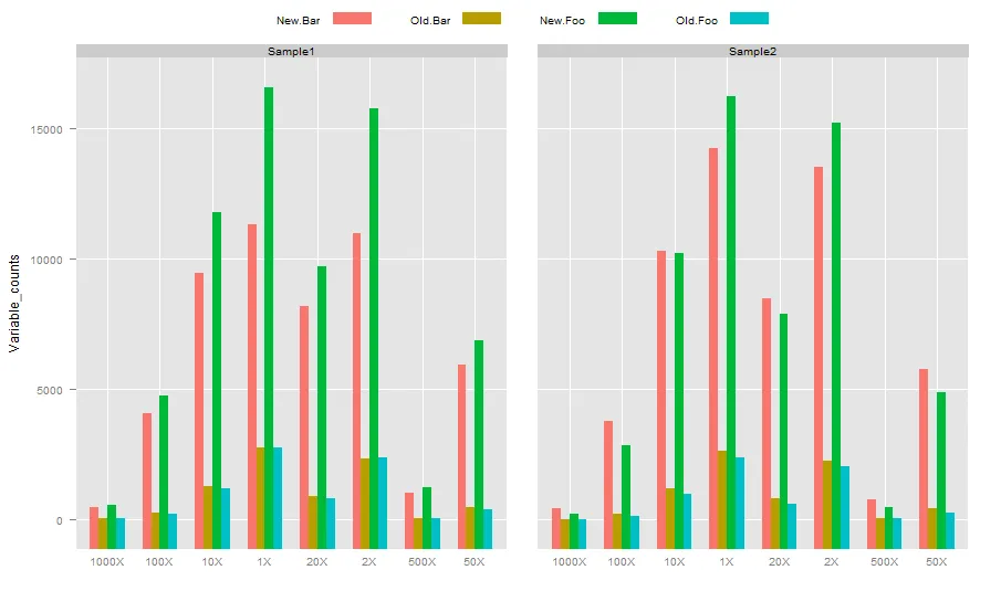
我正在尝试绘制这个数据的柱形图。
到目前为止,我编写的R脚本如下:
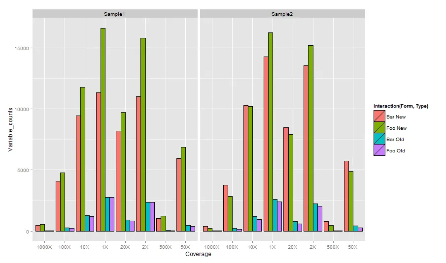
这段代码的输出结果如下: 。
。
我想知道是否可以通过不同的颜色显示“表格”变量,或者至少可以在各自的柱形下方命名它们,或者任何可能的东西? 非常感谢您的帮助。
到目前为止,我编写的R脚本如下:
library(ggplot2)
f<-read.table("Coverage_test", sep="\t", header=TRUE)
f$Coverage <- factor(f$Coverage, levels=unique(as.character(f$Coverage)))
g = ggplot(data=f, aes(x=Coverage, y=Variable_counts, group=Form, fill=Type))
+ geom_bar(position="dodge", stat="identity", colour="black")
+ facet_grid( ~ Sample_name, scales="free") + opts(title = "Coverage", axis.text.x = theme_text(angle = 90, hjust = 1, size = 8, colour = "grey50"))
+ ylab("Number of variables") + scale_fill_hue() + scale_y_continuous(formatter="comma")
ggsave("Figure_test_coverage.pdf")
这段代码的输出结果如下:
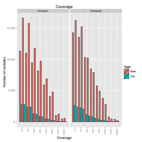
。我想知道是否可以通过不同的颜色显示“表格”变量,或者至少可以在各自的柱形下方命名它们,或者任何可能的东西? 非常感谢您的帮助。