在ggplot中平滑绘制相邻的条形图

4

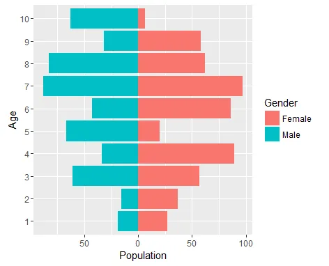
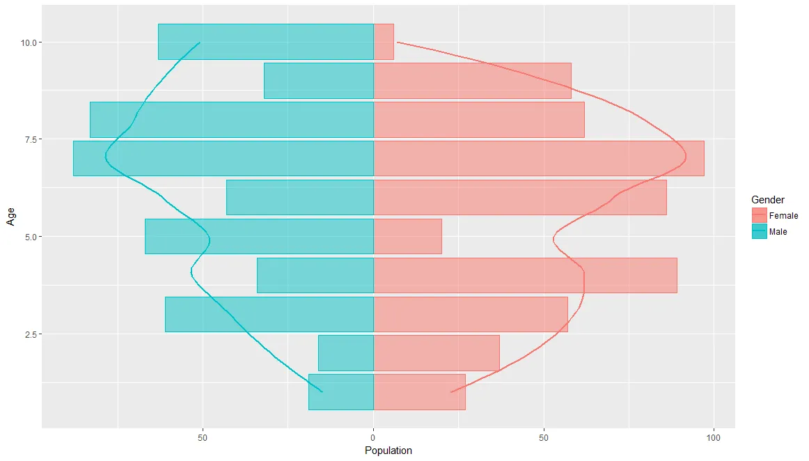
我从一个未回答的 问题 重新创建了这个图。但是我想知道如何将柱状图叠加或替换为平滑的图表,即将X轴上的点链接在一起。如果是替换柱状图,则最好用颜色填充。我尝试使用geom_smooth进行调整,但无法实现我想要的效果,希望能得到帮助。下面是我讨论的问题的图表和代码。

set.seed(1)
df0 <- data.frame(Age = factor(rep(x = 1:10, times = 2)), 
                  Gender = rep(x = c("Female", "Male"), each = 10),
                  Population = sample(x = 1:100, size = 20))

head(df0)
#   Age Gender Population
# 1   1 Female         27
# 2   2 Female         37
# 3   3 Female         57
# 4   4 Female         89
# 5   5 Female         20
# 6   6 Female         86

library("ggplot2")
ggplot(data = df0, aes(x = Age, y = Population, fill = Gender)) +
  geom_bar(data = subset(df0, Gender=="Female"),
           stat = "identity") +
  geom_bar(data = subset(df0, Gender=="Male"),
           stat = "identity",
           position = "identity",
           mapping = aes(y = -Population)) +
  scale_y_continuous(labels = abs) +
  coord_flip()

简单的金字塔图

1个回答

2

如果我不知道你在使用 geom_smooth 时遇到了什么问题,我只能猜测它为什么不能正常工作。也许这与你在数据框中将年龄转换为因子有关?

我将年龄转换为数字,然后以下内容对我有效:

df1 <- df0 %>% mutate(Age = as.numeric(as.character(Age)))
ggplot(df1,
       aes(x = Age, y = Population, fill = Gender, colour = Gender)) +
  geom_bar(data = subset(df1, Gender=="Female"), alpha = 0.5,
           stat = "identity") +
  geom_bar(data = subset(df1, Gender=="Male"), alpha = 0.5,
           stat = "identity",
           position = "identity",
           mapping = aes(y = -Population)) +
  geom_smooth(data = subset(df1, Gender=="Female"), se = F) +
  geom_smooth(data = subset(df1, Gender=="Male"), se = F,
              mapping = aes(y=-Population)) +
  scale_y_continuous(labels = abs) +
  coord_flip()

生成的图表(平滑线覆盖在条形图上)


网页内容由stack overflow 提供, 点击上面的
可以查看英文原文,
原文链接