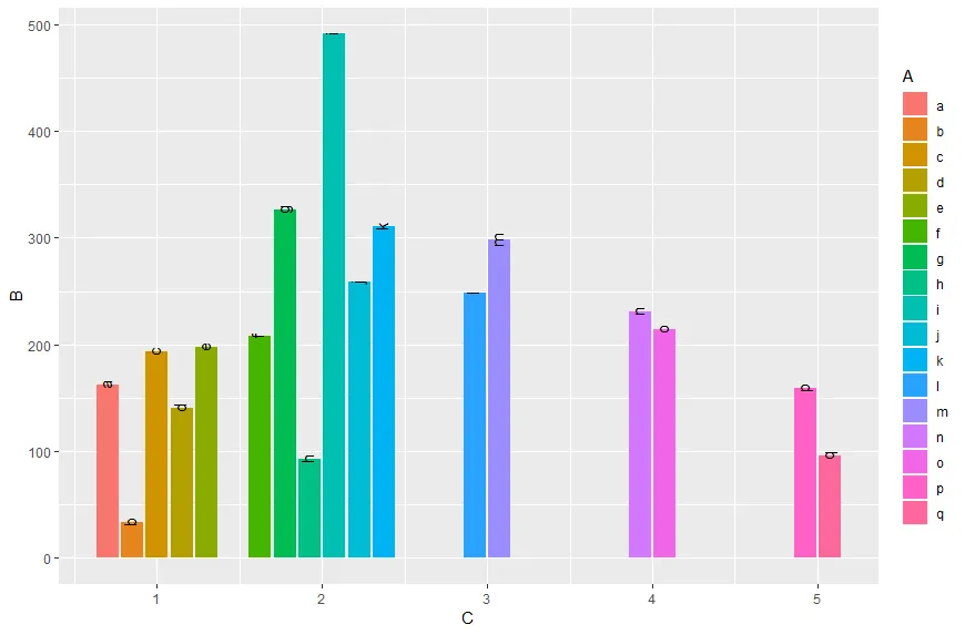
更新
自从ggplot2_3.0.0版本以来,您现在可以使用preserve = c("total", "single")与position_dodge2一起使用。
ggplot(data,aes(x = C,  y = B, label = A, fill = A)) +
  geom_col(position = position_dodge2(width = 0.9, preserve = "single")) +
  geom_text(position = position_dodge2(width = 0.9, preserve = "single"), angle = 90, vjust=0.25)
原始回答
如已经评论所述,您可以像在这个answer中那样做:
使用tidyr的complete将A和C转换为因子,并添加未见过的变量。自最近的ggplot2版本以来,建议在stat =“identity”的情况下使用geom_col而不是geom_bar:
data %>%
  as.tibble() %>%
  mutate_at(c("A", "C"), as.factor) %>%
  complete(A,C) %>%
  ggplot(aes(x = C,  y = B, fill = A)) +
  geom_col(position = "dodge")
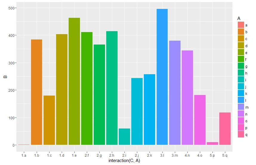
或者使用交互项:
data %>%
  ggplot(aes(x = interaction(C, A),  y = B, fill = A)) +
  geom_col(position = "dodge")
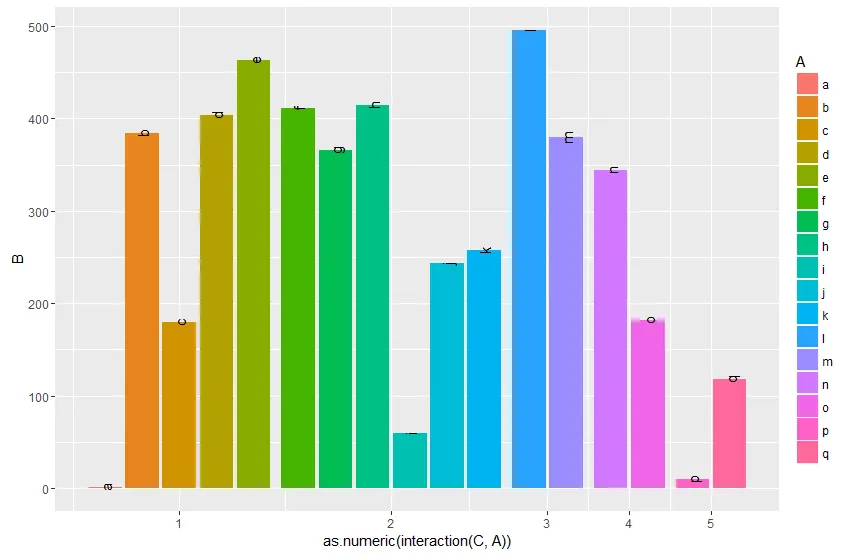
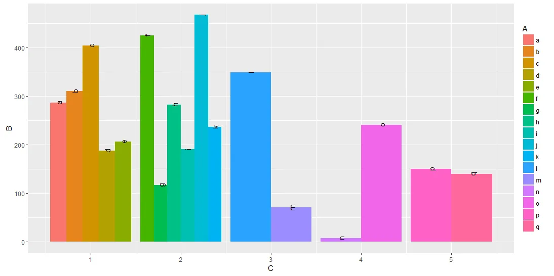
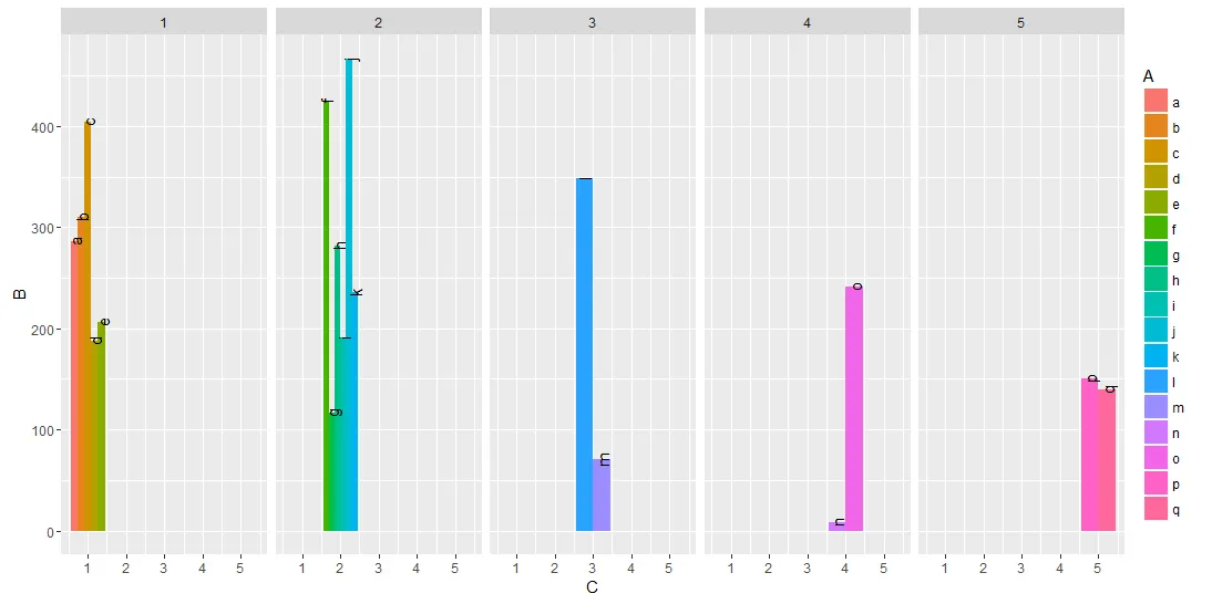
通过最终将交互转换为数字,您可以根据所需的输出设置x轴。通过分组(
group_by),您可以计算匹配的断点。在ggplot参数周围使用
{}的花式技巧是必要的,以便直接在管道中使用变量
Breaks和
C。
data %>%
  mutate(gr=as.numeric(interaction(C, A))) %>%
  group_by(C) %>%
  mutate(Breaks=mean(gr)) %>%
  {ggplot(data=.,aes(x = gr,  y = B, fill = A, label = A)) +
   geom_col(position = "dodge") +
   geom_text(position = position_dodge(width = 0.9), angle = 90 ) +
   scale_x_continuous(breaks = unique(.$Breaks),
                     labels = unique(.$C))}
编辑:
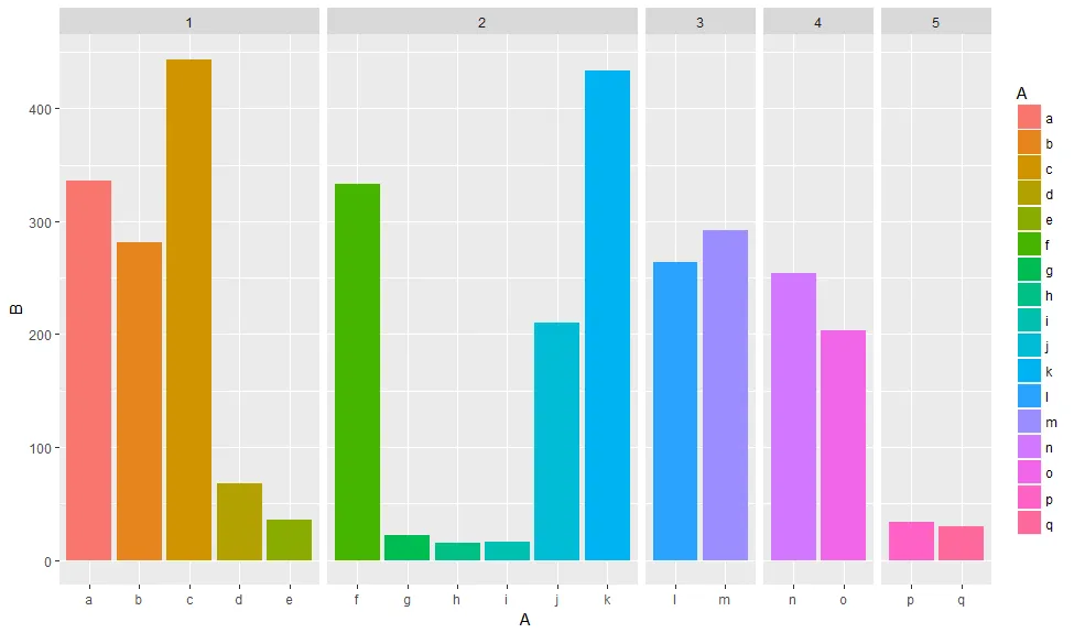
另一种方法是使用 facets。使用 space = "free_x" 可以设置宽度与 x 轴比例相关。
library(tidyverse)
data %>%
  ggplot(aes(x = A,  y = B, fill = A))  +
   geom_col(position = "dodge") +
   facet_grid(~C, scales = "free_x", space = "free_x")
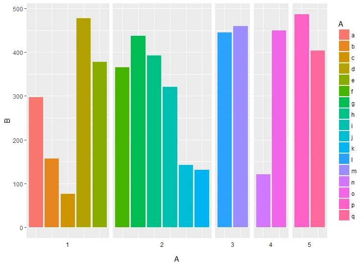
你也可以使用switch将分面标签绘制在底部,并删除x轴标签。
data %>%
  ggplot(aes(x = A,  y = B, fill = A))  +
  geom_col(position = "dodge") +
  facet_grid(~C, scales = "free_x", space = "free_x", switch = "x") +
  theme(axis.text.x = element_blank(),
        axis.ticks.x = element_blank(),
        strip.background = element_blank())
aes(x = )的情况下完成这个任务。如果您在geom_bar()中观察到的数量不均匀,该函数将限制单个观察宽度为组的宽度,以便所有观察都可见。 - Nate