我正在尝试在通过Pandas创建的三面板直方图上放置x和y轴标签以及标题,但似乎无法正确放置。我得到的唯一结果是在最后一个图形上有一个标题和一个x轴标签。我想要一个总体标题、xlabel和ylabel。下面是制作图表的代码。有什么建议吗?
df1.hist(column='human_den',by='region',sharex=True,sharey=True,layout=(1,3))
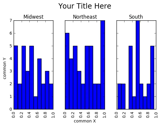
在接受答案这里的基础上,使用subplots创建Figure和axis对象实例。
import pandas as pd
import numpy as np
import matplotlib.pyplot as plt

# random data
df1 = pd.DataFrame(columns=['human_den','region'])
df1['human_den'] = np.random.rand(100)
df1['region'] = np.random.choice(['Northeast', 'South', 'Midwest'], size=100)

# set up figure & axes
fig, axes = plt.subplots(nrows=1, ncols=3, sharex=True, sharey=True)

# drop sharex, sharey, layout & add ax=axes
df1.hist(column='human_den',by='region', ax=axes)

# set title and axis labels
plt.suptitle('Your Title Here', x=0.5, y=1.05, ha='center', fontsize='xx-large')
fig.text(0.5, 0.04, 'common X', ha='center')
fig.text(0.04, 0.5, 'common Y', va='center', rotation='vertical')
注意,在df1.hist()中,关键字参数sharex、sharey和layout没有被赋值,而是使用plt.subplots中的sharex、sharey、nrows和ncols来实现类似的效果。重要的元素是将df.hist()的关键字参数ax分配给先前初始化的axes对象。标题可以使用suptitle设置。
plot()函数与kind、title、xlabel和ylabel,例如:plot(kind='hist', title='我的标题', xlabel='x 轴', ylabel='y 轴')。 - Pierz