为 Pandas 直方图设置轴标签

21

我还比较新手,所以可能有非常显然的答案。抱歉!

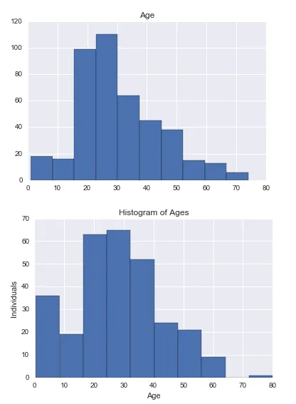
我正在通过groupby绘制两个直方图。 我希望我的子图都具有相同的x和y标签以及一个共同的标题。我以为sharex=True会起作用,但是很明显不行,因为这样设置之后df.hist就失效了。我尝试过各种版本的设置xlabels,但现在感到困惑。

import pylab as pl
from pandas import *

histo_survived = df.groupby('Survived').hist(column='Age', sharex=True, sharey=True)
pl.title("Histogram of Ages")
pl.xlabel("Age")
pl.ylabel("Individuals")

所以最终我只得到了子图的标签。

Out: <matplotlib.text.Text at 0x11a27ead0>

我的直方图截图

有没有解决这个问题的想法?(必须使用pandas/python。)

2个回答

37

标签是轴对象的属性,需要在每个轴对象上设置。

这里有一个我用过的例子:

frame = pd.DataFrame([np.random.rand(20), np.sign(np.random.rand(20) - 0.5)]).T
frame.columns = ['Age', 'Survived']

# Note that you can let the hist function do the groupby
# the function hist returns the list of axes created
axarr = frame.hist(column='Age', by = 'Survived', sharex=True, sharey=True, layout = (2, 1))

for ax in axarr.flatten():
    ax.set_xlabel("Age")
    ax.set_ylabel("Individuals")

嗨,谢谢!我尝试了一下,我现在觉得我搞定了!(不包括frame.columns这一行)。 - Dana Roemling

0

我来这里寻找同样的东西,但发现在plotly中更容易实现

import plotly.express as px

px.histogram(df, x="t_depth", nbins=150).update_layout(
    xaxis = dict(dtick=10), bargap=0.2
)

enter image description here


网页内容由stack overflow 提供, 点击上面的
可以查看英文原文,
原文链接