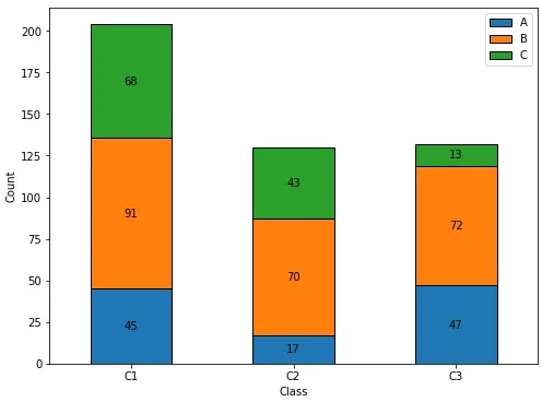
导入和测试数据框
import pandas as pd
import matplotlib.pyplot as plt
A = [45, 17, 47]
B = [91, 70, 72]
C = [68, 43, 13]
df = pd.DataFrame(data={'A': A, 'B': B, 'C': C}, index=['C1', 'C2', 'C3'])
A B C
C1 45 91 68
C2 17 70 43
C3 47 72 13
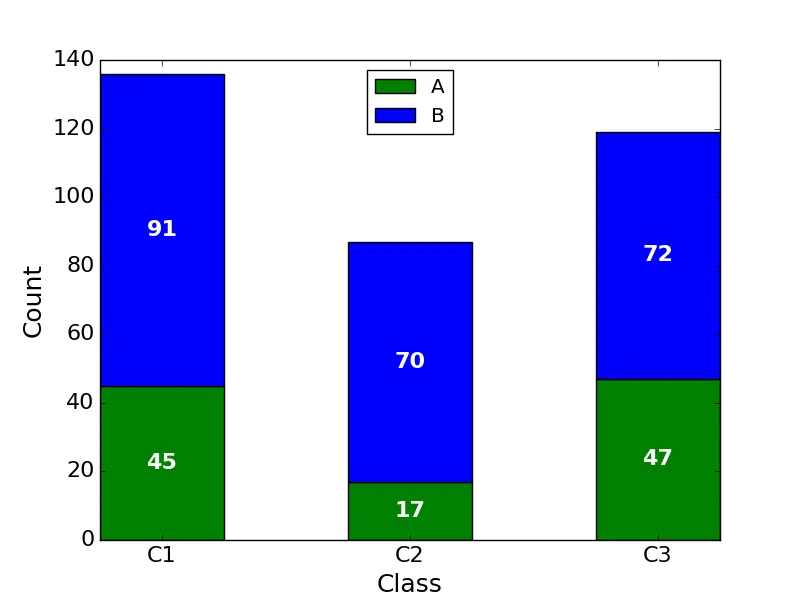
更新至matplotlib v3.4.2
- 使用
matplotlib.pyplot.bar_label,它会自动将值居中显示在柱状图上。
- 有关使用
.bar_label的详细信息和示例,请参阅如何在柱状图上添加值标签。
- 已测试通过
pandas v1.2.4,该版本使用matplotlib作为绘图引擎。
- 如果柱状图的某些部分为零,请参考我的答案,其中展示了如何自定义
.bar_label()的labels。
ax.bar_label(c, fmt='%0.0f', label_type='center')将更改数字格式,以显示不带小数位的数值(如果需要)。
ax = df.plot(kind='bar', stacked=True, figsize=(8, 6), rot=0, xlabel='Class', ylabel='Count')
for c in ax.containers:
labels = [v.get_height() if v.get_height() > 0 else '' for v in c]
ax.bar_label(c, labels=labels, label_type='center')
其他用于删除小片段标签的选项可以使用fmt
- 在matplotlib 3.7更新中,
bar_label的fmt参数现在接受{}风格的格式字符串。
fmt=lambda x: f'{x:.0f}' if x > 0 else ''fmt=lambda x: np.where(x > 0, f'{x:.0f}', '')与np.where一起使用
ax = df.plot(kind='bar', stacked=True, figsize=(8, 6), rot=0, xlabel='Class', ylabel='Count')
for c in ax.containers:
    ax.bar_label(c, fmt=lambda x: f'{x:.0f}' if x > 0 else '', label_type='center')
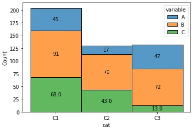
Seaborn选项
Seaborn DataFrame格式
df = pd.DataFrame(data={'A': A, 'B': B, 'C': C, 'cat': ['C1', 'C2', 'C3']})
A B C cat
0 45 91 68 C1
1 17 70 43 C2
2 47 72 13 C3
df = df.melt(id_vars='cat')
cat variable value
0 C1 A 45
1 C2 A 17
2 C3 A 47
3 C1 B 91
4 C2 B 70
5 C3 B 72
6 C1 C 68
7 C2 C 43
8 C3 C 13
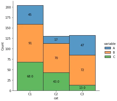
坐标轴级别图
ax = sns.histplot(data=df, x='cat', hue='variable', weights='value', discrete=True, multiple='stack')
for c in ax.containers:
labels = [v.get_height() if v.get_height() > 0 else '' for v in c]
ax.bar_label(c, labels=labels, label_type='center')
图表层级绘图
g = sns.displot(data=df, x='cat', hue='variable', weights='value', discrete=True, multiple='stack')
for ax in g.axes.flat:
for c in ax.containers:
labels = [v.get_height() if v.get_height() > 0 else '' for v in c]
ax.bar_label(c, labels=labels, label_type='center')
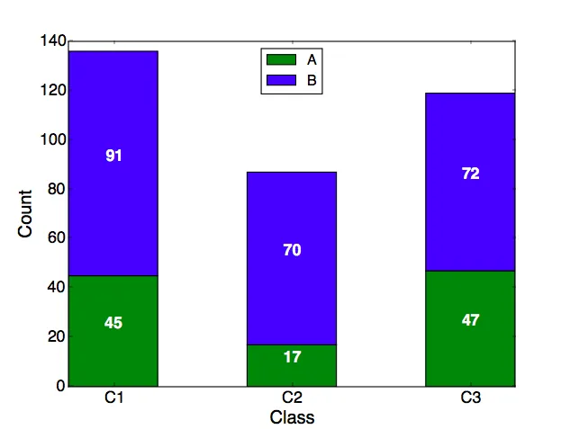
原始答案
- 使用
.patches方法解压缩一个matplotlib.patches.Rectangle对象列表,每个堆叠条的部分对应一个对象。
- 每个
.Rectangle都有提取矩形定义的各种值的方法。
- 每个
.Rectangle按从左到右、从底到顶的顺序排列,所以当通过.patches进行迭代时,每个级别的所有.Rectangle对象都按顺序出现。
- 标签使用f-string创建,
label_text = f'{height}',因此可以根据需要添加任何其他文本,例如label_text = f'{height}%'
label_text = f'{height:0.0f}'将显示没有小数位的数字。
绘图
plt.style.use('ggplot')
ax = df.plot(stacked=True, kind='bar', figsize=(12, 8), rot='horizontal')
for rect in ax.patches:
height = rect.get_height()
width = rect.get_width()
x = rect.get_x()
y = rect.get_y()
label_text = f'{height}'
label_x = x + width / 2
label_y = y + height / 2
if height > 0:
ax.text(label_x, label_y, label_text, ha='center', va='center', fontsize=8)
ax.legend(bbox_to_anchor=(1.05, 1), loc='upper left', borderaxespad=0.)
ax.set_ylabel("Count", fontsize=18)
ax.set_xlabel("Class", fontsize=18)
plt.show()

绘制水平条形图的方法如下:
kind='barh'label_text = f'{width}'if width > 0:
归属权:
jsoma/chart.py