如何使用Seaborn在条形图上添加聚合值注释

7
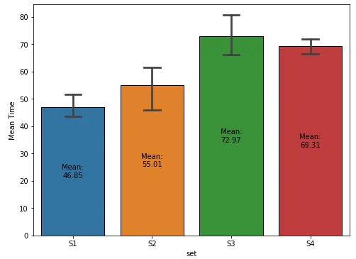
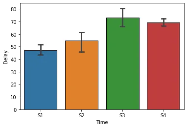
如何修改以下代码,以在每个条形图上显示均值和不同的误差线?
import numpy as np
import pandas as pd
import matplotlib.pyplot as plt
import seaborn as sns
sns.set_style("white")

a,b,c,d = [],[],[],[]

for i in range(1,5):
   np.random.seed(i)
   a.append(np.random.uniform(35,55))
   b.append(np.random.uniform(40,70))
   c.append(np.random.uniform(63,85))
   d.append(np.random.uniform(59,80))

data_df =pd.DataFrame({'stages':[1,2,3,4],'S1':a,'S2':b,'S3':c,'S4':d})
print("Delay:")

display(data_df)

          S1         S2         S3         S4
0  43.340440  61.609735  63.002516  65.348984
1  43.719898  40.777787  75.092575  68.141770
2  46.015958  61.244435  69.399904  69.727380
3  54.340597  56.416967  84.399056  74.011136

meansd_df=data_df.describe().loc[['mean', 'std'],:].drop('stages', axis = 1)
display(meansd_df)

sns.set()
sns.set_style('darkgrid',{"axes.facecolor": ".92"}) # (1)
sns.set_context('notebook')
fig, ax = plt.subplots(figsize = (8,6))

x = meansd_df.columns
y = meansd_df.loc['mean',:]
yerr = meansd_df.loc['std',:]
plt.xlabel("Time", size=14)
plt.ylim(-0.3, 100)
width = 0.45

for i, j,k in zip(x,y,yerr): # (2)
    ax.bar(i,j, width, yerr = k, edgecolor = "black",
          error_kw=dict(lw=1, capsize=8, capthick=1))  #  (3)
 ax.set(ylabel = 'Delay')
 from matplotlib import ticker
 ax.yaxis.set_major_locator(ticker.MultipleLocator(10)) 
 plt.savefig("Over.png", dpi=300, bbox_inches='tight')
2个回答

13

样本数据和 DataFrame

  • 使用 .iloc [:, 1:] 跳过列索引为 0 的 'stages' 列。
import pandas as pd
import numpy as np
import seaborn as sns
import matplotlib.pyplot as plt

# given data_df from the OP, select the columns except stage and reshape to long format
df = data_df.iloc[:, 1:].melt(var_name='set', value_name='val')

# display(df.head())
  set        val
0  S1  43.340440
1  S1  43.719898
2  S1  46.015958
3  S1  54.340597
4  S2  61.609735

更新至matplotlib v3.4.2

fig, ax = plt.subplots(figsize=(8, 6))

# add the plot
sns.barplot(x='set', y='val', data=df, capsize=0.2, ax=ax)

# add the annotation
ax.bar_label(ax.containers[-1], fmt='Mean:\n%.2f', label_type='center')

ax.set(ylabel='Mean Time')
plt.show()

输入图像描述

使用 seaborn.barplot 绘制图表

  • 在版本 3.4.2 之前使用 matplotlib
  • estimator 参数的默认值为 mean,因此柱子的高度是组的平均值。
  • 通过 .get_heightp 中提取条形高度,可用于注释条形。
fig, ax = plt.subplots(figsize=(8, 6))
sns.barplot(x='set', y='val', data=df, capsize=0.2, ax=ax)

# show the mean
for p in ax.patches:
    h, w, x = p.get_height(), p.get_width(), p.get_x()
    xy = (x + w / 2., h / 2)
    text = f'Mean:\n{h:0.2f}'
    ax.annotate(text=text, xy=xy, ha='center', va='center')

ax.set(xlabel='Delay', ylabel='Time')
plt.show()

2

Seaborn在处理长格式数据时表现最强大。因此,您可能需要转换您的数据,类似于以下方式:

sns.barplot(data=data_df.melt('stages', value_name='Delay', var_name='Time'), 
            x='Time', y='Delay',
            capsize=0.1, edgecolor='k')

输出:

在此输入图像描述


网页内容由stack overflow 提供, 点击上面的
可以查看英文原文,
原文链接