- 在
python 3.11、pandas 1.5.3 和 matplotlib 3.7.1 中进行了测试
导入和加载数据
import pandas as pd
import matplotlib.pyplot as plt
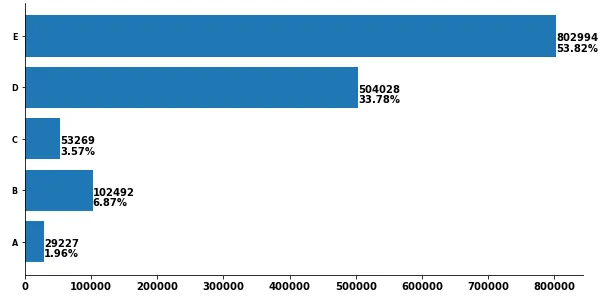
counts = [29227, 102492, 53269, 504028, 802994]
df = pd.DataFrame(data=counts, columns=['counts'], index=['A','B','C','D','E'])
df['%'] = df.counts.div(df.counts.sum()).mul(100).round(2)
counts %
A 29227 1.96
B 102492 6.87
C 53269 3.57
D 504028 33.78
E 802994 53.82
使用 matplotlib 版本 3.4.2 绘制图表
- 使用
matplotlib.pyplot.bar_label
- 有关使用
.bar_label 的详细信息和示例,请参见 如何在条形图上添加值标签。
- 如果使用垂直条形图,请改用
v.get_height() 而不是 v.get_width()。
- 可以使用
fmt 参数进行一些格式设置,但更复杂的格式设置应使用 labels 参数。
pandas 使用 matplotlib 作为默认的绘图后端。
ax = df.plot(kind='barh', y='counts', figsize=(10, 5), legend=False, width=.75,
title='This is the plot generated by all code examples in this answer')
labels = [f' {v.get_width()}\n {df.iloc[i, 1]}%' for i, v in enumerate(ax.containers[0])]
ax.bar_label(ax.containers[0], labels=labels, label_type='edge', size=13)
ax.spines['right'].set_visible(False)
ax.spines['top'].set_visible(False)
plt.show()
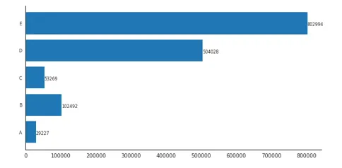
在 matplotlib 版本 3.4.2 之前使用 matplotlib 绘图
ax = df.plot(kind='barh', y='counts', figsize=(10, 5), legend=False, width=.75)
for i, y in enumerate(ax.patches):
label_per = df.iloc[i, 1]
ax.text(y.get_width()+.09, y.get_y()+.3, str(round((y.get_width()), 1)), fontsize=10)
ax.text(y.get_width()+.09, y.get_y()+.1, str(f'{round((label_per), 2)}%'), fontsize=10)
ax.spines['right'].set_visible(False)
ax.spines['top'].set_visible(False)
plt.show()
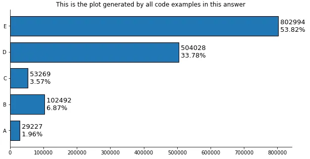
没有使用 pandas 的原始答案
import matplotlib.pyplot as plt
fig, ax = plt.subplots(figsize=(10, 5))
counts = [29227, 102492, 53269, 504028, 802994]
percents = [100*x/sum(counts) for x in counts]
y_ax = ('A','B','C','D','E')
y_tick = np.arange(len(y_ax))
ax.barh(range(len(counts)), counts, align = "center", color = "tab:blue")
ax.set_yticks(y_tick)
ax.set_yticklabels(y_ax, size = 8)
for i, y in enumerate(ax.patches):
label_per = percents[i]
ax.text(y.get_width()+.09, y.get_y()+.3, str(round((y.get_width()), 1)), fontsize=10)
ax.text(y.get_width()+.09, y.get_y()+.1, str(f'{round((label_per), 2)}%'), fontsize=10)
ax.spines['right'].set_visible(False)
ax.spines['top'].set_visible(False)
plt.show()
- 您可以调整位置。
- JohanC 提到了其他格式选项。
- 将文本的两个部分打印在一个字符串中,
\n 之间以获得 "自然" 行间距:
str(f'{round((y.get_width()), 1)}\n{round((label_per), 2)}%')- 使用
ax.text(..., va='center') 竖直居中并能够使用稍大的字体。
- 使用
ax.set_xlim(0, max(counts) * 1.18) 获得更多文本空间。
- 每行文本都以空格开头,以获得自然的 "水平" 填充。
- 注意
{ 前面的空格:str(f' {round((label_per), 2)}%')
- 当这些值处于万位数时,
y.get_width()+.09 与 y.get_width() 几乎相同。