简而言之:
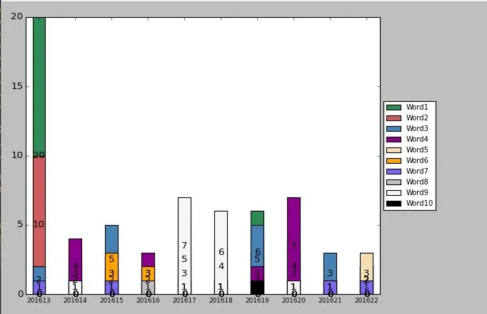
我正在尝试制作一个堆积条形图,并在其中标记每个柱子的适当值。但由于某种原因,柱子的高度完全错误。例如,第一周绿色的柱子应该有20点长,但实际只有10点。红色的柱子应该有10点长,但只有8点左右。第17周应该有多个柱子,但实际上只有一个(白色的)。
我猜测由于错误的柱子高度,标签也被放错了位置。我不知道为什么最底部的0也显示出来了,但这也是一个问题。
我不知道这些是否都是单独的问题,应该在单独的帖子中提出,但我觉得它们都有联系,有一个解决它们所有的答案。
这是当前的图表展示:
- 柱子的高度与数字不匹配。
- 标签似乎放置在错误的高度上。(应该位于每个柱子的中间)
- 在底部我还看到了“0”的标签,我真的不想在图表中看到它们。
我正在尝试制作一个堆积条形图,并在其中标记每个柱子的适当值。但由于某种原因,柱子的高度完全错误。例如,第一周绿色的柱子应该有20点长,但实际只有10点。红色的柱子应该有10点长,但只有8点左右。第17周应该有多个柱子,但实际上只有一个(白色的)。
我猜测由于错误的柱子高度,标签也被放错了位置。我不知道为什么最底部的0也显示出来了,但这也是一个问题。
我不知道这些是否都是单独的问题,应该在单独的帖子中提出,但我觉得它们都有联系,有一个解决它们所有的答案。
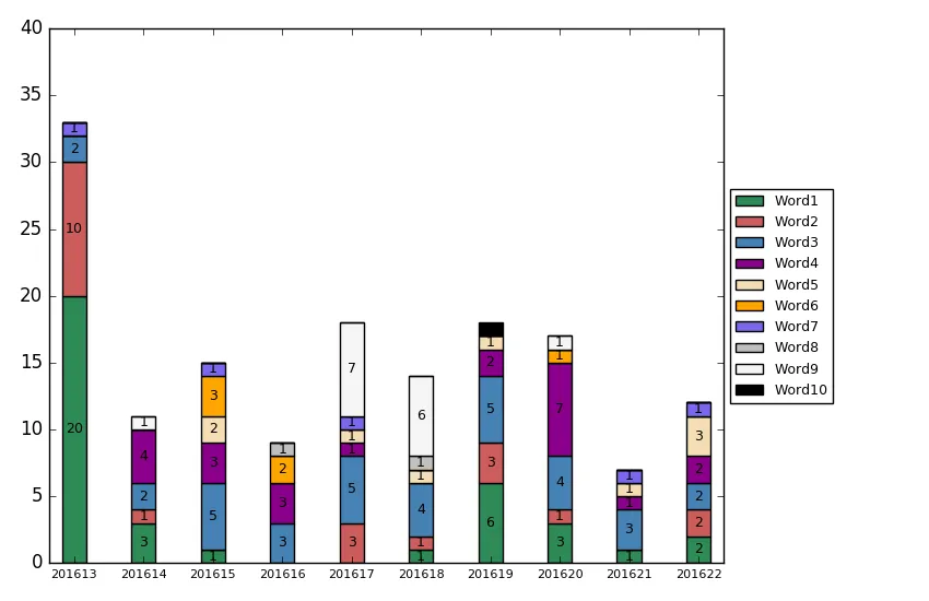
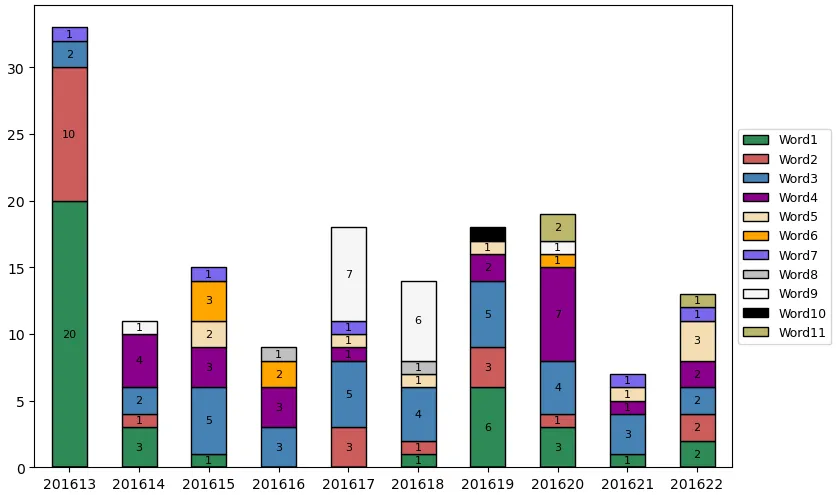
import matplotlib.pyplot as plt
import numpy as np


newYearWeek =[201613, 201614, 201615, 201616, 201617, 201618, 201619, 201620, 201621, 201622]
uniqueNames = ['Word1', 'Word2', 'Word3', 'Word4', 'Word5', 'Word6',
                'Word7', 'Word8', 'Word9', 'Word10', 'Word11']

#Each column in the multiarray from top to bottom represents 1 week
#Each row from left to right represents the values of that word.
#So that makes 11 rows and 10 columns.
#And yes the multidimensional array have to be like this with the 0's in it.
keywordsMuliarray = [
    [20, 3, 1, 0, 0, 1, 6, 3, 1, 2],
    [10, 1, 0, 0, 3, 1, 3, 1, 0, 2],
    [2, 2, 5, 3, 5, 4, 5, 4, 3, 2],
    [0, 4, 3, 3, 1, 0, 2, 7, 1, 2],
    [0, 0, 2, 0, 1, 1, 1, 0, 1, 3],
    [0, 0, 3, 2, 0, 0, 0, 1, 0, 0],
    [1, 0, 1, 0, 1, 0, 0, 0, 1, 1],
    [0, 0, 0, 1, 0, 1, 0, 0, 0, 0],
    [0, 1, 0, 0, 7, 6, 0, 1, 0, 0],
    [0, 0, 0, 0, 0, 0, 1, 0, 0, 0],
    [0, 0, 0, 0, 0, 0, 0, 2, 0, 1]]

fig = plt.figure(figsize=(8.5, 5.5))
ax = fig.add_subplot(111)
fig.subplots_adjust(top=0.85)

N = len(newYearWeek)
ind = np.arange(N)    # the x locations for the groups
width = 0.35       # the width of the bars: can also be len(x) sequence

colors = ['seagreen', 'indianred', 'steelblue', 'darkmagenta', 'wheat',
           'orange', 'mediumslateblue', 'silver',
           'whitesmoke', 'black', 'darkkhaki', 'dodgerblue', 'crimson',
           'sage', 'navy', 'plum', 'darkviolet', 'lightpink']

def autolabel(rects, values):
    # Attach some text labels.
    for (rect, value) in zip(rects, values):
        ax.text(rect.get_x() + rect.get_width() / 2.,
                rect.get_y() + rect.get_height() / 2.,
                '%d'%value,
                ha = 'center',
                va = 'center')
left = np.zeros(len(uniqueNames)) # left alignment of data starts at zero
helpingNumber = 0
for i in range(0, len(newYearWeek)):
    rects1 = plt.bar(ind, keywordsMuliarray[helpingNumber][:],width, color=colors[helpingNumber], label=uniqueNames[helpingNumber])
    autolabel(rects1, keywordsMuliarray[helpingNumber][:])
    helpingNumber = helpingNumber+1

# Shrink current axis by 20%
box = ax.get_position()
ax.set_position([box.x0, box.y0, box.width * 1, box.height])

# Put a legend to the right of the current axis
ax.legend(loc='center left', fontsize=9, bbox_to_anchor=(1, 0.5))

#plt.ylabel('Scores')
plt.xticks(ind + width/2., newYearWeek, fontsize=8)
#plt.yticks(np.arange(0, 81, 10))
plt.margins(x=0.02)
plt.tight_layout(rect=[0,0,0.8,1])
plt.show()
这是当前的图表展示: