如何在水平堆叠条形图中将跟踪文本居中对齐

3
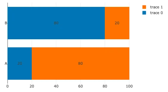
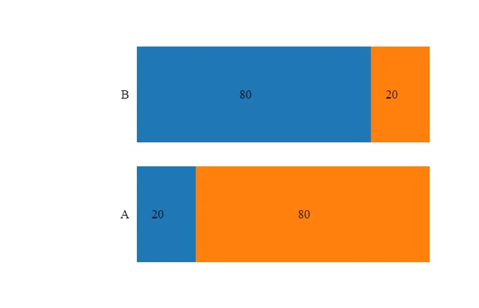
我有一个堆叠的水平条形图,希望为每个图跟定义文本,放置在相应条形的中心位置。我找不到一个设置此项的属性而不使用注释的方法,但我想为每个图使用 "text",并只能对齐它。
我正在使用 Plotly 3.4.1 和 Jupyter(Plotly 离线版)。除了尝试使用注释来实现这一目标,我找不到任何关于如何做到这一点的文档,如果我想要指定明确的坐标,则注释似乎是更合适的解决方案。我想要更简单的方法(比如 "align": "center"),但是在 go.Bar 下没有找到任何属性可以用于此项。
我只想让 "80"、"20" 出现在中心位置,而不是靠右对齐。
from plotly.offline import iplot, plot, init_notebook_mode
import plotly.graph_objs as go

def getStackedSentimentHbar():
    trace0 = go.Bar(
        y=["A","B"],
        x=[20,80],
        orientation = 'h',
        text=["20","80"],
        textposition="inside",
        hoverinfo = "none",
    )
    trace1 = go.Bar(
        y=["A","B"],
        x=[80,20],
        orientation = 'h',
        text=["80","20"],
        textposition="inside",
        hoverinfo = "none",
    )
    data = [trace0,trace1]
    layout = go.Layout(
        barmode='stack',
        showlegend=False,
        xaxis=dict(
            showgrid=False,
            zeroline=False,
            showline=False,
            ticks='',
            showticklabels=False
        ),
        yaxis=dict(
            showgrid=False,
            zeroline=False,
            showline=False,
            ticks='',
            showticklabels=True
        ),
        margin = dict(
            l = 200, 
            r = 50, 
            b = 50, 
            t = 50, 
            pad = 10
        ),
        font=dict(
            family='Heebo', 
            size=18, 
            color='#000000'
        )
    )
    fig = go.Figure(data=data, layout=layout)
    return fig

init_notebook_mode()
fig = getStackedSentimentHbar()
iplot(fig)
3个回答

1
一个更好的方法 - 使用单独的注释。

enter image description here

var x1A = 20;
var x1B = 80;
var x2A = 80;
var x2B = 20;
var trace1 = {
  y: ['A', 'B'],
  x: [x1A, x1B],
  type: 'bar',
  orientation: 'h',
};

var trace2 = {
  y: ['A', 'B'],
  x: [x2A, x2B],
  type: 'bar',
  orientation: 'h',
};

var data = [trace1, trace2];

var layout = {
  barmode: 'stack',
  annotations: [
    { x: x1A / 2, y: 'A', text: '20', showarrow: false },
    { x: x1A + x2A / 2, y: 'A', text: '80', showarrow: false },
    { x: x1B / 2, y: 'B', text: '80', showarrow: false },
    { x: x1B + x2B / 2, y: 'B', text: '20', showarrow: false },
  ],
};

Plotly.newPlot('myDiv', data, layout);
<head>
    <!-- Load plotly.js into the DOM -->
    <script src='https://cdn.plot.ly/plotly-2.0.0.min.js'></script>
</head>

<body>
    <div id='myDiv'><!-- Plotly chart will be drawn inside this DIV --></div>
</body>

这是来自官方Plotly文档的示例:https://plotly.com/python/horizontal-bar-charts/#color-palette-for-bar-chart

1
据我所知,Plotly 中没有这样的参数,但我们总是可以对 Plotly 进行修改 :)
让我们只复制所有的 x 和 y 值,但保留 text 不变。
下面的代码中有两个函数,getStackedSentimentHbar 和 getStackedSentimentHbarCentered。第一个函数返回原始图形,第二个函数返回带有(几乎)居中标签的图形。

enter image description here

from plotly.offline import iplot, plot, init_notebook_mode
import plotly.graph_objs as go

LAYOUT = go.Layout(
        barmode='stack',
        showlegend=False,
        xaxis=dict(
            showgrid=False,
            zeroline=False,
            showline=False,
            ticks='',
            showticklabels=False
        ),
        yaxis=dict(
            showgrid=False,
            zeroline=False,
            showline=False,
            ticks='',
            showticklabels=True
        ),
        margin = dict(
            l = 200, 
            r = 50, 
            b = 50, 
            t = 50, 
            pad = 10
        ),
        font=dict(
            family='Heebo', 
            size=18, 
            color='#000000'
        )
    )

def getStackedSentimentHbar(values):

    data = []
    for i, x in enumerate(values['x']):
        trace = go.Bar(
            x=x,
            y=values['y'][i],
            orientation='h',
            text=x,
            textposition='inside',
            hoverinfo = 'none',
        )
        data.append(trace)

    fig = go.Figure(data=data, layout=LAYOUT)
    return fig

def getStackedSentimentHbarCentered(values):

    data = []
    for i, x in enumerate(values['x']):

        trace = go.Bar(
            x=[int(i / 2) for i in x * 2],
            y=values['y'][i] * 2,
            orientation = 'h',
            text=x,
            textposition='inside',
            hoverinfo = 'none'
        )
        data.append(trace)

    fig = go.Figure(data=data, layout=LAYOUT)
    return fig

values = {'x': [[20, 80], [80, 20]],
          'y': [['A', 'B'], ['A', 'B']]}

init_notebook_mode()
fig = getStackedSentimentHbarCentered(values)
iplot(fig)

0

正如在this问题的答案中所指出的那样,您可以通过设置 insidetextanchor="start" (或'middle'或'end')来更轻松地实现此目标。


网页内容由stack overflow 提供, 点击上面的
可以查看英文原文,
原文链接