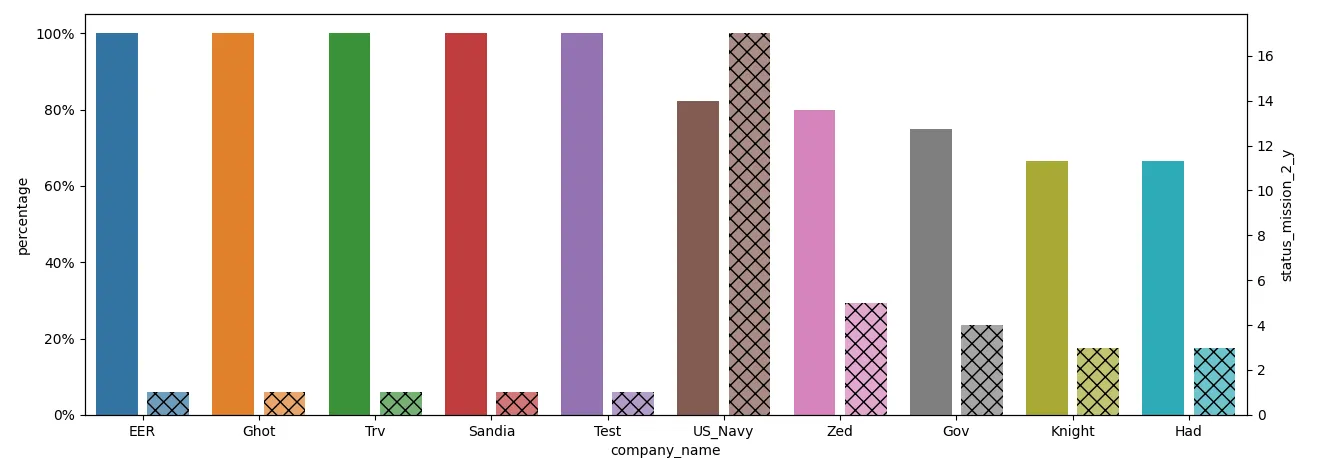
Seaborn绘制两个具有相同颜色和相同x位置的条形图。
以下示例代码调整了条形图的宽度,将属于
ax的条形图向左移动,将
ax2的条形图向右移动。为了区分右侧的条形图,使用半透明度(
alpha=0.7)和符号来进行标记。
import matplotlib.pyplot as plt
from matplotlib.ticker import PercentFormatter
import pandas as pd
import seaborn as sns
from io import StringIO

data_str = '''company_name  percentage  status_mission_2_y
EER 1   1
Ghot    1   1
Trv 1   1
Sandia  1   1
Test    1   1
"US Navy"   0.823529412 17
Zed 0.8 5
Gov 0.75    4
Knight  0.666666667 3
Had 0.666666667 3'''
data = pd.read_csv(StringIO(data_str), delim_whitespace=True)

x_ = data.columns[0]
y_ = data.columns[1]
y_2 = data.columns[2]

data1 = data[[x_, y_]]
data2 = data[[x_, y_2]]
plt.figure(figsize=(15, 8))
ax = sns.barplot(x=x_, y=y_, data=data1)
width_scale = 0.45
for bar in ax.containers[0]:
    bar.set_width(bar.get_width() * width_scale)
ax.yaxis.set_major_formatter(PercentFormatter(1))

ax2 = ax.twinx()
sns.barplot(x=x_, y=y_2, data=data2, alpha=0.7, hatch='xx', ax=ax2)
for bar in ax2.containers[0]:
    x = bar.get_x()
    w = bar.get_width()
    bar.set_x(x + w * (1- width_scale))
    bar.set_width(w * width_scale)

plt.show()
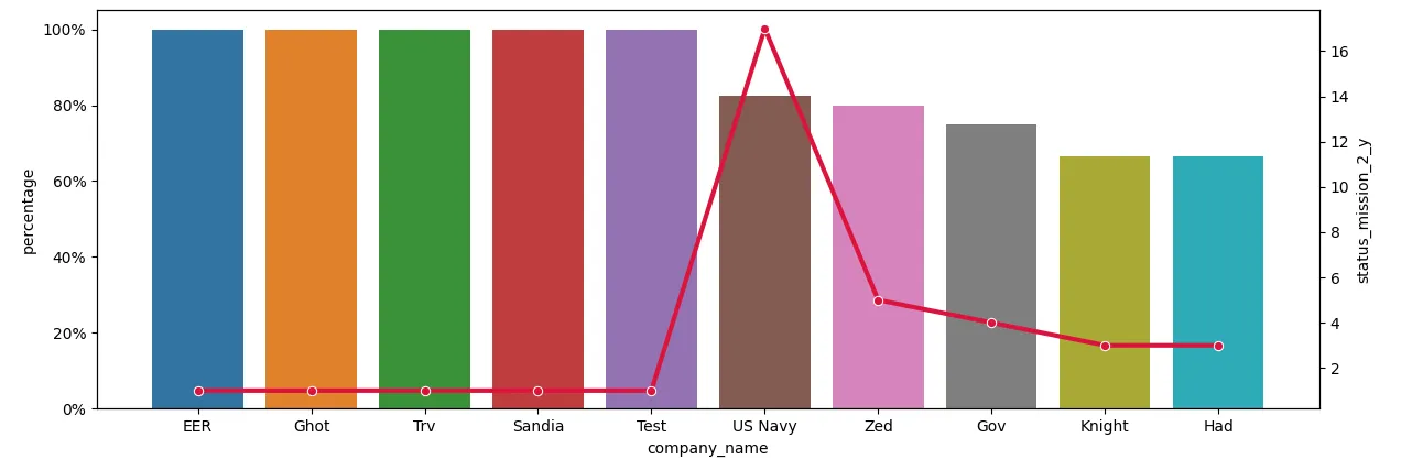
一个更简单的替代方案是将
ax上的
barplot和
ax2上的
lineplot合并在一起。
plt.figure(figsize=(15, 8))
ax = sns.barplot(x=x_, y=y_, data=data1)
ax.yaxis.set_major_formatter(PercentFormatter(1))

ax2 = ax.twinx()
sns.lineplot(x=x_, y=y_2, data=data2, marker='o', color='crimson', lw=3, ax=ax2)

plt.show()