如何在Plotly Express中绘制次要y轴

30
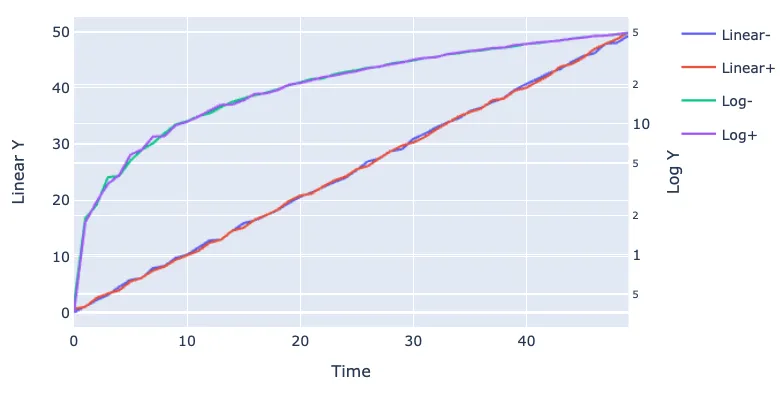
如何使用plotly.express在一个Pandas数据框中绘制多条线到两个y轴?我发现这对于绘制包含特定子字符串的所有列非常有用:
    fig = px.line(df, y=df.filter(regex="Linear").columns, render_mode="webgl")

因为我不想循环遍历所有过滤列并使用类似以下的内容:

    fig.add_trace(go.Scattergl(x=df["Time"], y=df["Linear-"]))

在每次迭代中。


感谢vestland的建议,但在问题和答案中并没有使用plotly express。相反,它多次使用了go.Scatter(x=df["x"], y=df["y"])。我想通过plotly express实现的是px.line(df, y=<list of column labels>),以一次性绘制所有特定列。目前,Plotly express不支持直接将线添加到secondary_y。因此,采用了下面我在答案中展示的间接方法。我很快会在问题中澄清这一点。对于熟悉plotly的人来说,这可能是小菜一碟。但对我来说花费了一些时间 :) - derflo
你似乎是正确的! - vestland
2个回答

59

我花了一些时间来琢磨这个,但我认为这可能对某些人有用。

# import some stuff
import plotly.express as px
from plotly.subplots import make_subplots
import pandas as pd
import numpy as np

# create some data
df = pd.DataFrame()
n = 50
df["Time"] = np.arange(n)
df["Linear-"] = np.arange(n)+np.random.rand(n)
df["Linear+"] = np.arange(n)+np.random.rand(n)
df["Log-"] = np.arange(n)+np.random.rand(n)
df["Log+"] = np.arange(n)+np.random.rand(n)
df.set_index("Time", inplace=True)

subfig = make_subplots(specs=[[{"secondary_y": True}]])

# create two independent figures with px.line each containing data from multiple columns
fig = px.line(df, y=df.filter(regex="Linear").columns, render_mode="webgl",)
fig2 = px.line(df, y=df.filter(regex="Log").columns, render_mode="webgl",)

fig2.update_traces(yaxis="y2")

subfig.add_traces(fig.data + fig2.data)
subfig.layout.xaxis.title="Time"
subfig.layout.yaxis.title="Linear Y"
subfig.layout.yaxis2.type="log"
subfig.layout.yaxis2.title="Log Y"
# recoloring is necessary otherwise lines from fig und fig2 would share each color
# e.g. Linear-, Log- = blue; Linear+, Log+ = red... we don't want this
subfig.for_each_trace(lambda t: t.update(line=dict(color=t.marker.color)))
subfig.show()

完成的图表

这个技巧是使用

subfig.for_each_trace(lambda t: t.update(line=dict(color=t.marker.color)))

我从nicolaskruchten这里得到了以下内容:https://dev59.com/nrjoa4cB1Zd3GeqPH_q-#60031260


4
好的回答!很少有人花时间引用他们的来源。 - vestland
真的是一个非常棒的解决方案,谢谢! - physiker
1
如果您对for_each_trace生成的颜色不满意,可以单独更新它们。例如,subfig.data[0].line.update({'color': 'black'})将第一条线更新为黑色。 - Jakob
如何在两个y轴之间共享指南线?两个y轴应该有不同的刻度,但是要共享相同的指南线。 - PaleNeutron

4

感谢derflo和vestland!我真的想使用Plotly Express而不是Graph Objects和双轴,以更轻松地处理具有大量列的数据框。我将其放入一个函数中。Data1/2作为DataFrame或Series运行良好。

import plotly.express as px
from plotly.subplots import make_subplots
import pandas as pd

def plotly_dual_axis(data1,data2, title="", y1="", y2=""):
    # Create subplot with secondary axis
    subplot_fig = make_subplots(specs=[[{"secondary_y": True}]])

    #Put Dataframe in fig1 and fig2
    fig1 = px.line(data1)
    fig2 = px.line(data2)
    #Change the axis for fig2
    fig2.update_traces(yaxis="y2")

    #Add the figs to the subplot figure
    subplot_fig.add_traces(fig1.data + fig2.data)

    #FORMAT subplot figure
    subplot_fig.update_layout(title=title, yaxis=dict(title=y1), yaxis2=dict(title=y2))

    #RECOLOR so as not to have overlapping colors
    subplot_fig.for_each_trace(lambda t: t.update(line=dict(color=t.marker.color)))


    return subplot_fig

更新:

这对于创建具有双轴的图表非常有用,但我还想提到网格线和零点的行为。 这些y轴是完全独立的。 因此,默认情况下,零点不会对齐(请参见红框),网格线也不会对齐:

enter image description here

您可以通过在应用布局时在yaxis字典中利用rangemode ='tozero'来相当轻松地对齐零点。 请参见layout-yaxis Plotly文档。 但是,如果您有负值,则无法使用此方法。

Plotly的好心人目前正在处理网格线对齐问题。 在此Github存储库中有一些很好的示例。


网页内容由stack overflow 提供, 点击上面的
可以查看英文原文,
原文链接